You are using an out of date browser. It may not display this or other websites correctly.
You should upgrade or use an alternative browser.
You should upgrade or use an alternative browser.
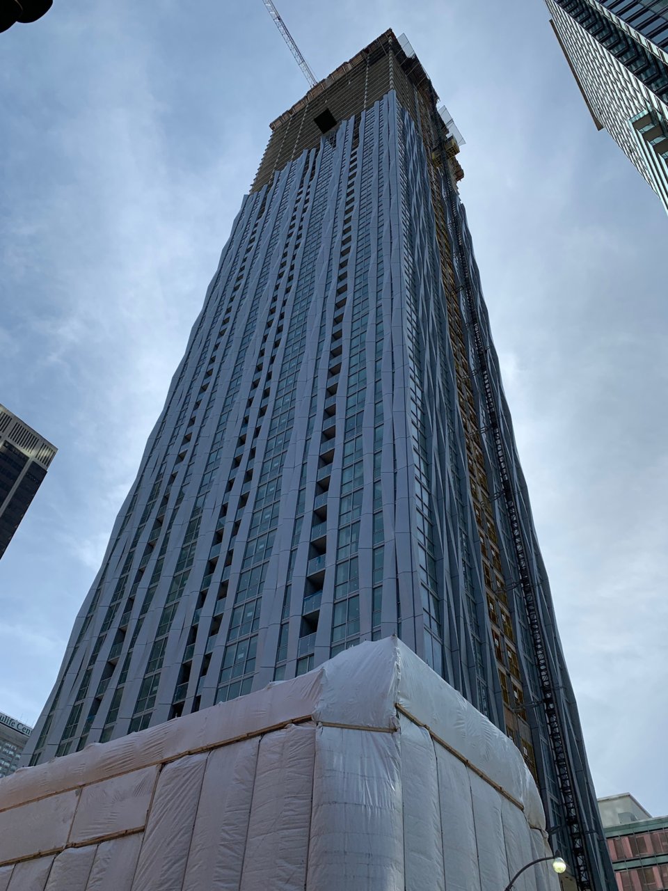
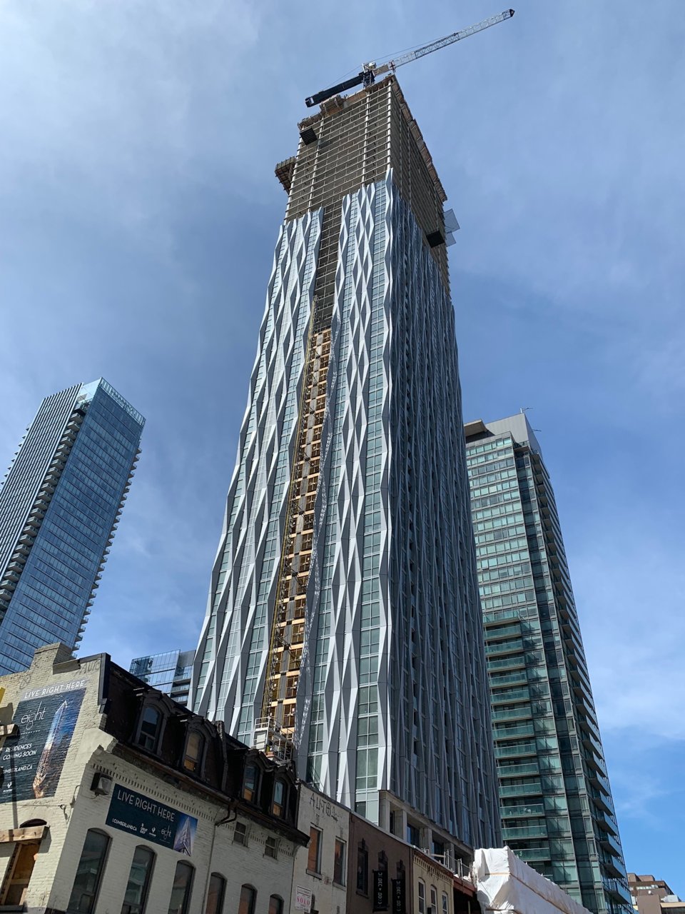
Toronto 1 Yorkville | 183.18m | 58s | Bazis | Rosario Varacalli
- Thread starter cruzin4u
- Start date
Yegger
Active Member
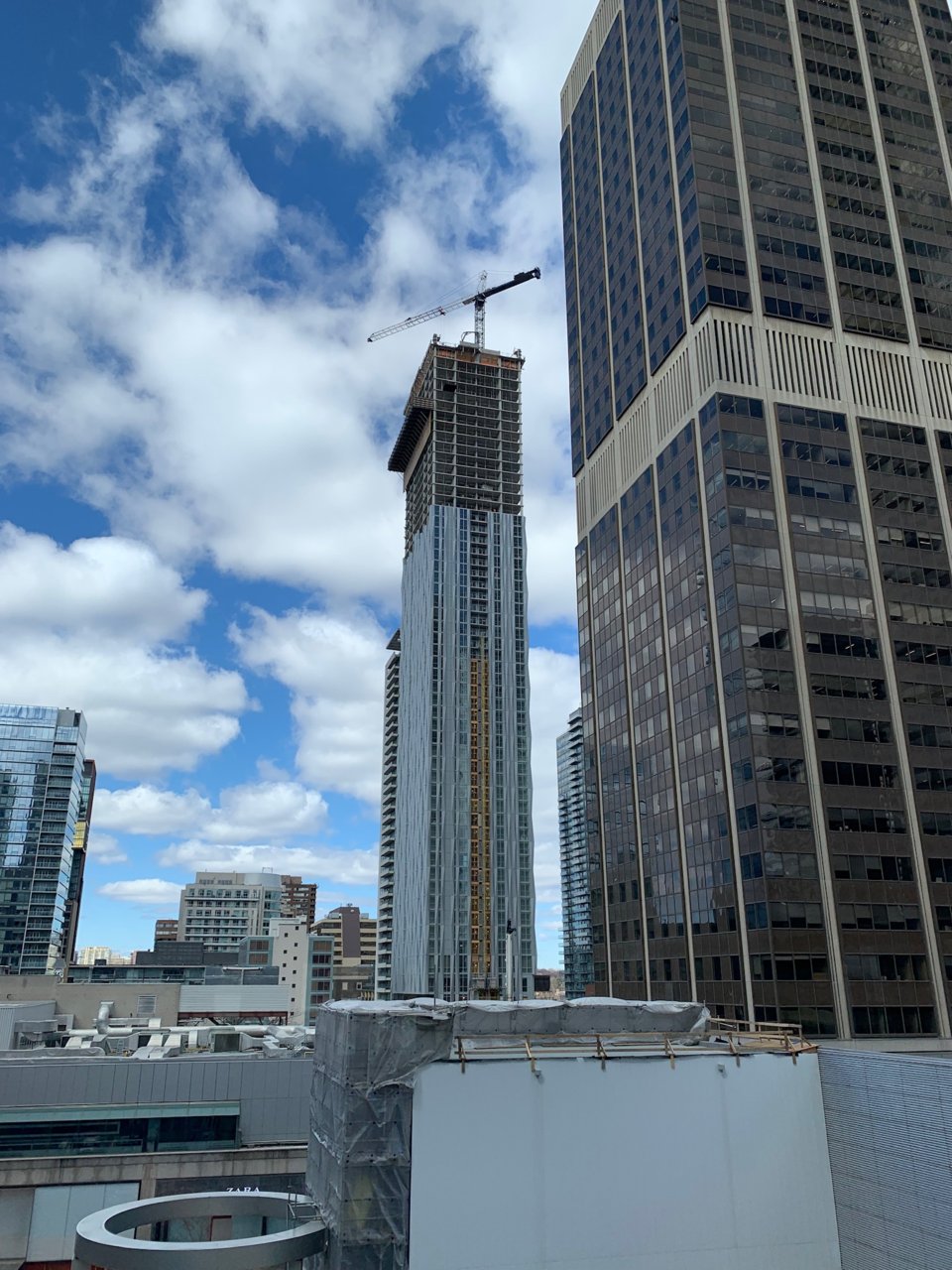
the taller this one gets the better i like it. The proportions combined with the effect of the panel really add to its sleekness.
Lyphe
Active Member
It's a great building.
But.
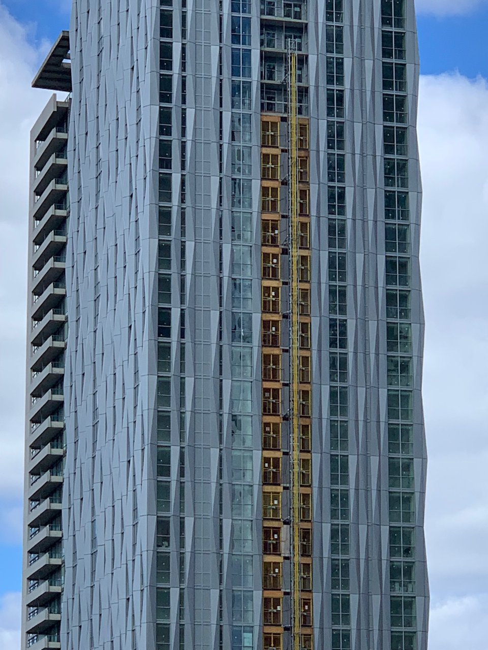
Every time I look at pictures, I just keep thinking what a shame it is that they used grey colored spandrel to fill in that one area instead of something the same color as the windows ... to create the illusion of windows.
But.
Every time I look at pictures, I just keep thinking what a shame it is that they used grey colored spandrel to fill in that one area instead of something the same color as the windows ... to create the illusion of windows.
zang
Senior Member
And what colour exactly are windows?It's a great building.
But.
Every time I look at pictures, I just keep thinking what a shame it is that they used grey colored spandrel to fill in that one area instead of something the same color as the windows ... to create the illusion of windows.
While I don’t necessarily agree with the grey used, the given time of day and both direct and ambient light means whatever colour is used will likely stand out. Black spandrels on a bright day will look funny. At least the grey matches the metal.
While they could’ve used something with a glass surface, the underlying colour would still look funny at some times of day. Regular windows with a gap would certainly look (somewhat) better, but that just means wasted—Yorkville priced—floor space. Having [whatever is behind those panels] flush with the facade is likely a concession made by the architects at the behest of the developer. Maybe Bazis/Plaza pushed hard for a floorplan that would require a dramatic change at the cost of Varacalli’s vision, and this was the only way to satisfy both. Sometimes there’re just no perfect concessions, hence the adage, “A compromise is an agreement whereby both sides get what neither of them wanted.” I certainly don’t see either developer or architect thinking that this was ideal.
Ideal would be to have architecture free of bureaucracy and compromise, but until architects start funding projects themselves, that ain’t gonna happen.
Lyphe
Active Member
It would obviously add to cost, but I have to imagine they could do a faux window all the way up that single very narrow area.
Again, the building is very nice, so my comment is really just thinking about how it could be even better.
Again, the building is very nice, so my comment is really just thinking about how it could be even better.
zang
Senior Member
I understand, it just seems like every third post around here is people complaining about the colour of the spandrels, with little thought to the reality and complexitites of building a multimillion dollar property. It’s a little tiring.It would obviously add to cost, but I have to imagine they could do a faux window all the way up that single very narrow area.
Again, the building is very nice, so my comment is really just thinking about how it could be even better.
ardwold1
Active Member
I think it is also worth repeating that within the next few years those spandrel bits, as well as the entire south facade, will be mainly obscured by Eight Cumberland...
Last edited:
Yes, won't be long before the south side is blocked for the most part.
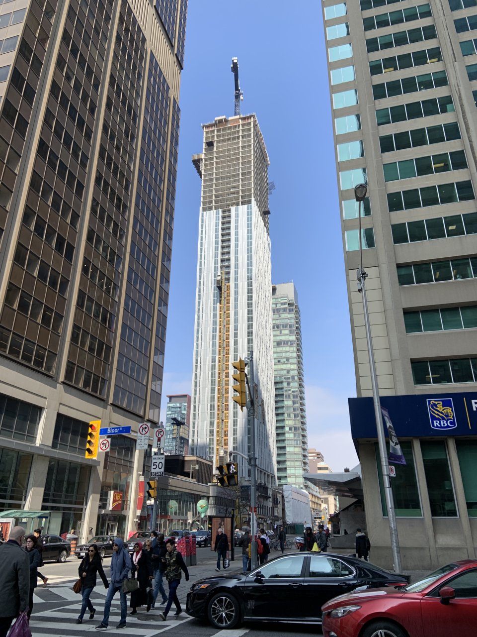
Benito
Senior Member
Today.
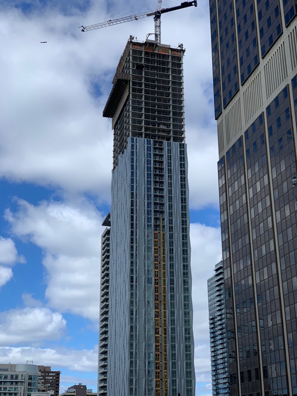
willwu
Active Member
Koops65
Senior Member
A journey down Yonge Street, to 1 Yorkville:
Bayer
Senior Member
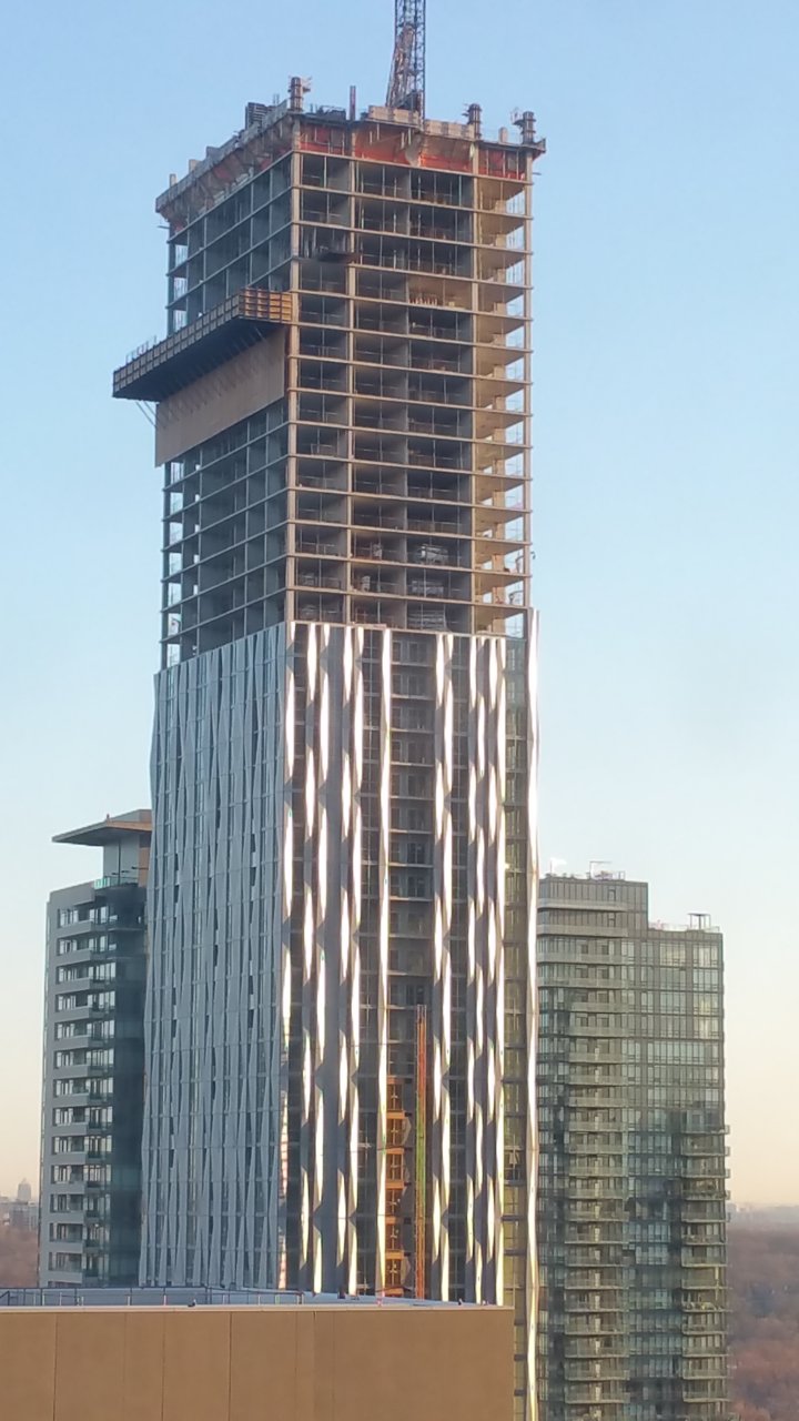
Shiny.
3Dementia
Senior Member
Still looks like a deep discount from the Gehry Annual Remainder Sales Event. Can't afford a Gehry? Shop here.
Though maybe no-one can afford a Gehry? ;-)
Though maybe no-one can afford a Gehry? ;-)
Benito
Senior Member
Today.
