News   Nov 22, 2024
 618     1 
News   Nov 22, 2024
 1.1K     5 
News   Nov 22, 2024
 2.9K     8 

The Tenor (10 Dundas St E, Ent Prop Trust, 10s, Baldwin & Franklin)

  • Thread starter billy corgan19982
  • Start date
Yeah I can see that in the design of the stage now that you mention it. I'm not sure that I'm sold on the stage as a centrepiece though. It's over on one side of the square, and the structure gives the square a "back", closing it off from the east. Good squares tend not to have a front and back. Agreed that the fountains are a fun, whimsical element, but that's why I mentioned that they work as a secondary element like they do at NPS. Both it and the tables and chairs are temporary and easily removed/turned off, making the pair an ineffective centrepiece. What's needed is something permanent, solid, prominent. Again, I realize that something like that would compromise the original vision of the square, but I don't think that vision was very good to begin with. Like 3Dmentia said, it's not rocket science.

I think too many designers and architects look down on tried and tested design principles and are always trying to do something new, even if that new thing is inferior.

Again, that was also a victim of the city’s basterdized changes to the architect’s design.

The square had no back or front. It was a pretty ingenious design with a slope providing a continuous flat square that gradually became the stage which itself became a garage entrance. The other side of the stage transitioned to stairs facing “The Torch”. I used to sit on those steps all the time. The stage itself was always populated with people sitting around.

If anything, it was Rogers who failed to create street interest on the CityTV building that lead the city to eventually just decide to make that side “the back” after which they installed a storage shed. They ruined it.

I can’t find an image from the other side but Victoria St side of the square was anything but a “back”. It was just as open and inviting.
5A3D1864-3BFE-4837-9232-68513ED8874F.jpeg
 
Last edited:
Again, that was also a victim of the city’s basterdized changes to the architect’s design.

The square had no back or front. It was a pretty ingenious design with a slope providing a continuous flat square that gradually became the stage which itself became a garage entrance. The other side of the stage transitioned to stairs facing “The Torch”. I used to sit on those steps all the time. The stage itself was always populated with people sitting around.

If anything, it was Rogers who failed to create street interest on the CityTV building that lead the city to eventually just decide to make that side “the back” after which they installed a storage shed. They ruined it.

I can’t find an image from the other side but Victoria St side of the square was anything but a “back”. It was just as open and inviting.

I don't think there is anything Rogers could have done with that building. They put a studio at street level, which is better than what existed before they took over the space. The real issue is the fact that the back of the Square is pretty much a driveway for the parking garage, and that Victoria Street itself is a pretty hostile street for pedestrians at that point. If (and it will never happen) Victoria Street ever went through a road diet at this point to tie it in with the square, I'm sure you would see more people wandering over to that end and peering into the studio. We get that with The Edge studio at Chorus Quay, and at 299 Queen.
 
Last edited:
Progress as of yesterday:
View attachment 206861

It'll get there eventually. When it does, if this screen is bright and high resolution like the one above the Eaton Centre, I think it'll have the effect of shaming Rogers into replacing their embarrassing media tower. They're a TV station! It's such an incredible opportunity for brand visibility — which is the entire reason they moved there — yet, they have this terrible little screen, on a tower with no other purpose. It's just waiting for an iconic curved display that can be the visual representation of Yonge Dundas Sq as the Coca Cola tower is in Times Square.

207102

Photo: Rogers Media
 
Last edited:
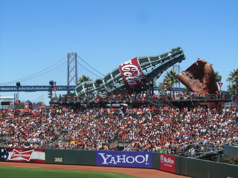
Actually, considering its shape, it wouldn't take much to make that into a gigantic bottle of coke. Imagine how it would look at night lit up from the inside!

That's not what I had in mind and I'm sure that's not how Rogers would ever want to use up its potential. The Torch should either be replaced with a media tower or better, have its shape replicated as a curved display, used to play Rogers content.
 
It'll get there eventually. When it does, if this screen is bright and high resolution like the one above the Eaton Centre, I think it'll have the effect of shaming Rogers into replacing their embarrassing media tower. They're a TV station! It's such an incredible opportunity for brand visibility — which is the entire reason they moved there — yet, they have this terrible little screen, on a tower with no other purpose. It's just waiting for an iconic curved display that can be the visual representation of Yonge Dundas Sq as the Coca Cola tower is in Times Square.

View attachment 207102
Photo: Rogers Media

There is nothing that can make this building more visually appealing. To be completely honest, I never fully understood why Rogers moved here. Life would be better if they tore it down and put a parking entrance in its place.
 
And it is clear that Rogers cares little about the aesthetics of the building. Their number crunchers are happy with the big billboards and are clearly not interested in spending more money to the benefit of our eyes and the city. They are still laying off people at the station and there is little hope that television revenue will be going up (as opposed to down) any time soon (decreasing the chances any more money will be spent on the building).

Heck, we are still waiting for them to cover the roof H-vac system.
 

Back
Top