News   Jul 16, 2024
 682     0 
News   Jul 16, 2024
 604     0 
News   Jul 16, 2024
 745     2 

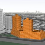
TCHC: West Don Lands Affordable Housing (589 King St E, 2x 4 + 8s, Core Architects)

^What works well with the chic grey and blacks in this neigbhourhood? (Chic because the architecture here & at River City is superior to most Toronto projects)

Bold magenta pink and Irish green street furniture--ie light poles, benches, garbage cans, flowers etc.

Agreed. Same goes for interior design: keep the colour palette neutral and add some bold punches of colour in accents.

People only look at the construction site and fail to visualize all the landscaping planned here. The whole area will be very green with the (underground) silva cells designed to produce healthy urban trees -- and a large range of trees at that with many different fall colours every year.
 
Does anyone know about the retail going in on King? Someone mentioned Sobey's earlier in the thread. Is that for this building? If there any proof a Sobey's would be moving in here?

That would be nice, but I don't believe that the back of the building is set up appropriately for delivery trucks. So I'm thinking, no.

But there is a healthy food place opening up soon across the street at 510 King St.
 
I always find it amusing how Sobey's--the "expensive brand"--moves into these TCHC projects when in fact the residents would be better served by their Freshco brand. (I used to shop at Sobey's when I lived across the street from one--I will say they've got the best interior design of all the majors and I love that shade of green.:))
 
This is no reflection on the photographer because these buildings look better in person, but in this light, they do not advance the cause of affordable housing and look dreary and bunker like (especially the view from the Gardiner - yikes!).
 
This is no reflection on the photographer because these buildings look better in person, but in this light, they do not advance the cause of affordable housing and look dreary and bunker like (especially the view from the Gardiner - yikes!).

It's the black brick. A red or lighter brick would have given a much better look. I wish they could ban black brick all together to save these developers from themselves.
 
Funny, I find the four-storey, wood-framed mid-rises to be some of the sharpest architecture being constructed in the city right now. My only issue is the stone at the base - why not take that dark, handsome brick all the way down?
 
These show only slightly more finesse than the aged stock being torn down in Regent park. In fact, I'd say the Regent Park stock may have been more innovative at the time, because it looked starkly new, and because the architectural ideas that were driving the construction of it all were more progressive.

I think the brick, however lovely it may be on its own was not the right fit for these buildings. They look soot-stained in advance, not the best way to go about resurrecting a former industrial slum area.

With their wood interior construction, banal forms and dull exteriors, I'd be surprised if these last as long as the sixty-some-odd years-old Regent Park stock has. Maybe some vines and shrubbery will help. There's a million things that could have been built here, and a multitude of ways they could have been finished. This was a very low setting for the bar, indeed. A well finished, low set bar.
 
Last edited:
I like the design of the three structures, but anyone who comes to my place comments on what an awful choice of brick colour.

I'm counting on Waterfront Toronto to do a bang-up job with the landscaping. And this Spring. Please.
 
What?! I love this brick colour. The dark grey is so much more elegant and urbane than the typical new, suburban, bright salmon colour brick that goes into most contemporary brick usage. Overall these buildings look great.
 
What?! I love this brick colour. The dark grey is so much more elegant and urbane than the typical new, suburban, bright salmon colour brick that goes into most contemporary brick usage. Overall these buildings look great.

At what point is there just too much grey? Have we not reached that yet? Is there no limit?
 
Great angels MafaldaBoy. I love this project, especially the taller building. A clean, elegant and stylish combination of beautiful brick mason ship and color choice, to the modern spandrel portion and nicely proportioned black mechanical floor on top.
 
Considering the amount of red brick in the area (and Toronto in general) this is quite refreshing. Looks even better in person. This is going to be a great area in a few years. What an amazing transformation in just a few years.
 

Back
Top