News   Jul 05, 2024
 2.9K     0 
News   Jul 05, 2024
 1.9K     13 
News   Jul 05, 2024
 679     0 

Star: New Signs for the TTC

I like the new design. I think it has the potential to become an iconic sign, and capitalizes on the TTC's great design heritage.

Am I alone in thinking the new versions are a bit of a mish-mash, and somewhat reminiscent of the MTA's signage (but not in a good way)?
 
Awesome! I love it. I would like to see them do this at all station entrances.
Also, it's very common for transportation systems to use just a logo, without the words "rail" or "subway" or "metro" etc. This is very common throughout the world. Most tourists know this when they visit a city. Also when you see a sign outside of some stairs going into the ground, it's pretty obvious it's a subway ;)

I just think some people like to be spoon-fed everything, or at the very least, think the masses are so dumb that everything must be spelt out.
 
I was at the design charrette and most of the attendees agreed that this pylon was a "signature" item that could used to identify a subway entrance. That being said, I proposed an alternative 'pillar' that had a bit more substance -- the pillar rendering above looks scrawny, and in the visual clutter, i don't think it has enough 'oomph' to stand out.

What I completely disagree with though is the fact that they're testing it at one entrance (and of all stations, Osgoode, which already has 3 different signage variations, and this would be four -- one on each corner!). This does nothing to build the 'brand' of the new pylon and will only lead to even more confusion. I wish the Commission would make up its mind on one design, and replace ALL SIGNAGE to conform to the new standard.. and not do it piecemeal. The current mish-mash of signage and identification is stressful for new users and outright shabby as an outward representation of the system as a whole.
 
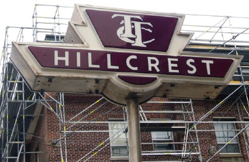
Here's a couple examples of the TTC logo with the horizontal crosspiece brought to the front.

70267802_2d62206715_m.jpg


Hillcrest_843-cropped.jpg


The credit for the second one goes to UT member Joe Clark.
 
I like the new signs a lot, and agree with the multiple comments about subway signs not generally having the word "subway" on them. It would be a sad traveller indeed who passed by a Black T in Boston or a blue U in Berlin not realizing it was a subway.

Though a trouble in this light, such as it is, with the TTC shield is that it's generic for the whole system, rather than specific to the subway.

Other cases of frontal-crosspieces: the Davisville Yard, and (in bowdlerized modern form) Long Branch Loop.

Some may think it to be cluttered; but in this light, I don't mind the frontal-bar look, esp. when it's got that old red'n'cream flavour (why, oh why, doesn't the TTC return to that old colour standard?)

70267802_2d62206715_m.jpg


Anyway, funny how few talk about this "classic 60s" standard design, maybe because it's so ubiquitous as to be taken for granted--presumably it came into common use because they were easier to manufacture by the pound (and less Art Decoish) than "profiled" signs a la Hillcrest. Anyway, I prefer it to its similarly-shaped successors/replacements which eliminate the frontal bar, or add the "Subway" word below, or discard the vac-formed plastic on behalf of flat sheets...
 
The "Hillcrest" sign is kinda cute.

As for the red & cream logo, I personally don't like it. It looks too 60s. I much prefer the red & white version. Maybe it's just an age thing.
 
Interesting how streetsigns are migrating from 3D classic designs that have existed for a long time to cheap 2D knock-offs, and the TTC, only about 10 years after bringing out the backlit rectangular signs they have now are considering more expensive shaped signs.
 
I wish the Commission would make up its mind on one design, and replace ALL SIGNAGE to conform to the new standard.. and not do it piecemeal.

I couldn't agree more. Things are always done so half-assed in Toronto. Well Canada as a whole really. Do the entire system or don't change anything at all.
 
Methinks it's an age thing.

Only way to be sure would be to survey who prefers which colour scheme and their age. I'm in my 20s and I find the 60s era colour scheme to be rather off-putting.
 
Though a trouble in this light, such as it is, with the TTC shield is that it's generic for the whole system, rather than specific to the subway.
Very true. If Boston had the MBNA logo indentify its rapid transit no doubt it would be confusing for tourists. Unlike Boston or Berlin or London, Toronto's iconic logo is for the system as a whole, not the rapid transit system specifically. So if the TTC logo is used to identify subway stations it's important to clearly show that it's the subway. The modified TTC shield with the SUBWAY bar seems to work fine, why not continue with that?
 
Very true. If Boston had the MBNA logo indentify its rapid transit no doubt it would be confusing for tourists. Unlike Boston or Berlin or London, Toronto's iconic logo is for the system as a whole, not the rapid transit system specifically. So if the TTC logo is used to identify subway stations it's important to clearly show that it's the subway. The modified TTC shield with the SUBWAY bar seems to work fine, why not continue with that?

But Boston DOES use the same logo for the subway and for buses and London does use the same logo concept for all different modes of transport, just with different colouring. People still manage to figure it out.
 
Honestly, people are not as stupid as we (and our governments) think. And for the occasional Joe Dummy who doesn't realise 2+2 = subway (or at least ome sort of transit), he could always just ask someone.

I like the 2 old school signs. Simple is almost always better.
 

Back
Top