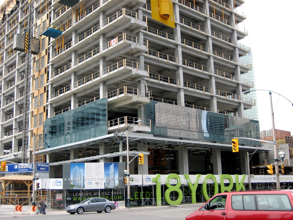
Southcore Financial Ctr: PricewaterhouseCoopers Tower (18 York St, bcIMC, 26s, KPMB)

Yeah, I'm afraid to say that to my eyes, the colour and fritting on this (Four Seasons is nice when it looks reflective but then looks messy and transparent up-close) look way better than the Four Seasons to me.

Then again, the Four Seasons' glass will have a very different effect once it stretches the full height of the tower.

This is a nice surprise for 18 York though, since I always expected clear glass or something similar to Telus. Variety in this new downtown financial district is key.
 
Probably the last update from this angle.

4530429961_918d276eac_o.jpg
 
I was jogging past this building and saw the glass on this tower. I like what is there so far, the colour reminds me of thier London office and so creates something of a corporate theme for them.
 
Great shot... but man, the sea of sea foam-teal-green hybrid is beginning to look dated and just plain gross. The Ritz, in all it's slanted glory is still an affectatious green glass goblin at heart.

Yeah, we're really starting to get glassed to death. I don't think it looks dated and gross, I think it looks bland and sterile.
 
Yeah, we're really starting to get glassed to death. I don't think it looks dated and gross, I think it looks bland and sterile.

There's quite a collection of poor towers in this area. The Pinnacle collection looks quite bad, and the MLSE towers are some of the worst offenders when it comes to glass colour.
 
It's easy to make a judgement call while staring at photos. When walking around an area, you don't notice it so much. Walking is the best way to take in a city. I think this forum makes many of us--me included :)--lazy and easily jaded. The real city for me is walking along Dundas West, the residential areas, etc.
 
I live around the area and it's not bad to see all the glass buildings as long as they each bring some uniqueness in their designs, shape of building, use of glass, podium finishes, etc.
I agree that it would be boring if the building shapes are all the same and very little colour is used to differentiate the buildings.
 
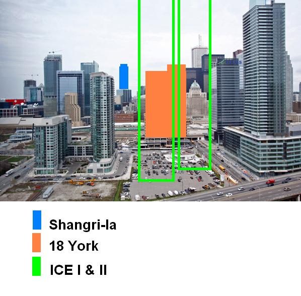
Nice updates guys! its too bad we won't be seeing much of shangri-la from that angle cause 18 york is rising fast and ice will seal the deal... I too am getting a little tired of green glass... The Ritz is a hybrid though because the colour of the glass changes depending on lighting/weather... I like blue glass the best :D
 
The monotonous colour and form in the neighbourhood does detract from the design of each particular building, but it's not terrible. Two or three colourful/non-glass towers plunked down right in the middle of it all would do a lot to alleviate the monotony. I fear that 18 York and Ice will just exacerbate the problem. Apparently the block west of 18 York will be an all glass tower too, so this may get much worse before it gets better.
 
Nice updates guys! its too bad we won't be seeing much of shangri-la from that angle cause 18 york is rising fast and ice will seal the deal... I too am getting a little tired of green glass... The Ritz is a hybrid though because the colour of the glass changes depending on lighting/weather... I like blue glass the best :D

Hey Steveve, not to worry, you will still see Shangri-la from that angle when 18 York and ICE are complete.

I didn't have time to do a real render for you, but this hasty diagram will demonstrate the point just as well.

:)

4555410736_816c61fcda_o.jpg

(Original courtesy Yoshimura)
 

Back
Top