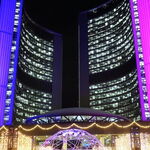
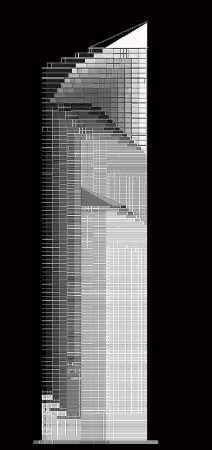
Obviously I need to do some more work on the top and, well, all around but here's how I'm interpreting it so far. Keep in mind that the top of the tower must taper back towards the south and west in order not to cast any additional shadows over Nathan Phillips Square.
You are a brave man... it's starting to happen. I became so baffled about to intrepret it, I was going to resort to layers of cardboard (ole fashion modelling).
Base on this render, I have a feeling that the only extra "layer" on the (otherwise) rectangle, should be a wider (deeper) version of one of the layers you've used.
More like the original "turn" in the terracing... does that make any sense?
In other words, more substantial depth in the second layer so the setbacks are actually terraces.... whatever the footprint would allow.
I have no idea what the above means so I'm sure you don't either.... if only I could draw.
I think the original "staircase" top meshes better with the rest of the building.
3Dementia: Sorry, I don't quite follow what you're suggesting.
edit: P.S. Sorry for using this as my own personal image thread guys, but I'm hoping some people will pipe-up with suggestions and critique what I'm doing.
I like the looks of that one, but wouldn't so many different floor plates equal much higher costs? Also, most of these details won't even be visible from most angles, correct? I think the design should stay as simple as possible, but still maintain a distinct look that's both attractive, and timeless.
Yeah, it it would increase costs but that's not really my consern at the moment. With regards to the details, the only ones that wouldn't be all that visible is the top few floors.
By all means, Whistler, go for it. Just post whatever you come up with
I like that look ^ , its not something I've seen in Toronto before. One thing I hate about some of the new buildings being built is that they're boxy looking like the 70-80's buildings. Toronto needs newer and different and that one is something Toronto needs! Keep up the great work.
cassiusa, your design looks interesting but it's tough for me to visualize what it would look like in the skyline/reality.
I do like the overall look you're going for, and if I would offer a general principle I would say "Less is always more" in these types of situations. A nice classy, modern building, that we can all be proud of.
Thanks for the opinion, Canuck. I definitely agree with less is more. I've been thinking about how to reduce the impact of those jagged sections without eliminating the terraces in the process. I've come to the conclusion that it might not be possible and perhaps I should only have those sections stick out a foot or two rather than the 5-10feet they do right now. I'll give it a shot and post the results.
BTW, feel free to say it sucks people - just give suggestions on how to make it not suck in the process


")