News   Jul 04, 2024
 718     1 
News   Jul 04, 2024
 649     0 
News   Jul 04, 2024
 592     1 

Sapphire Update, out-of-business (Stinson)

Status
Not open for further replies.
I definitely like approach No. 2 better.

Approach No. 1 will be difficult to resolve well - you would need a lot of contrast between the various sections of the facade for the average observer to recognize that the differences were intended and not just a mish mash of facades.

Here's a building in Vancouver (Carmanah Plaza - 1138 Alberni) with a similar variation in facades - but it's not all that clear that is what was intended. The only one that shows up clearly is the black area versus the areas above. I think there are 4 facade variations above the black area (above and to the left are a grid of windows; above and to the right are horizontally banded windows; directly above the black area is a thin vertical band of portruding solariums/balconies with thicker aluminum mullions; and at the top is glass curtain wall.) Pic below.

I think that a clean simple design can make more of a statement than a busy complex one. Compare the impact of the horizontal banding on the 70s office block next to Carmanah Plaza.

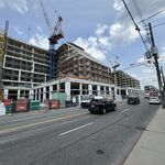
113-1116_Alberni.jpg
 
^ Pantages sort of has that thing going on for it. But i don't think the tower shown in the above post (Carmanah Plaza - 1138 Alberni) looks good.
 
Not sure. I haven't been extended an invite yet. It would be interesting to hear some of the feedback though. Will you be going?
 
I agree with most: approach #2 is the way to go here...

...and I don't: the multicoloured glass is way more fun. I particularly like the second from the left. This plan will only work though if the vertical stripes remain uninterrupted by horizontal elements during the detailed design stage.

Single colour glass will only really works in the plan on the right, where all of the indents will benefit from shadowing.

Approach #1 has all the appeal of a supermarket shelf: it's a plan to have no plan. Ick.

Anyway, as I can't imagine Approach #1 winning out, it's looking up! I look forward to the design being "finalized" (tough word to use based on how often Harry's building designs change), as we'll get to see another of Cassius's great renderings set amidst the cityscape, no doubt.

42
 
Toronto is far too shy about using colour - forget Sapphire, let's have Tourmaline towers

Tourmaline2.jpg


AoD
 
That Tourmaline rendering looks great. Very interesting how it meets the ground... is that were the drop off circle will be? I say do it Stinson... make it exactly like this new rendering. Very funky. :)
 
Truth be told, I am half-serious about the Tourmaline tower - certainly, the proposed design can use streaks of red glazing like CCBR (or gawd forbid, go full out a la Palais de Congress in Montreal)

AoD
 
The west end of the Palais de Congres in Montreal is amazing. (See www.flickr.com/photos/cas...et-701397/ and other photos in that set if you're interested.) I imagine that's somewhat like what the Sebastian Messer plan for the Absolute competition in Mississauga is meant to look like. The tourmailne crystal image above would be even more compelling were it turned upside down: it has the wedge shape of the proposed building's upper terraced floors!

42
 
The word so far is that people liked the multicolour approach, though I'm waiting for clarification on if that was about design 1 or design 2 or just in general.
 
Design 1 which has variations in both struture and colour I think is more unique but I would need to see a more realistic rendering to get a feel for it in the Toronto skyline... it might look too much like a toy... although that worked with ACAD. Design 1 is the most unique looking wherears the second more colourful rendering of Design 2 (2b?) is colourful but seems less unique to me. If it would be possible to show 1 and 2b in a skyline picture that would help. I find 2e to be more unique in shape than 2a, 2b, 2c, and 2d so of the Design 2s I would choose 2e for shape but with a muticolour approach with 2b if a Design 2 was chosen.
 
Status
Not open for further replies.

Back
Top