News   Jul 03, 2024
 22     0 
News   Jul 03, 2024
 171     0 
News   Jul 02, 2024
 1K     0 

Rem Koolhaas, the Irreverent – Neither Modernist nor Historicist

Foundation Buildings - Netherlands Dance Theatre -Interior


Rem Koolhaas
Nederlands Danstheater/Lucent Danstheater

(Netherlands Dance Theatre renamed Lucent Dance Theater)
1980 - 1987
Den Haag, Nederland


Foyer

i2.jpg
i1.jpg
i3.jpg

Courtesy Gulliver Uhde


Auditorium

2223377669_ddb7bd43e8_b.jpg

Courtesy flickr / Haags Uitburo copyright all rights reserved


Last edited:
Foundation Buildings - Patio Villa - Actual compared to Plans

You may believe you are looking at the Rem Koolhaas' version of Mies' Farnsworth House, or Phillip Johnson's Glass House, but you would be wrong. What you are seeing is a module inserted partially into a house to generate spacing and light. It is curiously referred to as a Patio Villa, and on the OMA website its design is openly called a 'parody' (see below) - the owners of this module would beg to differ.


Rem Koolhaas
Patio Villa
1988
Rotterdam, Nederland


Actual
Left - Glass Module; Right - Glass Module inserted into Building structure


oma_patio_villa_thumb_mar_04.jpg
bkoolha2.jpg

left - Courtesy Moco Loco; right - Courtesy archimagazine;

Plans
Angled Drawing of Glass Module


phpThumb_cache_..%252Fimages%252Fbuildings%252Fgallery%252Fpicture_1348_9.jpg_fltrwmi%257C..%252Fimages%252Fwatermark.png%257Cc%257C100%257C50%255D_h485_w750_1184085620_q92.jpeg


Plans
Left - Top-Down Drawing of Glass Module / Right - Elevation Drawing


phpThumb_cache_..%252Fimages%252Fbuildings%252Fgallery%252Fpicture_1348_10.jpg_fltrwmi%257C..%252Fimages%252Fwatermark.png%257Cc%257C100%257C50%255D_h485_w750_1184085675_q92.jpeg
phpThumb_cache_..%252Fimages%252Fbuildings%252Fgallery%252Fpicture_1348_11.jpg_fltrwmi%257C..%252Fimages%252Fwatermark.png%257Cc%257C100%257C50%255D_h485_w750_1184085687_q92.jpeg

Unless otherwise stated, all above Courtesy archiweb


From the OMA/AMO website:

In a parody of the classical Dutch section of houses in the slope of a dike, this house was projected on the raised embankment of a highway that was never built. On the north, the road and the entrance level are one level below the main site. The garden and the main area of the house - on the higher level - are defined on the south by a canal.

On the main floor of the house - more or less a square - a patio is placed in such a way that it generates, in combination with a free-standing wall, the living spaces of the house: a living area to the south, a dining zone to the north. The wall defines 2 "rooms" - a bedroom and a study - connected by a secret corridor that also gives access to the bathroom.

The garden elevation consists of four different kinds of glass - armoured, clear, etched and green, that create transparencies, obstructions and intensifications.

The (metal) east wall of the patio is a kitchen, the north-, and south wall are mobile, and the patio floor is made of glass planks that give daylight to the gymnasium below.


© OMA / AMO


SOURCE Under 'Patio Villa' Project Information
 
Last edited:
Strange Things Uncovered While Researching Rem - #8

Changing a flag into a ... Barcode?


Down with EU stars, run up stripes

from BBC News, UK
Originally Published 8 May 2002

(Re-formatted for Posting, Emphasis Added in Red - Z)

The rather sombre European Union flag could do with changing, suggests a top designer whose radical new version takes colours from the banners of all the member states. If it's run up the flagpole, will anyone salute it?

_1974721_eu_flag2_300.gif

The old (left) and the new proposal (right)

If the European Union accepts as many as 10 new countries to the already 15-strong club, it is feared the enlarged organisation's flag may look a bit out of date. The current version dating from 1986 boasts 12 stars - 12 being chosen as a pleasingly "perfect" symmetrical arrangement, rather than to represent member nations.

Dutch architect Rem Koolhaas thinks that this perfection can be improved upon - his new flag uses 45 vertical stripes, taking colours from every existing member's national flag.

The logo - designed in response to a request by European Commission president Romano Prodi to find ways of rebranding the EU - represents Europe's "diversity and unity", according to Mr Koolhaas.

_1974721_neil150ap.jpg

Putting the EU stars behind us?
(The photographer was obviously creating his or her own humour
in this unmistakeable framing - Z)


Star about-turn

EU officials are currently examining the design, which if approved could soon be flying from flagpoles across the continent - as well as featuring on EU signs, stationery and even car number plates.

Those who dismiss the radical, bar-code-like design out of hand may be unaware of Mr Koolhaas's pedigree. The 2000 winner of the Pritzker Prize - the Nobel of architecture - Mr Koolhaas is regularly consulted by the EU when it is seeking some blue-sky thinking. Last year, Romano Prodi and Belgian Prime Minister Guy Verhofstadt set Mr Koolhaas the task of reinventing the oft-maligned city of Brussels as Europe's vibrant capital city.

Already unfavourably compared to wallpaper, the TV test card and deckchair fabric, the stripe design is only one of the proposals submitted by the Dutch "brainstormer". Stinging criticism was, of course, to be expected. The creation of a new flag is seldom a simple process.

Flagging enthusiasm

With the end of apartheid and white-rule in 1994, South Africa considered a reported 7,000 proposals for a new flag to represent all the races of the fledgling "rainbow nation".

Some of submissions to the multi-party group set up to find the new flag would have made Mr Koolhaas's effort look positively conservative.

Alongside designs incorporating clasped black and white hands, doves and hearts and a large black cat sitting with a small white mouse, were a hammer and sickle logo substituting a banana and a rifle, and a cartoon of Bart Simpson sunning himself on a beach. When Nelson Mandela took the nation's helm on 26 April 1994, a rather more diplomatic six-hued flag was run up (black, green, gold, blue, white and red), which tipped a nod to the ruling ANC, the Union Jack, the Transvaal and the nation's sporting colours.

Drawing conclusions

The compromise design was - like the EU stripes - intended to reflect both diversity and unity, but was also supposed to be simple enough "that a child could draw it recognisably". That many children already have difficulty remembering the order of the colours of the rainbow, raises the worry that the complex Koolhaas design may prove a little too taxing for young artists.

Some have suggested adding stars to the existing design as new members join the EU. The United States flag has changed 27 times since the Stars and Stripes was adopted in 1777 - with 25 of those alterations made to add new stars as new states entered the Union.

The US flag now has 50 stars clustered in the top left corner - up from the original 13 - in an arrangement that would make an EU flag with 25 stars look positively sparse in comparison.

© BBC


SOURCE

Entire Flag
(sometimes referred to as EU barcode, wallpaper, throw rug, and TV test pattern)

rem_main.jpg


Courtesy DWR - Design Within Reach


Note: Despite submissions, and an increase to 27 total EU Members to-date, the flag remains as it was - with the original 12 stars intact.


Last edited:
Good idea to make a compilation of Koolhaas' work.
Thusfar I haven't seen you mention his Educatorium in Utrecht, hence why I'd like to add information about this building to this thread, if you don't mind.

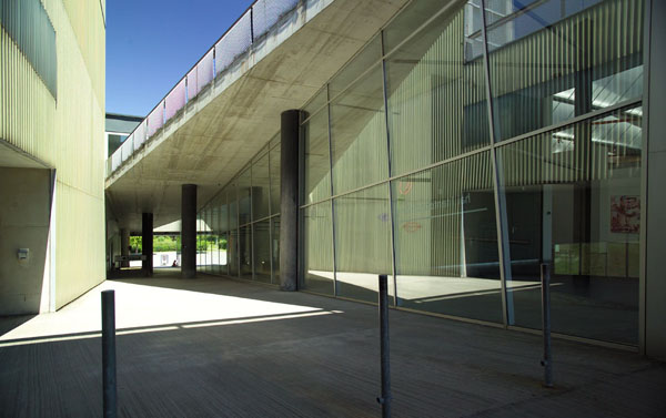
Educatorium, Utrecht University, Utrecht (The Netherlands)

Design - Realisation: 1992-1997
Architects: OMA (Rem Koolhaas & Christophe Conubert)

The Educatorium is situated in the centre of the university campus 'De Uithof' and it is the connecting element between the existing buildings Transitorium I and the Willem C. van Unnikbuilding: the Educatorium combines two existing buildings dating from the 'sixties by means of a hybrid glass and steel construction divided by a strip of cement whose lines reflect the trajectories of student life and identify various functional spaces.

The Educatorium encompasses two lecturehalls, one with 400 seats and one with 500 seats, three examination halls with room for 150, 200 and 300 students. Furthermore, there is a cantina (capacity: 950 persons) and extensive bikeparking. The tilted floors are the lecture halls.

Koolhaas studied the project's sustainability with the aid of architect Cristophe Cornubert, another member of the Office for Metropolitan Architecture (OMA) specialising in sustainable alternatives to materials with harmful effects on the environment.

The two architects have created a building which attempts to cut energy consumption and carbon dioxide emissions while supplying good light and temperature conditions in the interiors through control of natural lighting and of the heating and cooling system.

To minimise dispersal and consumption of energy, large surfaces of insulated glass on the northern and western facades guarantee optimal incidence of the sun's rays, allowing heat to accumulate by the greenhouse effect and saving on electricity for lighting.
In the study room, natural lighting is optimised by low windows offering views and high windows for lighting, conveying rays of light toward a light-coloured ceiling which intensifies the light and reflects it down to the reading tables.

In the summer the eastern façade, which is also completely made of glass, is shaded by large trees, while the southern façade employs a combination of semi-automatic screens which allow light to filter through in different ways depending on how the building is being used inside.
The building's heating system makes direct use of the university's cogeneration plant, exploiting an underground heat accumulator which is also used for the hot water heater.

Cooling is achieved by a passive ventilation system exploiting the phenomenon of cool air at night and the building's ability to accumulate heat without any additional mechanical systems.
The flow of air in the building is obtained by balanced ventilation based on movement through hollow floors and self-regulating air intakes.

The bay covering the theatre-conference halls, generated by the curve in the cement strip dividing the building, is interesting not only from the compositional point of view but also as an example of sustainable building: its extrados is covered by a lawn providing better thermal and acoustic insulation for the interiors and offering a pleasant green view from the study rooms overlooking it.
The architects also took care to save water using Gustavsberg toilets, which need only four litres to flush, cutting consumption by 50%.
The cement structure is left exposed, and less cement is used, a thickness of 20 cm instead of 60 cm, characterising the building's appearance and confirming that sustainable architecture can be good architecture.

(Source: Flores Zanchi)

The building looks somewhat like a slightly opened book.
I used to follow lectures there and I still make all my exams in this beautiful building.

vk_educatorium1.jpg


09%20educator1.jpg


And 2 pictures I took with my cameraphone:

SP_A0250.jpg


SP_A0098.jpg
 
I don't mind any post Ronald, and I enjoyed yours (your camera phone is quite sharp).

Just to give you an idea of the way I was approaching this: I am not taking a strictly chronological path, but I will cover nearly all of Rem Koolhaas' work, provided I can find materials to post from across the net. That would be impossible with Richard Meier, whose work is prodigious in number. Mr. Koolhaas, on the other hand, readily admits to not having produced many buildings over his career (see the Charlie Rose video earlier). Yet they both have had an enormous impact on Architecture worldwide, albeit for different reasons.

If I were to turn around and discuss his books - one of which is 1300+ pages and the total number is astonishing - I would have to be a great deal more selective.

This area will cover what I call Rem Koolhaas' 'Foundation Buildings' so I will have to cover the Educatorium, Grand Palais in Lille France, etc. I will also humanize Mr. Koolhaas with those "Strange Things Uncovered ... " posts, and by brief discussions of what he has failed to have built, but which are also interesting - such as Sea Terminal in Zeebrugge, Belgium.

I stop deliberately at times during a transition, hoping that people who are reading this will drop in and contribute - so keep your comments, pictures, and articles coming if you have anything else to say, even if it is in regard to something way back at the beginning.
 
Last edited:
Nexus Housing - Models

"Dilemma of European architect building in Japan: Should the project be 'as western as possible?'
Is it just another export like a Van Gogh, a Mercedes, a Vuitton bag?
Or should it reflect the fact that it exists in Japan?"


Rem Koolhaas


Rem Koolhaas
Nexus World Housing
1991
Fukuoka, Japan


3D Models

190638965_f42dac2633_o.jpg
190638966_987a459225_o.jpg


190638967_7ba73e34ec_o.jpg

All photos on this page © flickr / eligotman


From the OMA/AMO website:

This project consists of 244 individual houses in the Kashi District of Fukuoka, each three stories high, packed together to form two blocks. Each house is penetrated by a private vertical courtyard that introduces light and space into the center. A closed cyclopic wall wraps around the exterior of the blocks so that they can eventually serve as socles for Isozaki's future towers.


Confronted with the possibility of building in Japan, a European architect faces a dilemma: should the project be 'as western as possible'?; is it just another export like Van Gogh, a Mercedes, or a Vuitton bag?; or should it reflect the fact that it exists in Japan?
In Fukuoka, the character of the site reinforces this dilemma: the context is more organized, less 'chaotic', than the typical Japanese city. For this operation, Arata Isozaki invited one Japanese architect (Osamu Ishiyama) and five non-Japanese architects (Oscar Tusquèts, Christian de Portzamparc, Marc Mack, Steven Holl) and O.M.A. to define a superblock with freestanding perimeter buildings for a client who wanted to introduce a 'new urban lifestyle' in Japan. The only 'Japanese' aspect of his master plan: 120-meter-high twin towers (architect: Izosaki) projected at the center of the otherwise five-story-maximum development.

Like an earlier scheme in the shadow of the Berlin Wall, the project explores a fusion of the Roman city - sections of Pompeii, for instance, form continuous tapestries where houses never become objects- and similar experiments by Mies van der Rohe where individual courtyard houses are consolidated to form blocks, so that the substance of modern architecture is condensed to generate urban form.

The project consists of twenty-four individual houses, each three stories high, packed together to form two blocks. Each house is penetrated by a private vertical courtyard that introduces light and space into the center.
On the lower level a concourse leads to individual front doors; beyond each door lies a patio with white pebbles. A continuous staircase leads to individual rooms on the second floor and living quarters on the third - a suite of living, dining, open-air, and 'Japanese' rooms where screens and curtains generate different configurations.
A closed cyclopic wall wraps around the exterior of the blocks so that they may eventually serve as socles to Isozaki's future towers. The roofs of the domed Japanese cells are covered with grass. 'Escaping' from the walls are the floating rooflines of the living room floors. They resonate with the mountains that surround the bowl of the city.

Each house offers a variety of spatial conditions and tectonic contrasts: enclosed vs. exploding, intimate vs. open, public vs. private, high vs. light, concrete vs. abstract.

© OMA / AMO

SOURCE Under 'Nexus World Housing' Project Information
 
Last edited:
Nexus Housing - Drawings of Floors, Crosss-Sections etc

nexus1.jpg

© Hiroyuki Kawano

Rem Koolhaas
Nexus World Housing
1991
Fukuoka, Japan


master.jpg


groundfl.jpg
groundcol.jpg


1floor.jpg
1floorcol.jpg


unitcol.jpg
lcddunit.jpg


pieces.jpg
1floorgrid.jpg
CADlcdd.jpg


explo.jpg
sections.jpg

Courtesy carbon cudenver edu

 
Last edited:
Nexus Housing - Exteriors 1

nexus3.jpg

© Hiroyuki Kawano


Rem Koolhaas
Nexus World Housing
1991
Fukuoka, Japan


01.jpg


02.jpg
03.jpg
04.jpg

05.jpg
06.jpg
07.jpg


08.jpg
09.jpg

© 1998 FORES MUNDI All Rights Reserved

2ecdfc12.jpg

Courtesy livedoor

 
Last edited:
Nexus Housing - Exteriors 2

nexus2.jpg

© Hiroyuki Kawano


Rem Koolhaas
Nexus World Housing
1991
Fukuoka, Japan


Top Row
left – Aerial View;
centre - " The 'Roof-Landscape'";
right - “Street side of the building with shops on the ground floor”


photo0.jpg
photos4.jpg
photo1.jpg

Courtesy carbon cudenver edu

204597239_0ae4673961_o.jpg

© flickr / homary

 
Last edited:
Nexus Housing - Interiors


Rem Koolhaas
Nexus World Housing
1991
Fukuoka, Japan


Interior Model

190638964_adbdd69469.jpg

© flickr / bryanboyer

Actual Interior
left - "The vertical courtyard on groundfloor"; centre - "View up the courtyard"; right - "The living space on third floor"


photo2.jpg
photo3.jpg
photos5.jpg

Courtesy carbon cudenver edu


Last edited:
NEVER BUILT - Sea Terminal in Zeebrugge

Despite the fact that this building won first prize in a 1989 design competition in Zeebrugge, Belgium, it was never built. OMA still considers it officially an open project, but most people in Zeebrugge do not. The terminal was for the ferry trade across the Straits of Calais - what we otherwise know as the English Channel.


Rem Koolhaas
Sea Terminal

(aka Seaterminal, Sea Trade Center, Ferry Terminal)
Proposed 1989
Zeebrugge, Belgium


KOOLHAAS_REM_241094_3.jpg

Courtesy limits

123_07.jpg
A020SD_2788.jpg

left - Courtesy portalVitruvius / ©: Pritzker / OMA / Koolhaas; right - Courtesy iworldbook


From the OMA/AMO website:

To stay viable after the opening of the tunnel between England and the continent, the ferry companies operating across the channel propose to make the crossing more exciting. Not only would the boats turn into floating entertainment worlds, but their destinations - the terminals - would shed their utilitarian character and become attractions.

Sign
How to inject a new 'sign’ into a landscape that - through scale and atmosphere alone - renders any object both arbitrary and inevitable?

To become a landmark, this project adopts a form that resists easy classification to free-associate with successive moods- the mechanical, the industrial, the utilitarian, the abstract, the poetic, the surreal. It combines maximum artistry with maximum efficiency.

Theme
Its chosen theme - A Working Babel - reflects Europe’s new ambition: its different tribes - the users of the terminal - embarking on a unified future.

The original Babel was a symbol of ambition, chaos, and ultimately failure; this machine proclaims a functional Babel that effortlessly swallows, entertains, and processes the traveling masses.


Site
Parallel to the dike, the site is divided into incoming and outgoing bands. Waiting cars assemble in an S around a circular playground and a drive-in restaurant.


Building
The building crosses a sphere with a cone.

The two lowest floors organize traffic to and from the ferries with maximum efficiency; four ships can load and unload simultaneously without interrupting traffic flow.

A bus station is projected above this sorting machine; pedestrian acces is through a separate external loop. Above, two floors of parking wind in an ascending spiral culminating in a great public hall, where the panorama of sea and land is revealed for the first time.

Then the cone splits into vertical segments: a wedge of offices divides the sphere into hotel and promotional sections. The void between these two parts offers an upward view to the sky and a downward view, through a glass floor, to the depths of the parking garage.

The entire building is capped by a glass dome. Under the dome, the two halves are connected by ramps and bridges. The hotel roof accommodates the ulitmate "North Sea Casino”; an amphitheater that slopes down toward the sea can be used as a conference center.

© OMA / AMO​
 
Last edited:
Kunsthal - Early Designs, then Sketch and 3D Model compared to Actual

Kunsthal is called the "Museum Without a Collection" - this is in part reflected in the intense use of the interior space. Unless you have been there, it is also difficult to explain how varied each side of the Museum appears - often disorienting first-time visitors. We will respond to each of these points as we examine the images in this post and those ahead.

kunsthal.jpg


Rem Koolhaas
Kunsthal
1992
Rotterdam, Nederland


Early Designs now archived in the OMA Collection at
the Nederlands Architectuurinstituut


oma_kunsthal_450.jpg

©: NAI / OMA / Koolhaas

Perspective Sketch (first row)
compared to
Actual (second row)


466223298_6102def159_b.jpg
0eedf9dd.jpg

© flickr / hakee (first row); © livedoor (second row)


3D Model (left) compared to Actual (right)

maquette_kunsthal_750.jpg
521148495_60cf929671.jpg

© flickr / michaelcfreedman (left);© flickr / Purple Cloud (right)


From the OMA/AMO website:

The Kunsthal combines 3300 square meters of exhibition space, an auditorium and restaurant into one compact design. Sloping floor planes and a series of tightly organized ramps provide seamless connection between the three large exhibition halls and two intimate galleries. Its position, wedged between a busy highway and the network of museums and green spaces known as the museum park, allows it to function as a gateway to Rotterdam’s most prized cultural amenities.


The program demanded three major exhibition spaces - to be used jointly or separately, an auditorium and an independently accessible restaurant.

The site presents a dual condition:
the southern edge is bordered by the Maasboulevard, a `highway` on top of a dike. The northern side, a level lower, faces the Museum Park - conventional contemplation.

The building was conceived as a square crossed by two routes: one, a road running east/west, parallel to the Maasboulevard; the other, a public ramp extending the north/south axis of the Museum Park.
With these given, and the fact that these crossings would divide the square into four parts, the challenge became: how to design a museum as four autonomous projects - a sequence of contradictory experiences which would nevertheless form a continuous spiral. In other words, how to imagine a spiral in four separate squares. The concept of the building is a continuous circuit.

The pedestrian ramp is split, with a glass wall separating the outside, which is open to the public, from the inside, which is part of the circuit. A second ramp, running parallel and reversed, is terraced to accommodate an auditorium, and beneath it the restaurant. On the level where the two ramps cross, the main entrance is defined. From there the visitor enters a second ramp which goes down to the park and up to the dikelevel.

Approaching the first hall, one confronts a stairway and an obstructed view, which is gradually revealed - a landscape of tree-columns with a backdrop of greenery framed, and sometimes distorted by the different types of glass of the park facade. From there one follows the inner ramp leading to hall 2, a wide open skylit space facing the boulevard. A third ramp along a roof garden leads to a more intimate single-height hall and further on to the roof terrace.

© OMA / AMO


SOURCE Under 'Kunsthal' Project Information
 
Last edited:
Kunsthal - Exteriors 1


Rem Koolhaas
Kunsthal
1992
Rotterdam, Nederland


Roof of Kunsthal
left - simple Aerial; right - close-up of Display Board

Kunsthal%20vogelvlucht.jpg
00017403.jpg

left - © Panzer Faust; right - Courtesy archinform / © Ralph Richter

Looking up from Groundlevel
through gap in building at roof Display Board


432849929_95ffd31e0a_o.jpg
413194207_c43f0ccc2f_b.jpg

© flickr / hum902, parsnip_lee

20050830009206.jpg

© vision union

 
Last edited:
Kunsthal - Exteriors 2

This is an image sequence, compiled from several photos, to orient you toward the sides of the building. It is a type of groundlevel view of each side in a clockwise pattern. Take note of the variations in each side - the materials used (i.e. cladding), as well as the differences in detailing. The roof is only partially visible, but the message tower on that roof can be used - when included in the photo - as a device for deciphering where you are, at any given moment.


Rem Koolhaas
Kunsthal
1992
Rotterdam, Nederland


Approaching the Kunsthal Streetside

105395067_6afd852bc2_b.jpg

© flickr / magicsmile

Frontal View of Streetside
across the street from building

00017402.jpg

Courtesy archinform / © Ralph Richter

Going Past Streetside of Kunsthal
now looking back almost in the direction
where one started this sequence

521152563_28955d4c67_b.jpg

© flickr / Purple Cloud

Viewing two sides at corner
left side to corner will be viewed in its entirety in next photo
right side to corner is the Streetside of building we have viewed already

0eedf9dd.jpg

© livedoor

Viewing the entire ajoining side

521148495_60cf929671_b.jpg

© flickr / Purple Cloud

Viewing Parkside of Kunsthal
which is opposite Streetside
(Footbridge in foreground provides access to Park)

273033816_f871f08129_o.jpg

© flickr / gèr-HÀRDT

Viewing the entire ajoining side in 3/4 Perspective
also seeing streetside view again

05072303-b.jpg

Courtesy Panzer Faust

 
Last edited:

Back
Top