News   Jul 15, 2024
 291     0 
News   Jul 15, 2024
 463     0 
News   Jul 15, 2024
 550     0 

Pretty much the last gasp for TTC type & tile preservation

My parents have a washroom with similar style elements. The next time I visit I should use a washable marker to trace some TTC lettering above the toilet and take a picture. Dump Station perhaps.
 
http://www.ubahn-muenchen.de/stationen.html

Check out some of the stations they're building these days in Munich. They don't have to be more expensive than ours. They're just more attractive. If we skipped the pointless mezzanines, we could have nice high-ceilinged stations, too. I like the TTC font, and I love some stations (Eglinton West, Dupont, Old Mill), but some of them are just plain unattractive. There's absolutely nothing to them. They were designed (if the word is even appropriate) to be utilitarian and nothing else. Most of them look like a real architect hasn't come within 10 miles.

Here's Candidplatz. This wouldn't cost a dime more than a TTC station, but it certainly provides a more memorable experience.. I love Westfriedhof, too.

candid2.jpg


west4.jpg
 
Indeed. Unadorned space isn't the work of the devil. The designers of our subway system understood that - even though we've fallen on hard times intellectually since then and many demand visual distraction at every turn.
 
"To suggest without having seen it that the Museum station is not a success, I take exception. They always say that art is at least 15 years ahead of the public. Well we have to think ahead. These should be inviting."

Um, I think you mean 15 years behind the times. Oh and Celine Dion is a big hit with the kids these days.

Maybe Councillor, you should pick up an art magazine once and a while.
 
I don't understand why Wellesley and Rosedale are "historic" but Eglinton is not (though it's possible Eglinton already has historic designation).. If anything Wellesley *shouldn't* be historic, as there's the greatest redevelopment potential there if they ever decide to rid the station of the parking lot above it. Not to mention the station is due for an upgrade in the next couple years with the second exit on the north end.

They were the lucky ones when it was decided to list a few token stations in the 80s. But what's galling about the statement
Two stations on the Yonge line, Rosedale and Wellesley, have heritage status and will not be changed.
is that, despite said "heritage status", they were changed--new tiling, new sash, etc. IOW, "will not be changed" means you're preserving a disfigurement--and moreover, a disfigurement that happened in the face of heritage status.. Now, there's a travesty--in fact, if anything, being earmarked for heritage ought, at this point, be incentive for change, i.e. restoration.

OTOH to use "development potential" as an alibi against Wellesley's heritage status is as asinine as these bathroom-tile "anti" arguments, if not more so. Look: the parking garage would not be included in the "reasons for designation". Period. (Though I *can* see how the station can be an impediment to redevelopment, because...how're you gonna access anything built upon the garage's footprint, unless you turn the existing station into a condo vestibule?)
 
Indeed. Unadorned space isn't the work of the devil. The designers of our subway system understood that - even though we've fallen on hard times intellectually since then and many demand visual distraction at every turn.

Concrete as a material is very flexible and can provide quite a bit of adornment and visual stimulation. It's just a much more demanding material than most in terms of execution. Poorly mixed, stained, and badly cracked concrete can completely spoil an otherwise good design.
 
"I come from an art background - and the Bloor/Danforth stations are boring," said Commissioner Sandra Bussin

This quote would be laughable if I could bear the thought of the TTC destroying the BD line with their incompetent renovations.

Museum is a disaster.
 
The original subway design was for a system as a whole, with a unified look based on continuity of design above and below ground and consistent typographical use. Had the TTC cared about - or even been aware of - their own design heritage they could still have maintained a coherent look after vitrolite was no longer available by retrofitting their properties while also expanded the system with new stations. The huge orders for materials would have allowed for economy of both scale and price. What we've got now is a system based on discontinuity, the bizarre idea that users require each station to reflect what's above it, a group of rich benefactors cherrypicking a few stations here and there to make-over, a second tier of probably less flamboyant makeovers for other stations, and a public that gets the idea that design is about interior decorating rather than being a problem-solving process to make the system work better.
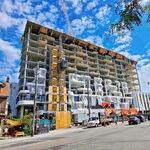
 
What we've got now is a system based on discontinuity, the bizarre idea that users require each station to reflect what's above it

I think that an approach of common design for the entire system is equally valid, but I can't fathom how the idea of reflecting the community that the station serves is bizarre.
 
If nothing important ever happened at the intersection of Danforth and Donlands why should we have to look at a visual representation of the fact as our train pulls into the station? Will it help us understand that we haven't arrived at Wookie Station yet?
 

Back
Top