News   Nov 15, 2024
 1.6K     4 
News   Nov 15, 2024
 1.5K     1 
News   Nov 15, 2024
 1.7K     0 

Museum Station

OCAD students could have created a much funkier Museum station for $100,000! Which actually makes me realize what an amazing concept that would be for St Patrick's Stn: OCAD students remake the station maybe every five years? A subway station as art gallery/studio space? Cool!:)
 
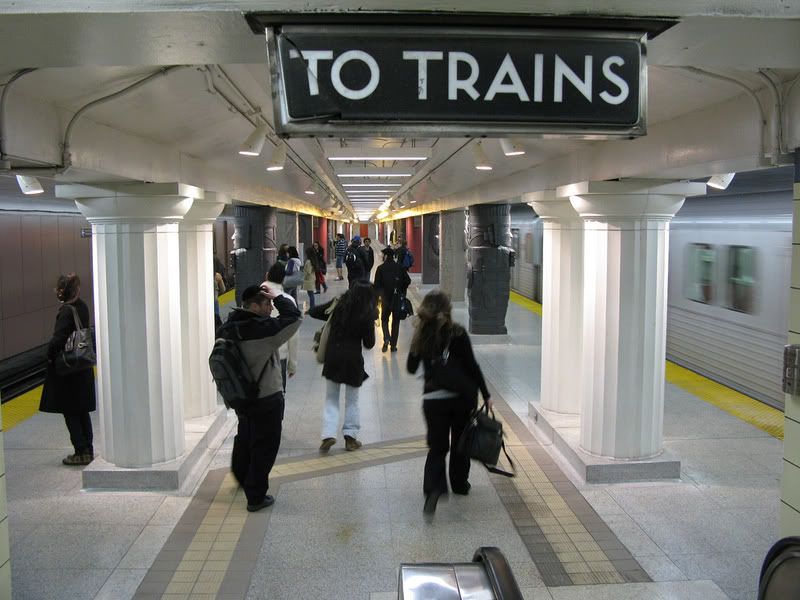
This image shows exactly what is wrong with the TTC. While they create these new tacky scenes and 1980s vegas touches, the completely ignore these beautiful little touches of design that are just left to rot.

2401668317_3faa68908a_b.jpg

I was thinking the exact same thing.
 
OCAD students could have created a much funkier Museum station for $100,000! Which actually makes me realize what an amazing concept that would be for St Patrick's Stn: OCAD students remake the station maybe every five years? A subway station as art gallery/studio space? Cool!:)

It's a great idea, though I'm not so hot on it being applied to St. Patrick. They should do a station that really needs help - like Dundas (on Yonge). I don't think it's important that it be their local station - OCAD is important on city-wide level.
 
yeesh, is it just me or does it feel like some ppl are really negative on this forum...

i dunno but as a marketing executive, i think this does a lot more for ttc's branding purposes than anything that "feels like Toronto". If anything, this project speaks louder for TTC communicating that it is improving itself than some clean up of a ttc station or two that is done in in a "sophisticated" way that apparently 'matches' with the rest of the city.

I think for those who didn't see the rendering (or, unlike us on the forum, the non-UTers that didn't see the rendering to such detail to notice the ceiling and other shortcomings in comparison) will appreciate the renovations to this station and find the station design's novelty of interest. And let's just call that a good thing...

I'm in marketing/design as well and this does nothing for the TTC brand. If anything, it devalues it. Simple novelty doesn't qualify as good design...unless novelty was the ultimate goal. As a subway station, this isn't the case. The design is simply bad.
 
Novelty acts, and standing out against context rather than fitting into it and extending it, is currently fashionable. Privatization has been hot since the Reagan/Thatcher era, and some might say that the TTC has taken this to the ultimate by privatizing their brains and allowing a monied elite to design their stations for them. Ho hum.
 
Novelty acts, and standing out against context rather than fitting into it and extending it, is currently fashionable. Privatization has been hot since the Reagan/Thatcher era, and some might say that the TTC has taken this to the ultimate by privatizing their brains and allowing a monied elite to design their stations for them. Ho hum.

I think the main problem with this TTC brand of "novelty" is that it isn't practical. Some would consider the ROM add on a novelty. I don't consider it such because it was also the most practical design as far as the needs of the museum went.
 
yeesh, is it just me or does it feel like some ppl are really negative on this forum...

i dunno but as a marketing executive, i think this does a lot more for ttc's branding purposes than anything that "feels like Toronto". If anything, this project speaks louder for TTC communicating that it is improving itself than some clean up of a ttc station or two that is done in in a "sophisticated" way that apparently 'matches' with the rest of the city.

It sounds like you have a negative idea of what "feels like Toronto", and this is where you and many forum members diverge.
 
I kinda like that idea, since I actually do like the columns themselves. So maybe painting the ceiling dark would be a good idea.
 
costs

I think people are out of touch with reality in terms of how much things cost.

Signage - like is currently up on the new Sheppard line costs $500,000 for a station this size. The ceiling would have cost an additional $1million.
 
OCAD students could have created a much funkier Museum station for $100,000! Which actually makes me realize what an amazing concept that would be for St Patrick's Stn: OCAD students remake the station maybe every five years?

With the "wallpaper" that is so often used for advertising at St. George and other stations, St. Patrick could get a new design every week! (but the TTC will have to figure out how to stop the wallpaper from peeling off)
 
I think people are out of touch with reality in terms of how much things cost.

Signage - like is currently up on the new Sheppard line costs $500,000 for a station this size. The ceiling would have cost an additional $1million.

It really costs five hundred thousand dollars for those ceiling mounted signs that we see on the Sheppard line?

I understand that a custom grilled ceiling for a somewhat large area is expensive, but if you're going to redesign original stations which are fine but dirty, pay attention to the details and build a breathtaking station that no one will want to touch in ten years time. Otherwise, it's easy to waste money on renovations that don't live up to their potential.
 

Back
Top