yyzer
Senior Member
from today's Daily Commercial News:
Contractors work in dead of night to complete make-over of Museum subway station
Patricia Williams
staff writer
Re-cladding the track walls of the Toronto Transit Commission’s redesigned Museum subway station required tradesmen to work the graveyard shift.
Typically, the crew started work at about 2.30 a.m, after the Toronto subway shut down and power was cut to the third rail. They’d call it quits around 5 a.m.
“As soon as we got the go-ahead, we’d work nonstop like maniacs,” said Damiano Petrozza, president of Vaughan’s Jeviso Construction Corp., the project’s general contractor.
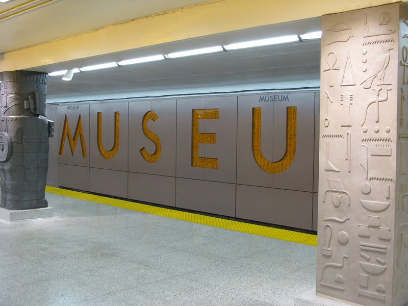
The track walls were re-clad in metal panels with the name of the station printed in large lettering, part of an ambitious revitalization project overseen by Diamond + Schmitt Architects.
The project team included electrical engineers Mulvey + Banani International Inc. and structural engineers Halcrow Yolles. Ontario Panelization installed the track wall panels.
The station design re-imagines the subway platform as a hypostyle hall supported by archeologically inspired columns.
Based on artifacts from the nearby Royal Ontario Museum and the Gardiner Museum, five column designs are repeated.
The fabricator, Design Plaster Mouldings, employed artists to create full-scale carvings.
The columns were cast in glass-fibre reinforced cement.
Updated ceiling lighting and a new monolithic wall finish create a contemporary backdrop for the designs.
The lion’s share of the construction was carried out evenings, from about 7 p.m. to 5 a.m.
Re-cladding the track walls took place in the wee small hours, from 2.30 a.m. onwards.
“The restricted hours posed the biggest challenge,” said Petrozza, who described the project as a first of its kind for his company.
Initially, the old tiles on the track walls had to be removed.
Workers then spent four months drilling holes in the concrete walls to accommodate fasteners to support the 420 new panels.
At platform level, the station’s existing 46 columns were walled off, eight at a time, and demolished. The exposed steel beams were fire-proofed before being enclosed again. Terrazzo pedestals were constructed to accommodate the columns, made up of two, 110-kilogram castings. The column halves were positioned on the pedestals and glued together using a fast-setting epoxy.
The demolition subcontractor was Demtec.
Diamond Schmitt also worked with the transit commission to streamline the way-finding and other signage in the station.
The redesigned station officially re-opened earlier this month. The $5 million project was funded in part by the Toronto Community Foundation, the TTC and the provincial government.


