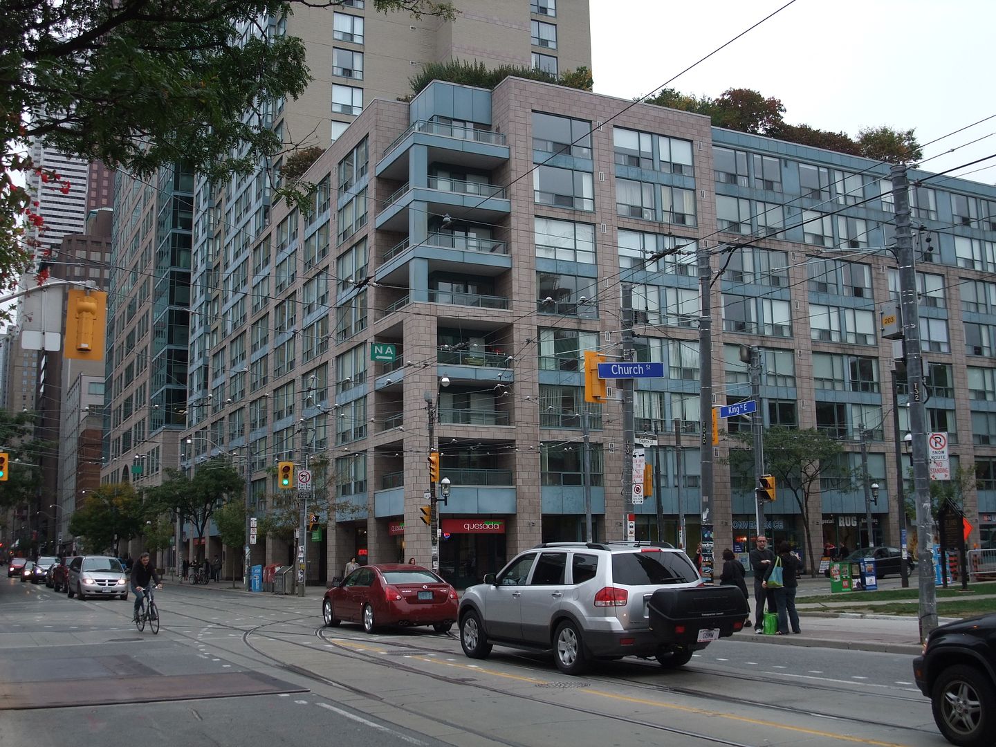
My apologies to the residents of Yonge and Finch, but my criticism is on its architecture (or lack of) not on its urbanistic qualities. Yes, it fills the zoning envelope well, (and is a "background" building) but is so second-rate, so reductive in its commodity approach to design in terms of materials, windows, proportions, and colour. No, it is not offensive (not like the Primrose Hotel at Jarvis and Carlton and so many other buildings of that era), but is inoffensiveness a reason for acceptance? Imagine if it had been designed by aA or CORE or KPMB or HPA, and we had a building that actually enhanced the corner and St. James Cathedral.
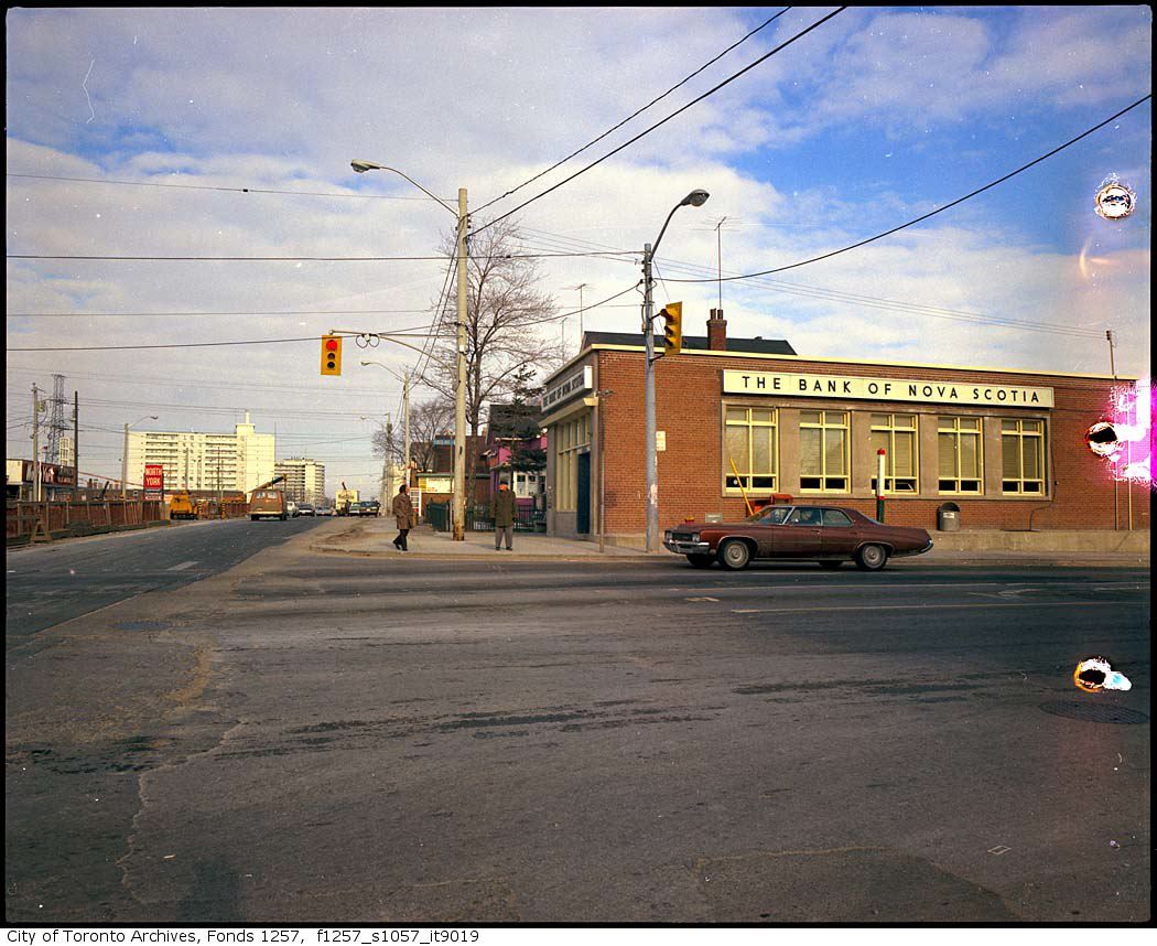
True, there was a two decade gap between the Beaux-Arts beauty's demo and this building (and I do remember the two-storey above-grade parking garage that used to be on the block). However, the contrast between the architectural quality of the two buildings does illustrate the decline of quality over the decades (Very few of the "now" pics in this thread actually look better than the "then"; what does that mean?)
I do believe that there has been a huge improvement in design over the past 10-15 years because of the committment of some developers and their architects (GG, Context, Freed, Allied, Lantera). I think we should celebrate that fact, which means not accepting buildings because they are "serviceable" but insist on the best in design excellence, particularly when the site is as critical as the historic crossroads of King & Church.