News   Nov 22, 2024
 709     1 
News   Nov 22, 2024
 1.3K     5 
News   Nov 22, 2024
 3.3K     8 

Hilton Garden Inn (Peter & Adelaide, Easton Group, 16s, P+S)

How does shit like this actually get approved? It essentially dwarfs the neighboring buildings, has almost zero architectural appeal, is not at all respective of the heritage buildings it is huddled in with and looks like it belongs on the side of a highway. I just don't get it- I really don't!

p5
 
How does shit like this actually get approved? It essentially dwarfs the neighboring buildings, has almost zero architectural appeal, is not at all respective of the heritage buildings it is huddled in with and looks like it belongs on the side of a highway. I just don't get it- I really don't!

p5


Don't get to bent out of shape about this one. Scale wise it actually fits in well with it's neighbors across the street and near by. It makes an effort to reflect the industrial design of the surrounding area. I'm just glad that the entrance has been updated and has moved away from the 1990's crap design from before. As long as they use brick this should turn out fine, you won't even notice it when done.
 
Sometimes I wonder if the people here actually ever set foot in the club districts. Sure it gets a little hectic on the streets for 2 or 3 nights of the week, but unless the walls are paper it'll be barely noticeable from inside. It's not that bad. Besides, I'd assume people staying at a hotel in the club district would be interested and aware of the clubs, thereby making this hotel quite convenient.

Indeed. What some people fail to realize is that people who are visiting might WANT to stay in that hotel FOR the noise and convienient partying. I sure would.
 
Well Toronto can certainly introduce a design review process that isn't only about land use, but also includes aesthetics, and would expand how proposals are already evaluated. The Aura proposal, for instance, was tweaked in a way that didn't impose a total rethink on Graziani and Corazza's original proposal. Design review improved it by creating something more visually attractive by rebalancing the respective weights of the tower and the base and improving the retail presence at street level.
 
I like the way the city has been going about it with Aura and 1 Bloor East. Looking at each project individually and offering suggestions that will, in turn, allow the developer greater density for something more aesthetically appealing is the way to go. Having a 'pre-canned' list of rules for developers will only lead to monotony with each developer playing it safe. And, like Urban Shocker already stated, the City can work with what the architects have already come up with and find a happy balance.
 
And who would want the unionized hacks at city hall deciding what buildings look like, when they have no qualifications to do so?

No to unionized city hall hacks, or management hacks, or even freelance hacks for that matter. But a properly empowered design review panel of peers, on the other hand...
 
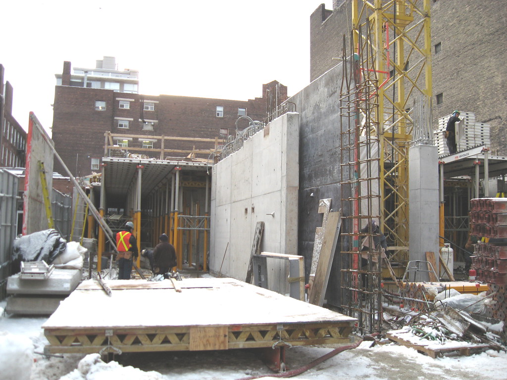
Photos taken January 3. It is above ground, looking west from Peter St.

2163750627_7766d40c9c_b.jpg


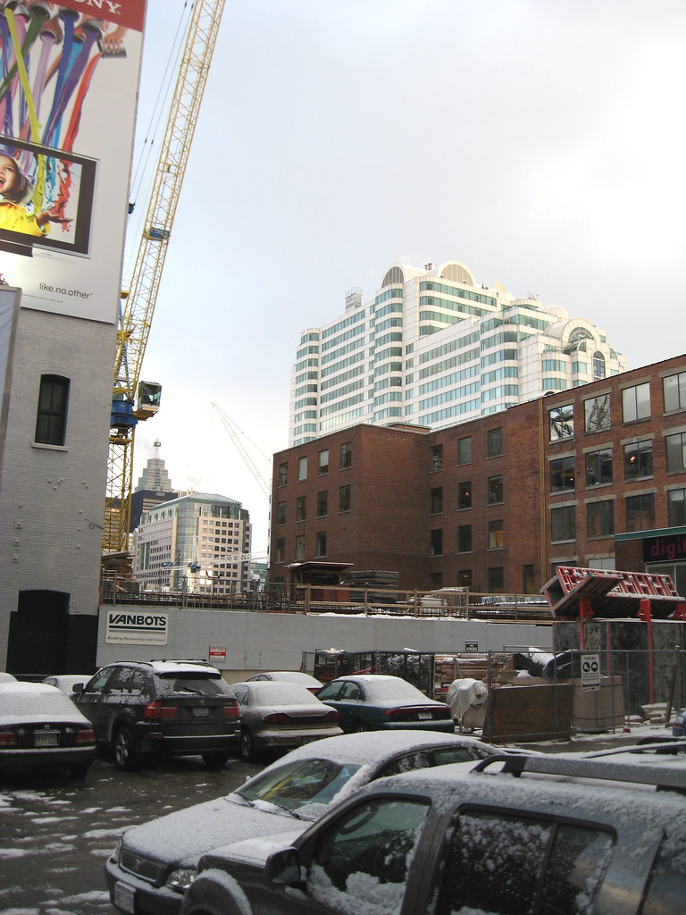
Looking east the Festival/Lightbox cranes are visible in the distance.
2163750611_08f736e1c0_b.jpg
 
When was Vancouver's panel enacted? I ask because I find most of the stuff built there throughout the 90s far worse than the little bit that actually got built here. A conifer in a planter suspended 200ft odd feet in the air? C'mon!
 

Back
Top