News   Nov 22, 2024
 794     1 
News   Nov 22, 2024
 1.4K     5 
News   Nov 22, 2024
 3.5K     8 

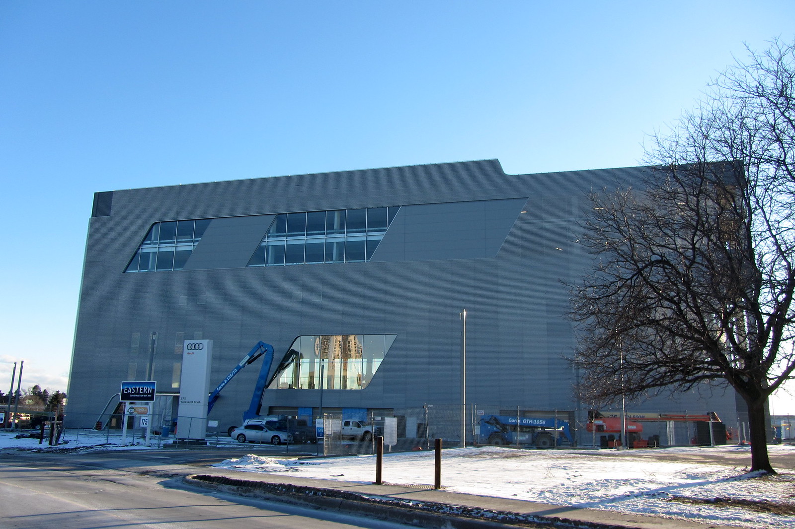
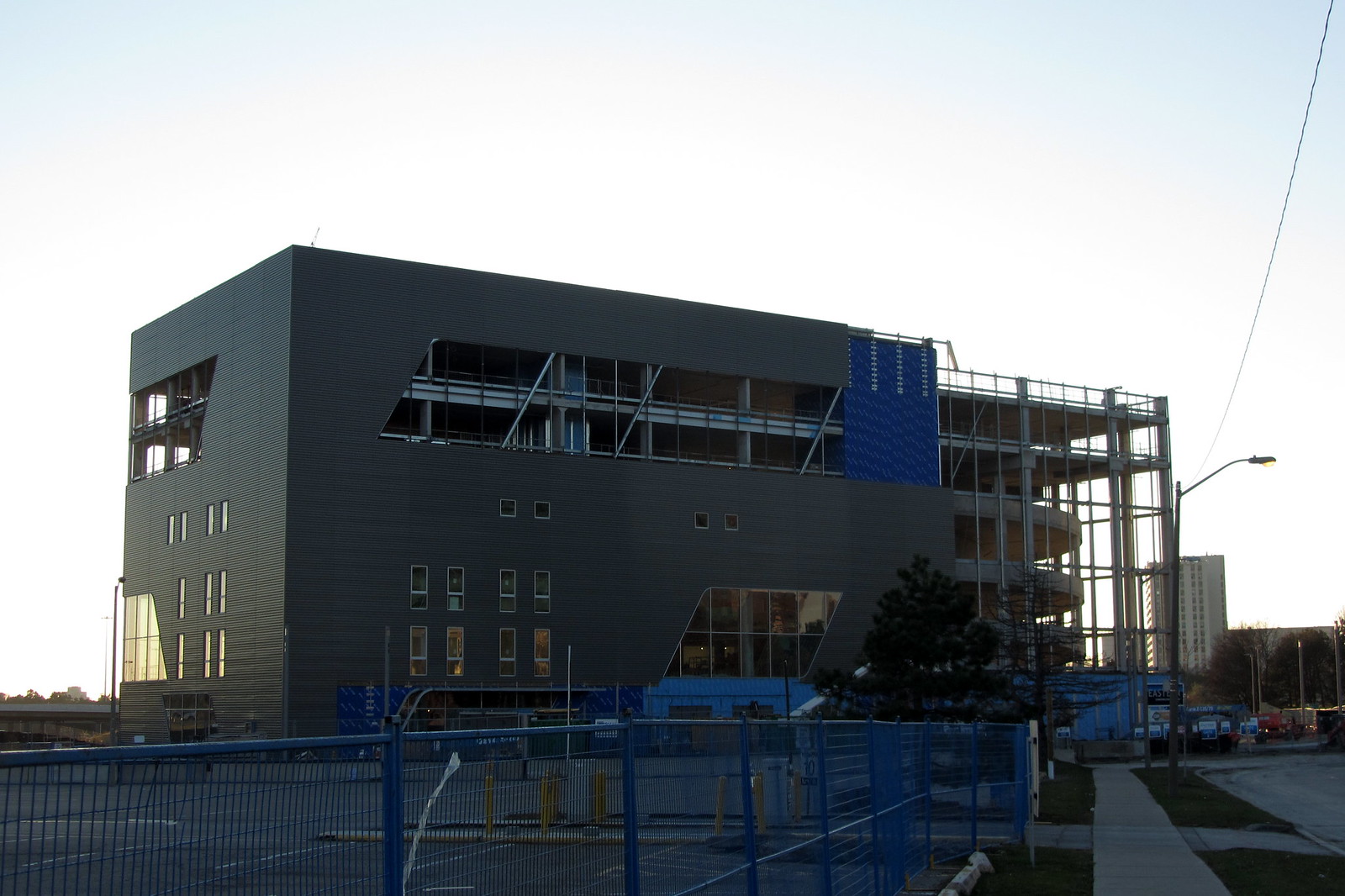
Audi Midtown & Porsche North Toronto (243-255 Consumers Rd, 6s, Teeple Architects)

I dunno... works for BMW in my neck of the woods.
We don't know what the main factor is when it comes to bringing in customers, though visibility is certainly an advantage in a competitive marketplace. The first thing I'll do is Google "BMW dealership Toronto" and go to the closest one to my location if I'm interested in buying one. I might also consider business reviews, which don't inspire confidence in the DVP dealership.
 
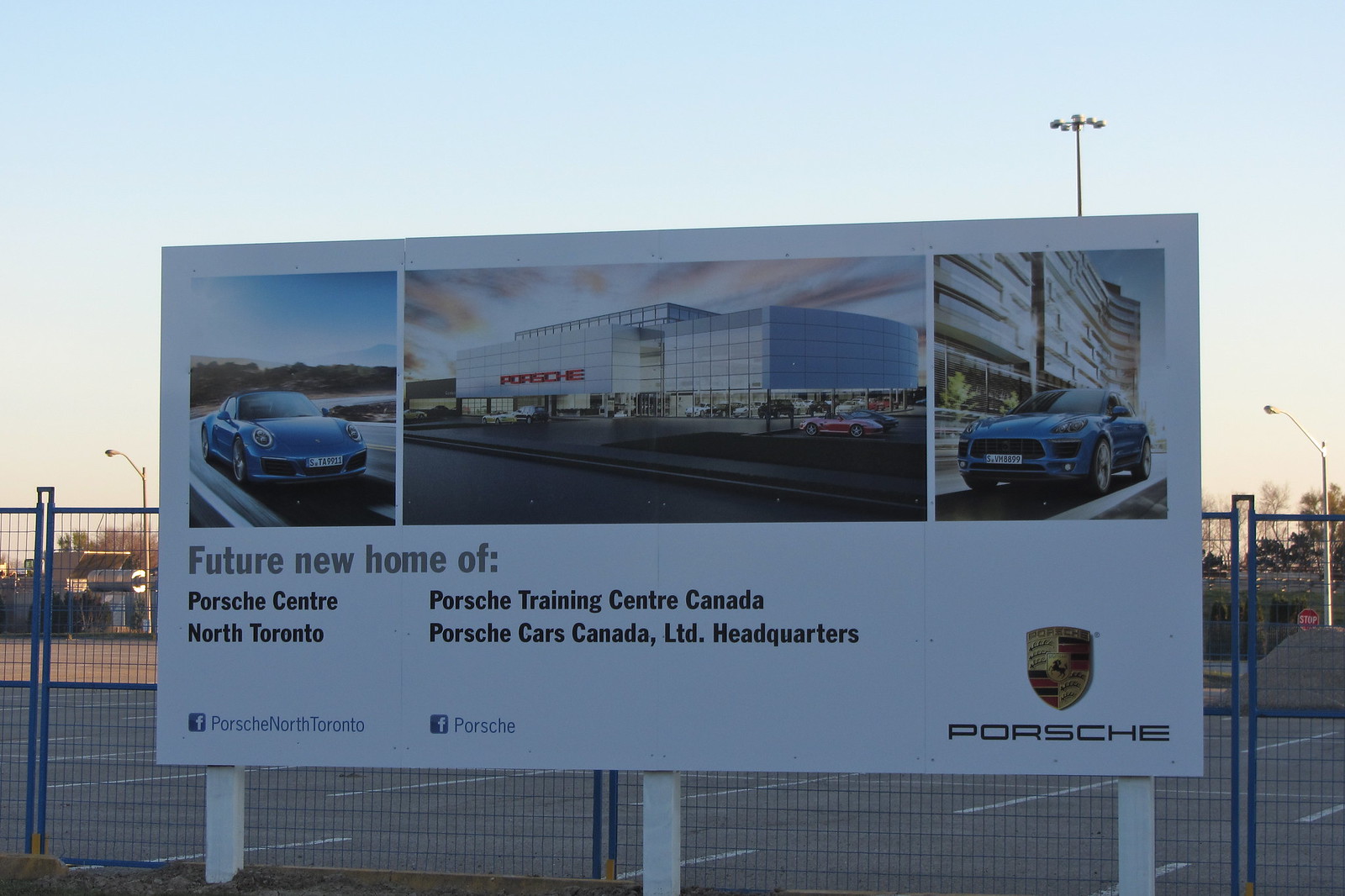
As mentioned earlier in this thread, a Porsche dealership is expected to open up next to the Audi dealership here, and it will be 2 storeys plus a mezzanine, for what it's worth.
Applicant's drawing:
porsche.jpg
 

Attachments

  • porsche.jpg
    porsche.jpg
    26.9 KB · Views: 1,625
Junctionist: BMW's DVP ratings notwithstanding, the branding sure doesn't suffer when it's visible to a bajillion motorists coming down the DVP day and night. That's my point. The building is pretty sleek and stuffing the upper floors with cars behind show windows isn't a bad idea either.
 
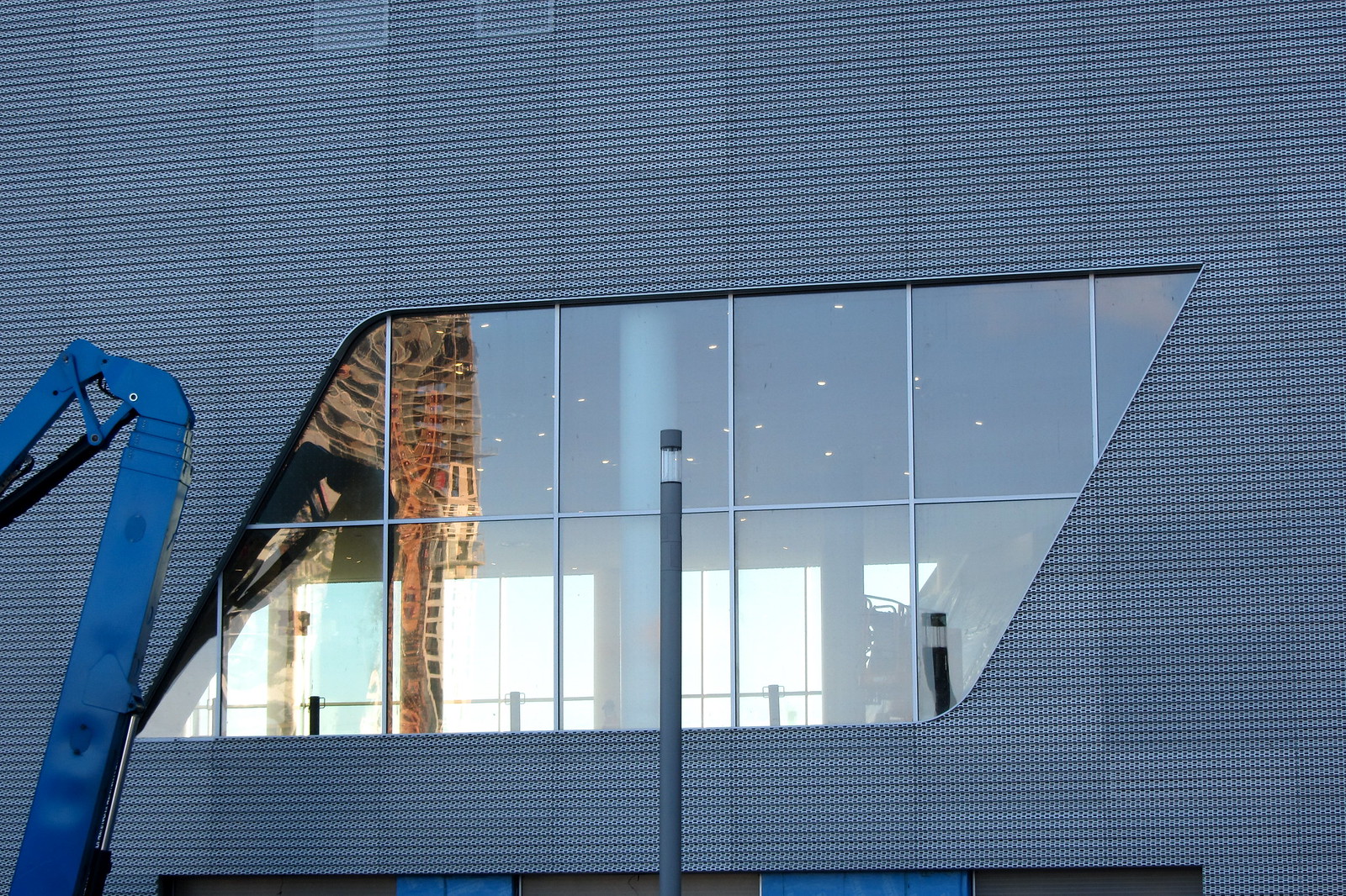
The street facing side of this looks terrible. Too much blank space. The cladding is definitely neat, though.
 
No, they're not lighting it from inside. That cladding is part of Audi's corporate design language. It's custom made for them and used around the world in their dealers and offices. Audi calls it the "Audi Terminal" concept.

Below are some evening shots of one of their dealerships in Cork, Ireland and Laval, Quebec using the same material as well one of their offices in Germany.

awf-vertrieb_audi-facade-1_product-carousel.jpg


IdMrydk.png


awf-vertrieb_audi-facade-5_product-carousel.jpg
 
Last edited:
Lights from inside the building will seep through the several translucent parts of the cladding at night.

If you drive north on the DVP you will almost see what I mean.
 
I don't have an issue with the cladding material per se but it's the minimal amount of glass and windows on that side of the building that is more of an issue. Those photo examples from John English above look great because the glass/cladding composition is well-balanced.
 

Back
Top