News   Apr 15, 2024
 894     0 
News   Apr 15, 2024
 2K     5 
News   Apr 15, 2024
 642     0 

Transit Fantasy Maps

My criteria would be having a ROW for the entire length. So St. Clair, Spadina, Harbourfront and QQ get mentioned but not Queen, King, Dundas, College, etc. However I'm afraid of sparking UT debate #19832 on what is rapid transit. I agree that listing every bus and surface connection would make it too cluttered.

That would be a good dividing point. Should those routes be given RT bubbles then, or stick with their current numbers?

Here is the schedule. Only the stations that I mentioned earlier don't have funding earmarked in the capital budget.

I'd just also like to add one other comment that I'm glad you've dropped the ridiculous official name of "Vaughn Metropolitan Centre" and replaced it with "Vaughn Centre".

Thank you. And yes, I think the name is ridiculously long to fit on a transit map, and doesn't fit with the established naming convention. There's no "Town" in Scarborough Centre, and no "Civic" in North York Centre. Why should Vaughan get "Metropolitan" then?

Haha, those are the questions every Toronto fantasy mapper gets bogged down by. For my map I've been toying with the idea of creating loose classes of modes, where on the main map St Clair, QQ, and Spadina are grouped as plain grey narrow lines - but every other streetcar line omitted. But I'd have a downtown inset below the main map with the entire mixed-traffic streetcar system included, shown with the narrowest line width and lightest colour (white). Don't like how it looks all that much at the moment, so it's still a work in progress.

I tried to do a bit of that grouping three ways, although not specifically on these maps:

1) Line weight: thick line = grade separated, thin line = at-grade or infrequent commuter rail
2) Labelling: numbered = heavy rail, lettered = LRT, BRT, or commuter rail
3) Station shape: circle = less than 15 min frequency, square = greater than 15 min frequency.

And a suggestion for you with regards to the mixed-traffic streetcar system: if you want to show it but don't want to highlight it, use a passive colour like a grey. If you're using a black background, figure out whether a lighter grey or a darker grey is more visually prominent, and use that one for the ROW streetcar, and the less prominent for the mixed traffic streetcar. That will give you the visual hierarchy you're looking for, while still keeping it as 'background info' on the map.

But altogether I really like how those line maps look. Very sharp, clean, and easy to understand. I particularly like the idea of including neighbourhoods/cities...though I think it might need some tweaking. One that stands out for me is Richmond Hill. I think it should show as Markham for south of Hwy 7, and RH to the north. As well, to prevent confusion perhaps only use municipalities and (former) borough boundaries instead of neighbourhoods?

Thank you! It's easier to do the neighbourhood thing when the line is a straight line, because when you have two parallel branches you end up having to do a split in the middle of the map to make it work. I can see the merit in only doing former borough names, but the reality is "Toronto" tells people very little about where they actually are. "The Annex" or "The Danforth" I think are a lot more useful, especially if someone is going to a neighbourhood but doesn't know what stop to get off at. The trick is finding place names that are recognizable to most people, and establishing boundaries that are recognized by most people. I think part of the reason why neighbourhood boundaries are inconsistent a lot of the time is there's no single source to go to for that, it's open to interpretation. 'Setting' the boundaries using maps like this may help firm the boundaries up in people's minds.

Great stuff as always! Reminds me of the linear maps found on some of NYC's new subway cars. Something that should definitely be implemented here to replace the current subway maps, especially with so many new lines under construction.

Thanks! I do think that these should be implemented sooner rather than later, because you're right, once all those new lines come on board it's going to make reading a full system map squeezed above the door very difficult. I've been trying to create a system map that would fit in the advertising space beside the subway doors, but so far haven't come up with anything that really works for me yet. I'm tinkering with it though.

And yup, very similar to NYC, although I modelled the style on what LA will be implementing: http://calurbanist.com/wp-content/uploads/LA_line_maps.gif. I was there a bit over a month ago, and I was quite impressed with how easy to read their maps were, both the system map and the line maps. I decided to incorporate some of those features into the maps I'm working on now, including using station bubbles coloured the same as the line for regular stations, and white for transfer stations. It gives the transfer stations more prominence without being too elaborate. I also liked their use of circular station markers for rail, and square for BRT. Personally though, I think using that distinction method is more useful to denote frequency than technology type.

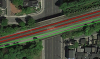
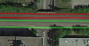
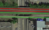
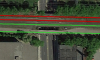
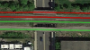
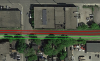
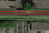
As for Lakeshore West, I've always thought a station could be used between Oakville and Clarkson at Ford Drive. Huge redevelopment opportunities and perhaps an RER stop there could alleviate congestion at Oakville and Clarkson stations respectively, especially as development inches further north of Dundas in Oakville.

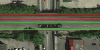
I agree, and the same could be said for Lorne Park. The main street through there will likely need a grade separation for RER anyway, so a simple station (stairways leading up to platform level from the underpass) could be a very useful addition. That Ford Drive station would probably be a preferable one for GO to use for rail to bus transfers, since it would be a straight shot off the 403.
 
I was looking at the Midtown CP corridor (North Toronto Subdivision), and was surprised to find that it is significantly overbuilt for the 2 mainline tracks CP uses today. I'd previously thought that getting a pair of GO tracks in there would be a squeeze, but in fact there seems to be plenty of room. All but one of the grade separations already support at least 4 tracks!

The Midtown corridor could serve as an express version Bloor-Danforth subway, providing a quick crosstown ride for people travelling from Mississauga and Etobicoke to Midtown and North York. Of course this corridor is a much lower priority than most other GO track expansion projects, most notably a dedicated pair of tracks in the Milton corridor, which is a prerequisite.

Going from east to west, here's how a pair of dedicated passenger tracks could fit.

Summerhill Station
North Toronto railway station is directly above the Summerhill subway platforms. I'd connect them using a new subway entrance into the ticket hall of the station building.
I've also included a siding on the north side of the corridor to serve 3-car high-platform DMUs from Peterborough.
1_Summerhill.png


Avenue Road:
2_Avenue.png


The next bunch of crossings have structures for 4 tracks, with space for a 5th track or a platform.
Davenport Road:
3_Davenport.png


Dupont Station:
4_Dupont.png


Howland Road:
5_Howland.png


Bathurst Street:
6_Bathurst.png


Christie Street:
7_Christie.png


Shaw Street
8_Shaw.png

Ossington Avenue:
9_Ossington.png

Dovercourt Road:
10_Dovercourt.png


Bartlett Avenue is the tightest point on the line, where an industrial building is awkwardly close to the tracks.
The road itself is not important for traffic access, so a simple bicycle/pedestrian underpass would do for grade separation.
11_Bartlett.png


Dufferin Street
12_Dufferin.png


Lansdowne Avenue is the one bridge not suitable for 4 mainline tracks. It looks like a new bridge would be needed for the southernmost track.
13_Lansdowne.png


Symington Road:
15_Symington.png


Finally, the new West Toronto Diamond supports 4 tracks on both levels. An at-grade junction with the GO Galt Subdivision would do for the first phase, but would likely need to be grade-separated at some point in the distant future.
17_West Toronto Junction.png
 

Attachments

  • 1_Summerhill.png
    1_Summerhill.png
    1.2 MB · Views: 1,297
  • 2_Avenue.png
    2_Avenue.png
    627.6 KB · Views: 1,245
  • 3_Davenport.png
    3_Davenport.png
    417.6 KB · Views: 1,205
  • 4_Dupont.png
    4_Dupont.png
    1.3 MB · Views: 1,228
  • 5_Howland.png
    5_Howland.png
    297 KB · Views: 1,208
  • 6_Bathurst.png
    6_Bathurst.png
    272 KB · Views: 1,215
  • 7_Christie.png
    7_Christie.png
    183.9 KB · Views: 1,207
  • 8_Shaw.png
    8_Shaw.png
    181.9 KB · Views: 1,203
  • 9_Ossington.png
    9_Ossington.png
    213.3 KB · Views: 1,182
  • 10_Dovercourt.png
    10_Dovercourt.png
    153.8 KB · Views: 1,220
  • 11_Bartlett.png
    11_Bartlett.png
    656.6 KB · Views: 1,209
  • 12_Dufferin.png
    12_Dufferin.png
    351.4 KB · Views: 1,196
  • 13_Lansdowne.png
    13_Lansdowne.png
    623.3 KB · Views: 1,207
  • 15_Symington.png
    15_Symington.png
    762.4 KB · Views: 1,230
  • 17_West Toronto Junction.png
    17_West Toronto Junction.png
    1.1 MB · Views: 1,220
Last edited:
Another map from me after a night of toying with Illustrator:

DcsJIwZ.png


PDF link

The concept this time around was a network not unlike those found in Europe, where regional rail systems are often integrated directly with longer-distance national/intercity rail services. There are defined lines, but a line would consist of various express and local services, as well as shorter or longer trains that terminate at different stations along the route. Remote areas like Orangeville or Gormley could be served by low capacity DMUs, which could be coupled with larger capacity EMUs at major stations further down the line.

Visually inspired by Vancouver's Skytrain diagram.

EDIT: Also meant to include stops for the high speed line at Pickering and Oshawa (theoretically there wouldn't be a service on the high speed line that stops at every station; I'm not sure if that would be a suitable stopping pattern for a high speed service, but I still think the line should be commuter-oriented rather than purely intercity, where some trains would stop at Pickering and others at Oshawa, etc.)

EDIT 2: Added high speed stops and deleted the extra Walkers station

EDIT 3: Added Brantford-Toronto service and branch lines to Scarborough Centre and Port Colborne, and changed Cambridge line to a through service to Peterborough via Union Station
 
Last edited:
By the time all of this is built (Sheppard East LRT, Scarborough Subway Extension, GO RER) we will be past the Accessibility for Ontarians with Disabilities Act deadline of 2025 for the TTC to be accessible, so in theory all those little wheelchair icons should be unnecessary.

Of course, if you're going just by what is funded, you could put the wheelchair icon next to every station except Greenwood, Keele, Spadina, Christie, Castle Frank, Summerhill, High Park, Museum, Rosedale, Old Mill, Glencairn, Warden, and Islington.

With the TTC/Metrolinx planning for construction all the way out beyond 2025 shouldn't the next budget cycle have the long-range plan for all the stations bar none? The AODA is a requirement...I wonder what would happen if they ignore it for their capital plans.

A lot of the above stations have fire code issue (only 1 means of egress). I thought it would take almost 10 years from feasibility to implementation (at least the way the TCC does it)
 
With the TTC/Metrolinx planning for construction all the way out beyond 2025 shouldn't the next budget cycle have the long-range plan for all the stations bar none? The AODA is a requirement...I wonder what would happen if they ignore it for their capital plans.
It's a requirement set by the provincial cabinet, that applies solely to the TTC. If the cabinet wants to set the requirement, the cabinet could actually fund it as well. Given the complete lack of funding for the province for these capital works, I'm amazed that TTC has advanced so far, and is so much further ahead of other cities, such as Montreal, London, Paris, or New York City.

Ultimately, the cabinet should pony up the money, or change the date.
 
Another map from me after a night of toying with Illustrator:

The Weston-Finch and Islington-Steeles stations are close to each other, how about moving the Islington-Steeles station to Woodbridge? Just east of the fairgrounds looks like a nice spot for a station.
 
It's a requirement set by the provincial cabinet, that applies solely to the TTC. If the cabinet wants to set the requirement, the cabinet could actually fund it as well. Given the complete lack of funding for the province for these capital works, I'm amazed that TTC has advanced so far, and is so much further ahead of other cities, such as Montreal, London, Paris, or New York City.

Ultimately, the cabinet should pony up the money, or change the date.

...or Toronto could fund services for our most neediest!

The province has also decided it is up to each provincial body to fund it themselves. There is an incentive provision (s. 33) that could pay someone to create standards above and beyond what is mandated.

I don't think there is discretion to not have it in compliance under the Act nor a funding mechanism. So any change would be a new piece of legislation that says Ontario doesn't support transit for the disabled OR Ontario is giving Toronto a sweetheart deal. Hmmmm....not going to happen!
 
not quite fantasy but what the lines would be like once everything has been finished.
12244658_723659971097979_8887381865456946390_o.jpg
 

Attachments

  • TTC.jpg
    TTC.jpg
    91.6 KB · Views: 355

Back
Top