News   Nov 04, 2024
 188     3 
News   Nov 04, 2024
 264     0 
News   Nov 04, 2024
 431     0 

CIRCA 1+2 (Markham Ctr, Tridel/Dorsay, 2x 16s, Turner Fleischer)

Solaris

Senior Member
Member Bio
Joined
Jun 22, 2008
Messages
5,727
Reaction score
423
Location
Toronto
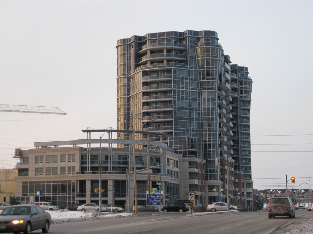
I was a little suprised this building never made it to UT ... afterall its one MASSIVE building (bulk-wise, not height) :D ... and first 'new' tower built in Markham Centre ~

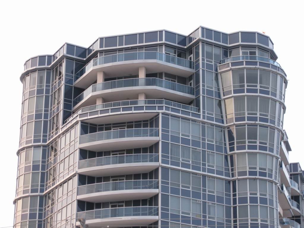
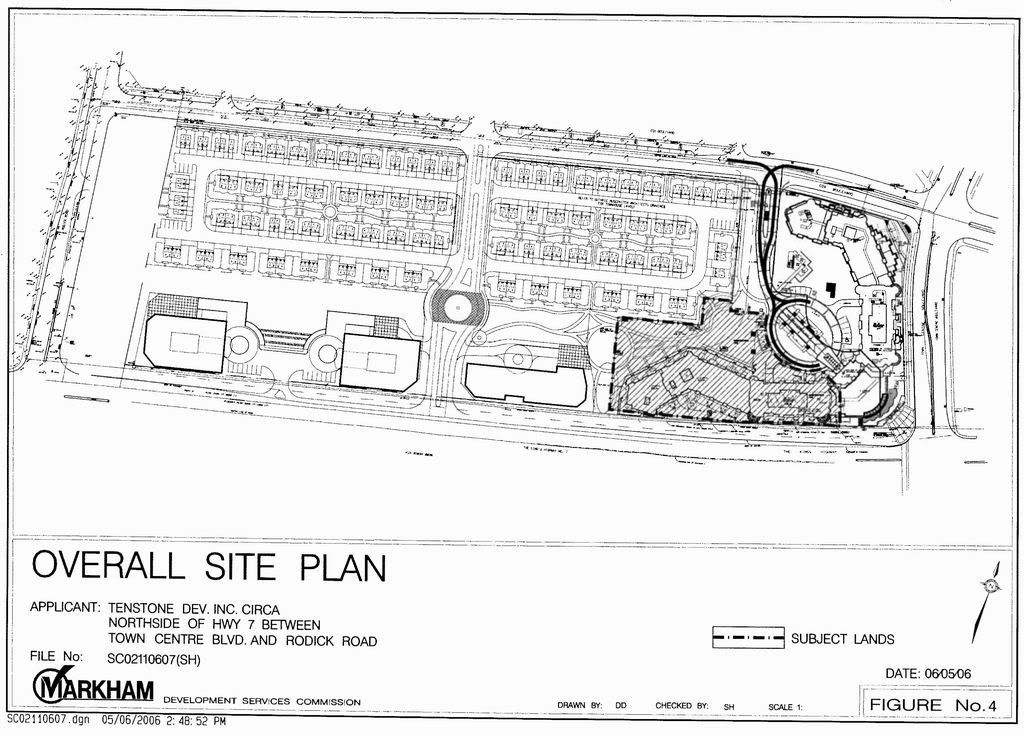
Part of a larger development plan with townhouses, 3 (future) office buildings, 2 residential towers with the first is already sold + occupied, although I'm not a fan of big bulky buildings, the architectural design elements (inverted cones, circular windows) here do interest me~

Website: http://www.tridel.com/circa/

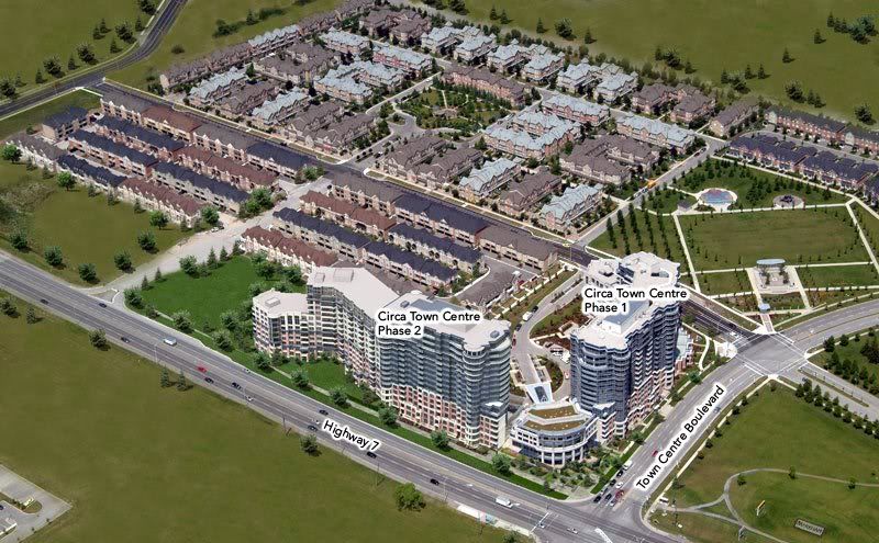
Community Master Plan
CIRCA_masterplan1.jpg
CIRCA_masterplan2.jpg


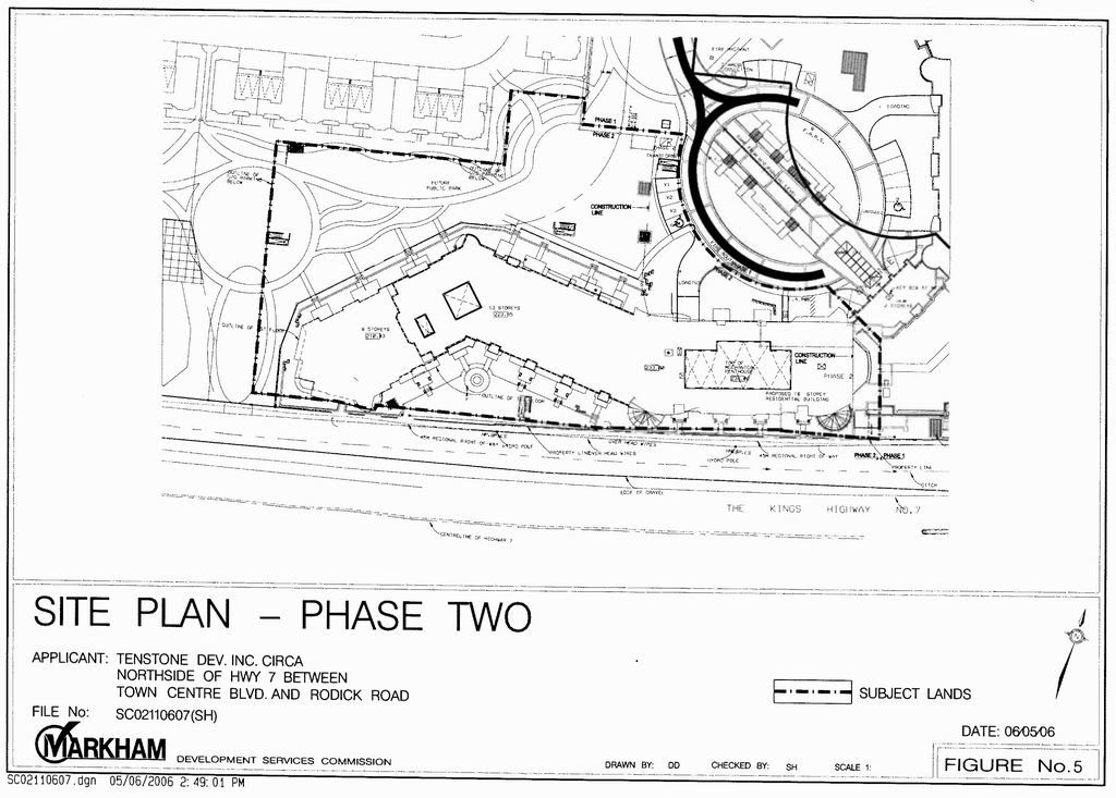
Phase 2 Site Plan
CIRCA_sp.jpg


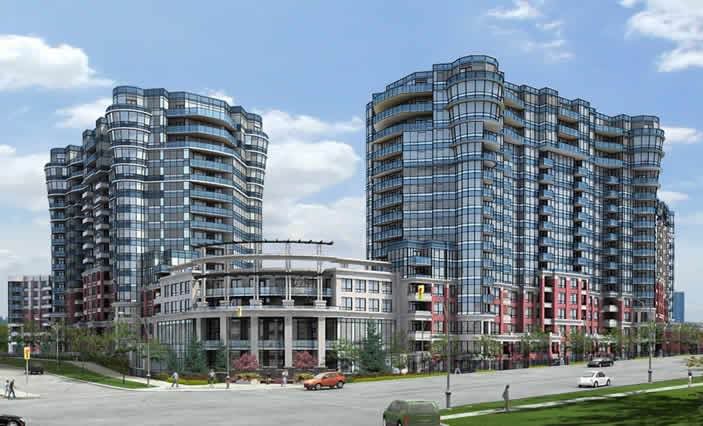
CIRCA - rendering
CIRCA_rendering.jpg


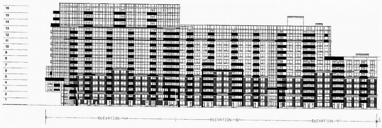
CIRCA 2 - south elevation (facing Highway 7)
CIRCA_south.jpg


CIRCA 2 - north elevation
CIRCA_north.jpg


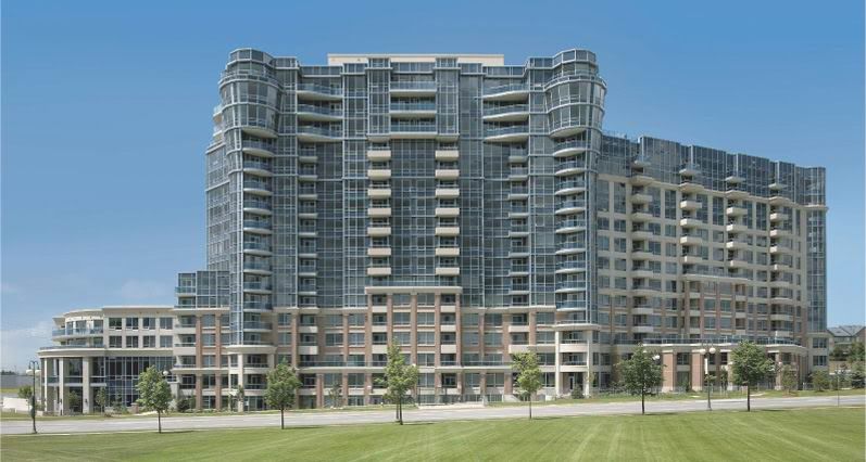
CIRCA 1 - east elevation (from TFAI's website)
CIRCA_east.jpg
 
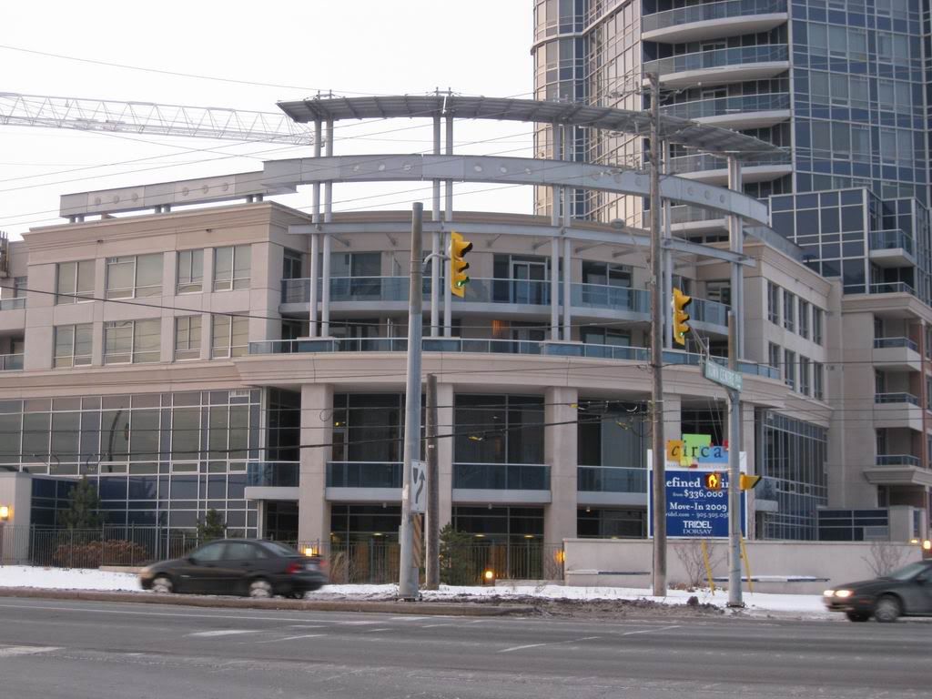
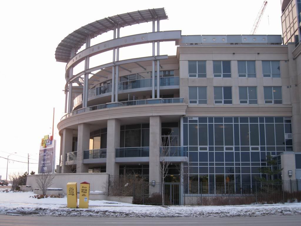
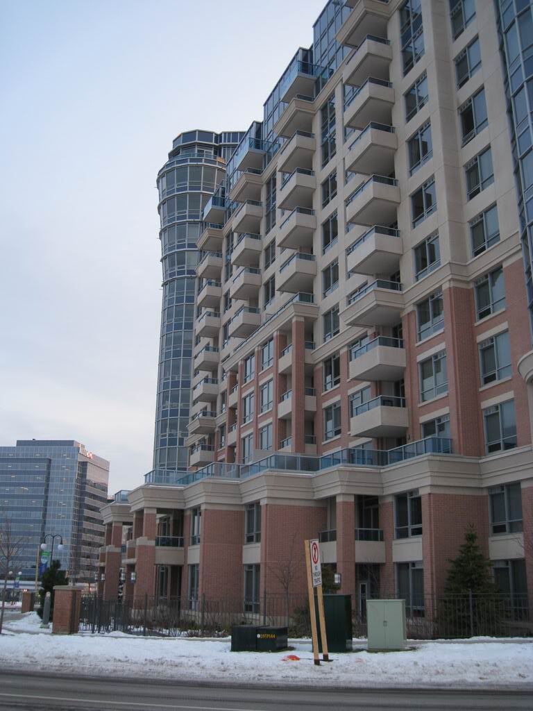
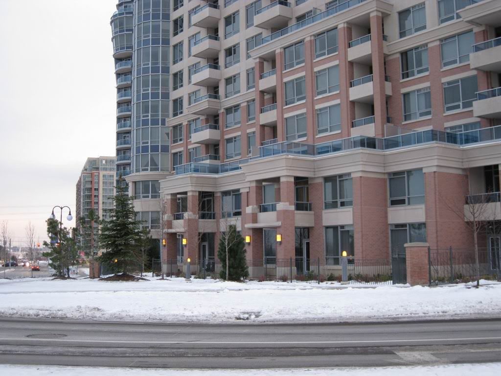
Phase 1 Photos - December 13 2008

Why I like CIRCA thus far ~ ;)

IMG_2921.jpg


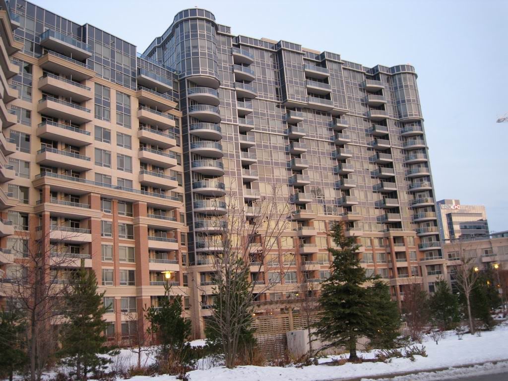
Commands Attention
IMG_2924.jpg


Intersection Corner Feature
IMG_2922.jpg


IMG_2923.jpg


Good Facade Rhythm
IMG_2925.jpg


Nice Street Relationship
IMG_2926.jpg


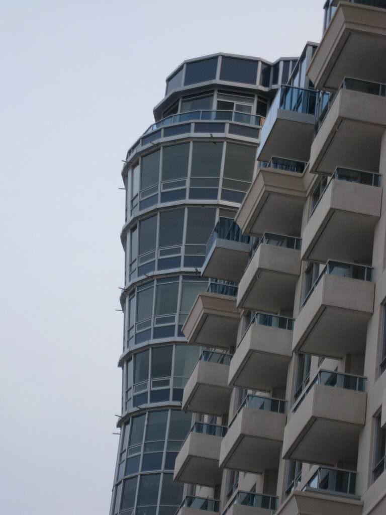
The Inverted Cones
IMG_2927.jpg


Interior Courtyard
IMG_2928.jpg


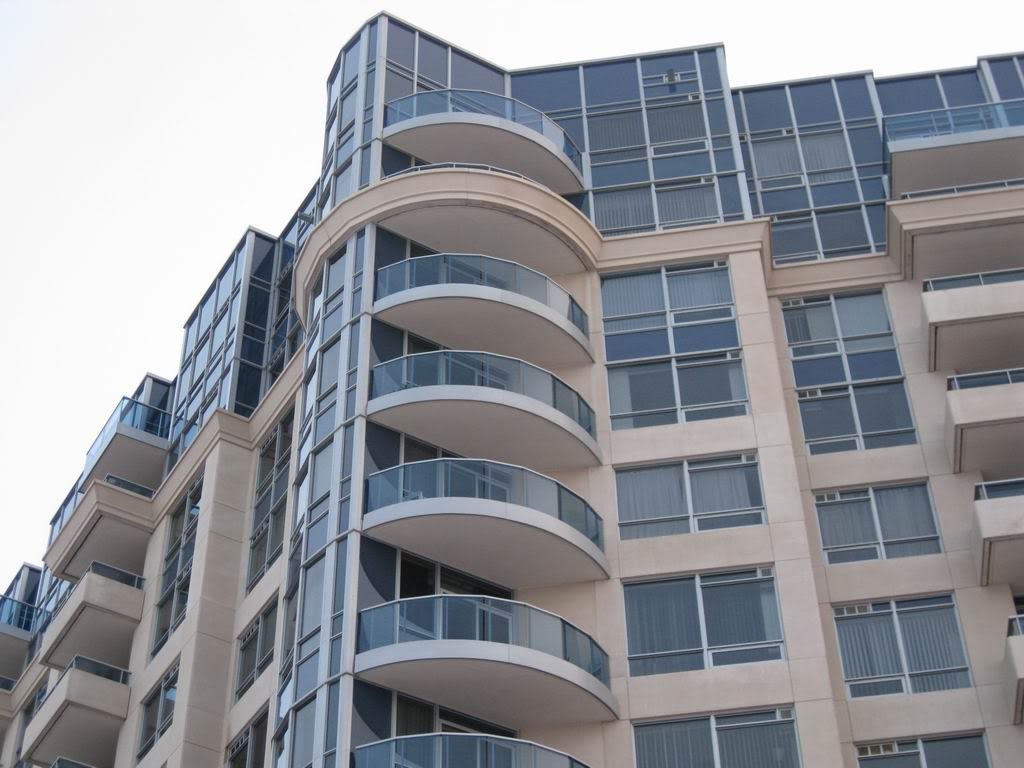
Circular Shaped Windows + Balconies
IMG_2929.jpg


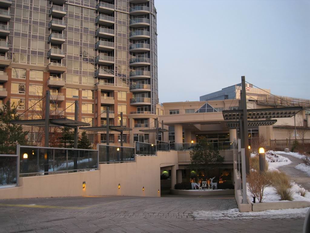
Main Entrance / Drop-off
IMG_2930.jpg
 
December 13 2008 update

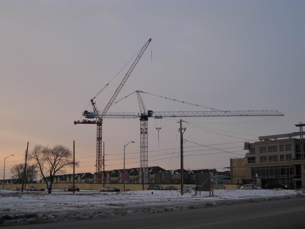
2 cranes in action for phase two~
IMG_2931.jpg


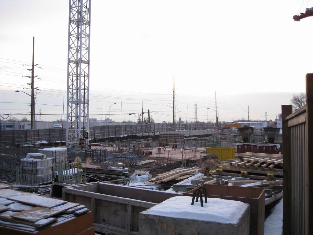
Construction has reached ground level already
IMG_2932.jpg
 
Thanks for the updates!

Solaris ... where do you live exactly - around the area I figured from the Markham tag in your name.

Just realized that came off stalkerish :) ...

Anyway, I don't know what to think about this development.
I used to go by it everyday when I was with IBM (internship).

I want to like them because it's unique but at the same time I can't really ... not sure what it is. Doesn't meet the street to well. I do like the top part, however, it's quite different.
 
Thanks for keeping us posted. :)

I think this building's greatest strength is how it presents a more classical, brick face to the subdivision housing and side neighbourhood streets, and presents a more modern and urban face toward the larger, arterial roads. It is a double agent for Markham.

This is what I like, from what I observe in the photos.
 
I find it weird that they built all these not unurban townhouses blocks behind Circa and then gave Circa, which is fine in its own right, the world's largest cul-de-sac.

Nice street relationship
IMG_2926.jpg


Maybe in "Irony World".

Correct. The condo has a relationship with the wrought irony fence, the fence has a relationship with the grassy bits, and the grassy bits have a relationship with the road (it's not a street).
 
I have to agree that is appears to me to have no relationship whatever with the street that is observable from any of the photos. Perhaps if we were to completely demolish the building and place pieces of it into the CERN reactor in Switzerland we could find that it exerts a sub-atomic pull on the matter forming part of the street, and if that were the case, then I could conclude that it had a relationship to the street. From the photos, not so much.
 
even though this is in Markham ... I honestly believe this is a building that one would have to see in person to appreciate .... with respect to my comment on "Nice Street Relationship", I was referring to the transition of facade materials at it approaches grade togehter with the staggering of building forms at the base ....

and although the building does not HUG the street line as shown in the photo above, the structure was angled in such a way that it acts as a view terminus as you drive down the curved South Town Centre Boulevard, and hence I said "Nice Street Relationship"
 
Huh. Interesting looking building.
I'm always encouraged by the deviations that Markham is willing to make to the standard cookie-cutter suburban formats, as opposed to Brampton which has the most horrible urban form despite the great population growth.
 
The side off Hi-way 7 is terrible ... worse in person. It's a bit better North / South but again as pointed out doesn't meet the street in anyway.

It's pretty much a disappointment ... they got lucky because the disign was at least somewhat interesting and I like the materials they used.
Again a building I approve of above 5/10m ... the lower part is just ......
 
Judging by these photos, Markham's new "Centre" is off to a poor start. I have few qualms about anything two floors and up, but the street presence is brutal. It flabbergasts me that suburban planners and developers still do not get the basics of good urban form. Perhaps the continued economic meltdown and the likely collapse of the domestic auto industry will knock some sense into them and force a rethink of this project's future stages.
 
I think that Markham planners understand quite clearly how to make a building properly meet the street, but they correctly realized that this model won't work on Highway 7. Imagine what it would be like as a pedestrian, store owner, or resident of this building if all that separated it from Highway 7 was a 3 metre wide sidewalk. It just wouldn't work.

It's regrettable that the new downtown is not on any main street, because in order to visit you have to divert your trip rather than pass through naturally. However, Highway 7 is an insurmountable barrier to any urban built form, and fortunately Markham, unlike Vaughan, recognized that and shifted their downtown area a bit south.
 

Back
Top