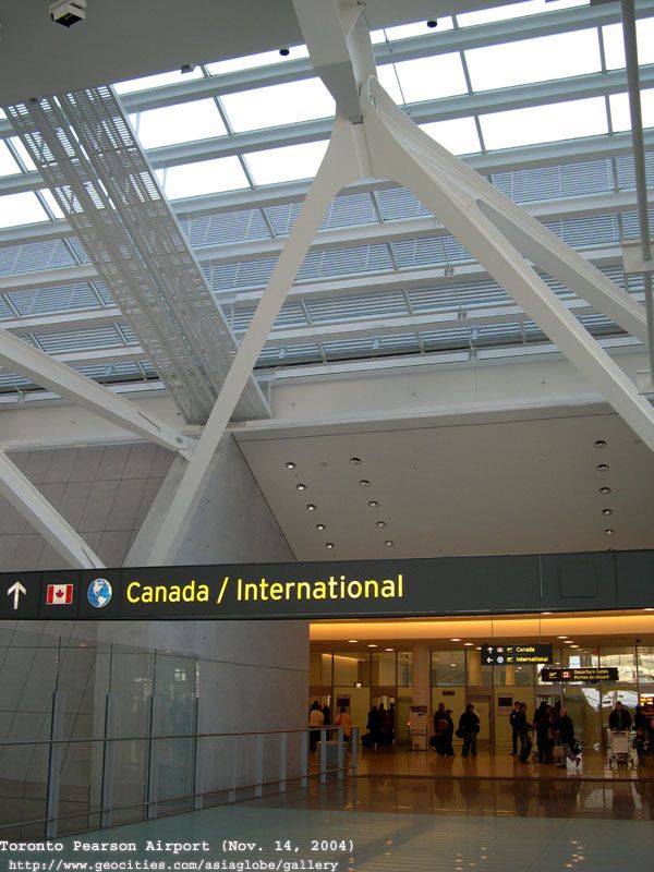
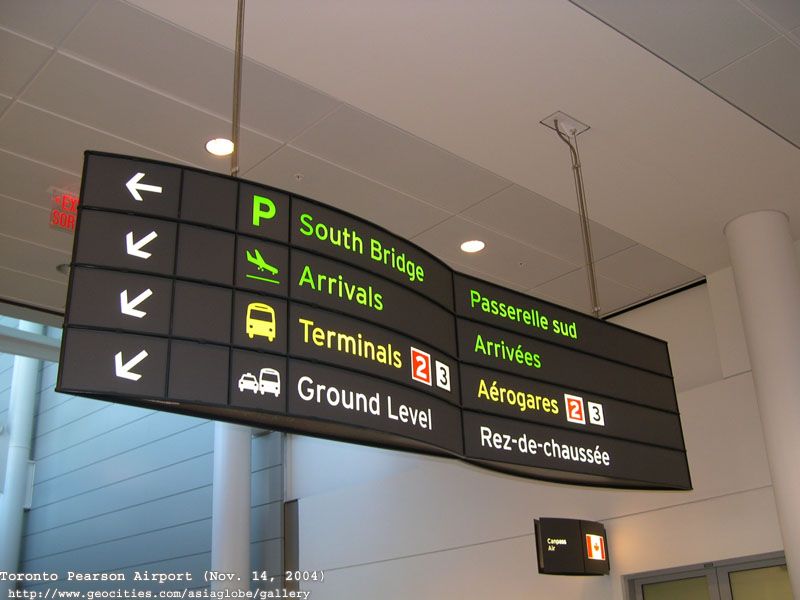
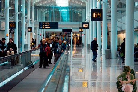
I'm a fan of the signs used at Pearson and I think that the TTC chould consider adopting it. The design is clean, simple and more importantly people can read it from a distance.
The commission should also consider renaming the subway/LRT lines. Names like Eglinton Crosstown, Bloor-Danforth and Yonge-University-Spadina are a mouthful. I think that the best option would be changing the names to simple letters and numbers.
YUS becomes route A, represented by yellow.
BD become route B, represented by green.
Sheppard becomes route C, represented by purple.
Eglinton-Scarborough Crosstown LRT becomes route 1, represented by blue.
Sheppard LRT becomes route 2, represented by red.
Finch LRT becomes route 3, represented by brown.
I think this would be the best option. Especially when you consider that many people have no idea what the lines are actually called. I've lost count of the amount of times I've had to refer to our subway lines as "the green one", "the yellow u" and "that little purple one at the top".


