News   Dec 20, 2024
 3.4K     11 
News   Dec 20, 2024
 1.2K     3 
News   Dec 20, 2024
 2K     0 

TTC: Redesigning TTC Signage

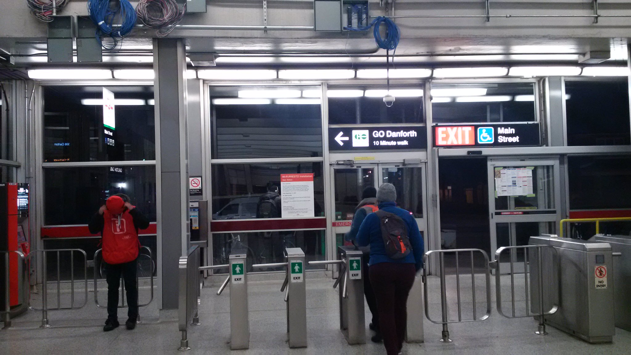
The signs aren't close to each other. It doesn't appear confusing standing in the station. The photo seems to have been taken from a distance, and this is only a small portion of it.

With it's unusually large and open mezzanine, Main Street has to be one of the easiest stations to navigate. Though the recent installation of a sign near above the front doors that says it takes 10 minutes to walk the 300 metres to Danforth GO is misleading.
CaxuYnmUEAAtUw2.jpg:large

Now that Walter has raised this thread from the dead, I'll note that about 3 years after this February 2016 post, TTC changed the sign showing the distance from TTC Main Street to GO Danforth from 10 minutes to 5 minutes. They'll probably have to replace it again now, to put a black T on it ... :)

Here's an August 2019 photo I took. The first time I noticed the new sign was July 2018. And I've got a November 2018 photo when it still said 10 minutes.
1682660864228.png
 
I hate the proliferation of little wall signage the TTC puts up over time (and somehow never takes down), they clutter the station walls like herpes.
 
I hate the proliferation of little wall signage the TTC puts up over time (and somehow never takes down), they clutter the station walls like herpes.
Do you have any photos to demonstrate the phenomenon you're referring to?
 
Do you have any photos to demonstrate the phenomenon you're referring to?
I don't have exact photos on me, but I remember recently passing through King and feeling like there was a lot of visual clutter, where it seemed like signs starting from the 90s were progressively added beside one another.

Even a simple example like this (not my photo) shows how an otherwise simple wall at King is made visually busy with unconsolidated signage.
1682819349882.png


Also I keep on complaining about this, but the perpetually-missing ceiling slats and conduit kudzu in the legacy stations also adds a lot to this feeling of haphazardness.
 
Last edited:
I've not really paid attention to the walls of the subway stations, so I'll have to take your word for it. For what it's worth I don't really see much of an issue with the King example you posted.

You'll get no debate from me on the missing ceiling slats though. Between that, and the black painted ceilings over the trackways where there used to be colour before, being in a subway station is becoming an increasingly soul crushing experience.

Also, while we're complaining about TTC signage, I have two items on my wishlist:

1) for the side signs on the trains to drop the "Line # to Destination" and formatting and instead have it set up with just the number and destination, i.e. "1 Vaughan". I can't recall which destination it is, possibly in fact the Vaughan-bound line 1, where the sign has to scroll the text because it's too long to display in one go. I can't imagine what knowledge the general public gains by including the word "line" on the display. They don't do it on the buses.... anymore - time to drop it from the trains, too.

2) for the next train arrival boards to be beaten in with baseball bats. I don't think there is a more useless feature on the whole of the TTC. There is no hope of seeing the next train arrival time from far down the platform, you have to walk all the way up just to see how long you're going to wait, and therefore the signs are useless at their primary function. When they're not showing advertisements, they're showing the news, which to me as a transit rider are equally irrelevant. I don't care to know that some politicians met somewhere to exchange haughty rhetoric, I want to know when my next train is, damn it!
 
I've not really paid attention to the walls of the subway stations, so I'll have to take your word for it. For what it's worth I don't really see much of an issue with the King example you posted.
I think this is probably me comparing to Montreal, but I while I feel from experience that the architectural prowess of their system is somewhat overhyped aside from the vast openness, they seem to treat their stations better, with less architectural drift from the original design intent. With the legacy TTC stations...it feels like everything goes and changes are made in accordance to immediate needs.

You'll get no debate from me on the missing ceiling slats though. Between that, and the black painted ceilings over the trackways where there used to be colour before, being in a subway station is becoming an increasingly soul crushing experience.
I think the issue with the ceilings and conduit kudzu is that it misses even the debatable shabby-chic that some subway systems have (i.e. New York*), and vaults over into pure ugliness.

* Maybe with New York, it's the overall system signage that ties everything together?
 
Last edited:
  • Like
Reactions: T3G
The ceiling slates need to disappear as they are an eyesore even if all of them are up. It's a mesh mash look showing where some have been removed and put back in place after X was done. They also collect dust. Been at least 15 years when I told the commissioners to get rid of the slates as well a number of times since then as they are a waste of resources to removed them, store them, clean them and reinstalled them, With them out of the way, quicker time to find a problem or asset what needs to be change or updated at a lower labour cost.

Though black hides the patchwork better than other colours, time to move to a bright lively one that gives a better feel than the dungeons. Not every stations needs to have the same colour.

Larger signage needs to happen when you are trying to read something from the distance than walking right up to to see its not what you want or thought it was. Notice location should be a standard location in all the station so rider will then come more aware what TTC is trying to say about Y.

With technology where it is today, no reason not to have more screens on the wall or between columns that are larger than the current platforms one to see when the next train is coming, what taking place, but most of all, informing riders as to disruptions within the system as well what it maybe. Also, then riders will know what options they have to deal with the disruption as how long it may hamper the system.

TTC needs to move into the 21th thinking on many levels and stop reinvented the wheel.
 
Don't make me mention the TTC's route 109 Ranee. Much of that bus route doesn't even run on Ranee at all (and half of that bus route runs along Marlee even).

Wikipedia still uses this pictograph for Toronto's streetcar system:
320px-BSicon_CLRV.svg.png


The TTC should adopt this pictograph, since it has an obvious pantograph (and even better, it is free to use). Yes, I know that it is based on the CLRV.

Jesus christ that's awful.

That's not much better, I'd rather they just used the generic tram icon used around the world.

iToW53D.png
So I stumbled on this thread through a Google search. AIGA doesn't really have a symbol for trams, but ISO 7001 has this:
768px-ISO_7001_PI_TF_007.svg.png

I got super sidetracked on a potential YouTube video tonight and redesigned the new streetcar pictogram for fun tonight, thoughts?

Flexity.png
 
So I stumbled on this thread through a Google search. AIGA doesn't really have a symbol for trams, but ISO 7001 has this:
768px-ISO_7001_PI_TF_007.svg.png

I got super sidetracked on a potential YouTube video tonight and redesigned the new streetcar pictogram for fun tonight, thoughts?

View attachment 549893
Looks good but I suggest it is not a good idea to create yet another Toronto variant. We do this all the time and it is really not a good idea. We are not unique.
 

Back
Top