News   Apr 26, 2024
 2.4K     4 
News   Apr 26, 2024
 628     0 
News   Apr 26, 2024
 1.2K     1 

TTC Cartography, Signage, and Wayfinding

Likes:
Correct me if I'm wrong, but this pdf map seems to also load much more quickly than the old one.

I love the addition of a "Spadina Tunnel: 3 minutes walking" warning. Now if only we could get the trains to stop telling southbound passengers to "Change here for Line 2" at that station...

Dislikes
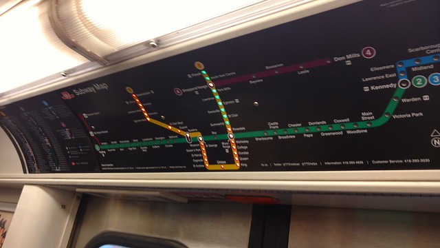
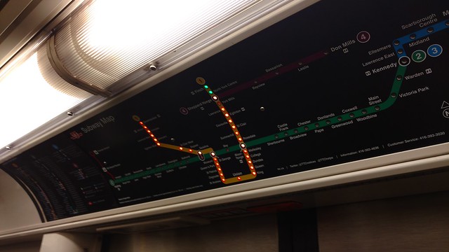
While consolidating overlapping routes into a single line does massively improve neatness, it does make it a bit harder to figure out where each individual route goes. It's mostly an issue where routes merge and unmerge, like over the Leaside Viaduct. For the typical situation where routes branch off heading away from a subway station, the merged design is fine.

The on-street looping for the 510 short turn along Adelaide, Charlotte and King is not shown. Instead there's just a dot labeled "510C" south of King. The actual looping route is useful information that should not be omitted.

I'm not sure about using GO's proper line colours. This is not a GO map - there are two completely separate fare systems. But the main issue is that Lakeshore East's red makes it look like a TTC route. I'd probably stick with a single colour for all GO lines.

I miss the use of the Toronto Subway typeface for station names. I get that the new font is more legible, but I really like the character of the TTC's own font, as well as the extra differentiation between street names and station names (i.e. DUFFERIN vs Dufferin St)

Overall it's a very impressive redesign.
 
Last edited:
I'm not sure about using GO's proper line colours. This is not a GO map - there are two completely separate fare systems. But the main issue is that Lakeshore East's red makes it look like a TTC route. I'd probably stick with a single colour for all GO lines.

I think they're anticipating greater integration between the TTC and GO in the future by being more explicit about the GO line colours… but personally, I'd like to see GO's East and West Lakeshore lines consolidated into one colour anyway (as so many trains run through), and further I anticipate that with electrification and increasing frequencies, we will see other lines consolidate in the future, with the first obvious one being the Kitchener and Stouffville lines as they get SmartTracked

So we will see change there anyway.

In other areas, owing to the diagramization (coining a term to describe the removal of geographic accuracy for the sake of graphic clarity—is there another word already?) of the former map, there are choices made all over the work in terms of how exactly it is best simplified. Some spots have me scratching my head.

For example, Weston Road between St. Phillips and Sheppard is strange, and makes for a particularly awkward connection at Oak St. Why take Weston so far west there? I would move it in line with Weston north of Sheppard for the next revision, and continue the St Phillips northeast diagonal further northeast.

Another head sractcher is the Lakeshore West GO line through Mimico. Why the horizontal line where it crosses Royal York? It makes the line very awkward through there, and should be shown as a straight line from the Humber Loop to where the diagonal is west of Royal York. If it's just to get the word Mimico and the GO logo in there for the station, then move those labels to the west side of Royal York where there's plenty of clear space. They have Weston GO station on the north side of Lawrence, so there's no reason not to put Mimico go on the west side of Royal York.

There will be many other places on the diagram where it could be tweaked, and I have others I could list. It will be interesting to see how many might be tweaked for the next revision and subsequent ones.

42
 
Why doesn't the TTC create a map of their express bus network, just like MiWay and YRT have done?
I am not sure I would describe the express bus routes as a 'network" at the moment - admittedly, they are about to add more routes but I think that most passengers will still take only one express bus and possibly link to a regular bus at one or both ends. A separate map of express routes does not make much sense to me.
 
In other areas, owing to the diagramization (coining a term to describe the removal of geographic accuracy for the sake of graphic clarity—is there another word already?) of the former map, there are choices made all over the work in terms of how exactly it is best simplified. Some spots have me scratching my head.

Schematic would I guess be the word for this type of map. Or schematization, for the changes made.

Personally I think it looks really good. But at the same time, was it necessary? I think having a to-scale map can be helpful at times. If you're lost in the fringes of the city and your only guide is the TTC route map, it showing the little curves in the roads could be helpful for navigation or knowing where you have to get off. I also think it could do a better job at showing combined routes - i.e using a thicker line like the old map. But so far I don't envision there being any major complaints.
 
Schematic would I guess be the word for this type of map. Or schematization, for the changes made.

These are typically called diagrammatic maps. I think it's a superior option in Toronto as the bus network is quite comprehensive and it was difficult to follow routes on the geographic maps. There is a bit of information lost, but these days there are automatic announcements and everyone has a smartphone so I think geographic maps aren't quite as useful as they once were.
 
  • Like
Reactions: PL1
Rather than completely cropping out the downtown core, I think it might have been better if the TTC just put a dashed line around and said "see insert". Makes it a bit harder to connect the lines if you aren't familiar with the system, and still accomplishes the same thing.
 
Is it just me, or is there something "amateurish" about this map? Hard for me to put my finger on it, but it looks like a map a small town system would produce rather than a large metropolitan one.

Rather than completely cropping out the downtown core, I think it might have been better if the TTC just put a dashed line around and said "see insert". Makes it a bit harder to connect the lines if you aren't familiar with the system, and still accomplishes the same thing.

This is common for transit maps that cover a large area. The newest edition, which I mentioned elsewhere, reminds me of the Los Angeles Metro map.
 
I've noticed a couple of toronto rocket trains now have the map reversed so that the red lights show where the train has been and green is where it's going to stop

26634436674_a5d7176339_z_d.jpg


27144166072_172ba5d6eb_z_d.jpg


I was heading north from Bloor and Younge
 
This is one of the stupidest things the TTC has ever done. Personally, I don't agree that it makes any more sense--I think the options (green>red or red>green) are about the same, with the existing one maybe making a bit more sense, but whatever, let's even assume the previous option was counter-intuitive and this one makes perfect sense. What on Earth is the logic behind changing them several years in? There are a few people that live in this city that ride the subway, last time I checked, and one or two of them might have looked at the light maps by now...suddenly reversing it will be extremely disorienting.
 
The lights should just turn off for every station already passed. None of the orange/green nonsense.

Lights off currently represents other lines or a short-turning train. For instance, when service is suspended on Yonge north of Bloor, Rosedale-Finch will be turned off.
 

Back
Top