


Steve X
Senior Member
Looks more like they shrink the size of the route numbers.
|
|
|
Because in smaller font applications it fails readability tests miserably. It's iconic for large font applications like subway walls, but for any kind of smaller application, not good.
You think? I find it looks good on the 512 stops and should be used on all of them. It's more legible than no sign which is what we have most places now!
And I like it in even smaller applications.
Hate to say it, but honestly I think that looks pretty awful. Looking at it on my iPhone (about as small of an application you can get), it's pretty hard to read. Also, there's the fact that Bloor-Yonge has no lower case typeface, so everything needs to be in caps. Again, fine for station walls, but I don't want signage to look like it's yelling at me.
For smaller-scale applications, like station signage, Clearview is the clear (no pun intended) favourite.
I remember when you and I tackled redesigning the standard subway map to fit the 20"x28" poster space currently used for ads, one of the questions I was wondering was if there is a standard used for typeface legibility. Or rather how small can a font be to be accepted as visible to the public. Definitely tried my hardest to keep the current font size, but couldn't do it - considering the inclusion of every Transit City surface stop basically required a downscaling. So yeah I wouldn't doubt that there is a standard for font readability/legibility.
Hate to say it, but honestly I think that looks pretty awful. Looking at it on my iPhone (about as small of an application you can get), it's pretty hard to read. Also, there's the fact that Bloor-Yonge has no lower case typeface, so everything needs to be in caps. Again, fine for station walls, but I don't want signage to look like it's yelling at me.
I remember when you and I tackled redesigning the standard subway map to fit the 20"x28" poster space currently used for ads, one of the questions I was wondering was if there is a standard used for typeface legibility. Or rather how small can a font be to be accepted as visible to the public. Definitely tried my hardest to keep the current font size, but couldn't do it - considering the inclusion of every Transit City surface stop basically required a downscaling. So yeah I wouldn't doubt that there is a standard for font readability/legibility.
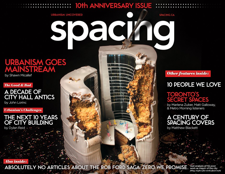
The missing lower case is a problem that could be solved. The mix of Subway font and lower case in that spacing cover seems fine to me. (I don't of course mean the "spacing" logo itself, which is a truly awful hodgepodge of characters.)
So many arguments in favour of Subway font. For one, given that it's actually chiselled into the walls, we're always going to have it. So we should build on that and use it more, to bring some consistency to the system.


Ah - I've been wondering what the point of those narrow frames was!Just wondering if anyone knows when these new signs at Wellesley went up? Noticed a whole bunch of stations beginning to see batches of these new ad frames being installed but none (except for Wellesley) with the signage installed in the thin strips next to the main poster.
Ah - I've been wondering what the point of those narrow frames was!