News   Dec 20, 2024
 3.5K     11 
News   Dec 20, 2024
 1.3K     3 
News   Dec 20, 2024
 2K     0 

Transit Fantasy Maps

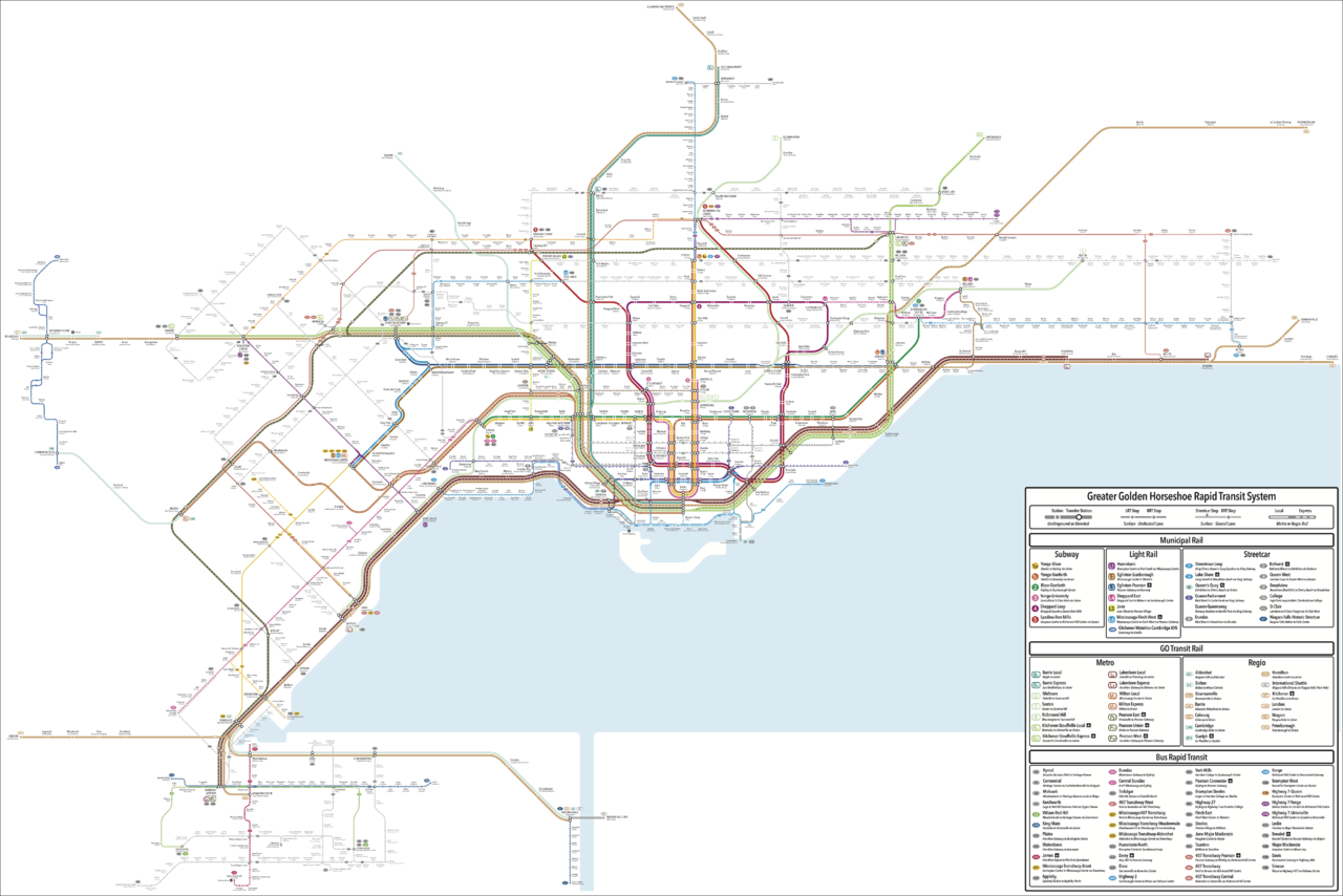
This one has taken me quite a while, but here's my latest map:

GTHA Rapid Transit v5.png


Full resolution map available here.

EDIT: Updated to PNG instead of JPG.
 
Last edited:
This one has taken me quite a while, but here's my latest map:

(work of art)

I really, really love the design of this map. It definitely looks a lot more fluid and interconnected than what it is now. Probably my favourite part is how you distinguished express trains as a separate service, and listing cross-streets and intersections for every station.

I'm not really as fond of the decision to implement a unified branding for all of the light rail and bus routes, though, and I'm really confused as to why interlining is back on the subway lines, or why Mississauga's eastern Transitway got a rail upgrade and not Hamilton. Also, extending Line 1 to Steeles, but not up to Clark to meet with Pearson East is an odd choice in my opinion.

[Edit: Also, on the Barrie Express Line (which is a weird name since it doesn't go up to Barrie anymore), Mulock and Aurora are in the wrong places. Mulock should be the one in the north.]
 
I really, really love the design of this map. It definitely looks a lot more fluid and interconnected than what it is now. Probably my favourite part is how you distinguished express trains as a separate service, and listing cross-streets and intersections for every station.

Thank you! It's been an evolution in the design language, but I think I've found something that works. The naming in particular strikes the right balance between the desire for unique station names, while still maintaining geographic relevance if people aren't familiar with neighbourhood names.

I'm not really as fond of the decision to implement a unified branding for all of the light rail and bus routes, though,

My thinking for this was that with each municipality having its own branding and naming (or colouring) scheme for its BRT routes, it makes navigating from one system to another more challenging. I went with a universal X## system to make that easier. It also simplifies things because there are several routes that cross municipal and operator boundaries.

The numbering is based off the US Interstate system, with major routes ending in either 0 or 5, and other routes filling in the gap. X5 is in Hamilton because its the furthest west, and X95 is in Oshawa.

and I'm really confused as to why interlining is back on the subway lines,

It really comes down to reducing the pressure on Bloor-Yonge. With the Relief Line (which is back as a subway here, since I think the OL will be toast after Ford loses in 2022) connecting directly with the Spadina Subway, it opens up the opportunity to use the wye again. This allows 3 patterns on the Bloor-Danforth Line, with the possibility of running trains through downtown. This would likely eliminate the need for a multi-billion dollar reconstruction of Bloor-Yonge.

Line 3 was put in there just to maintain a route for the Spadina Line customers wanting access to the Yonge-University Loop. It terminates at Davisville because that's where there is an additional platform for it.

or why Mississauga's eastern Transitway got a rail upgrade and not Hamilton.

For Mississauga, I think that Mississauga Centre is a much more natural terminus than Renforth. By upgrading it to LRT, both the Eglinton and Finch lines can terminate there, with the latter going up to Pearson, providing a direct rail connection between Mississauga Centre and Pearson. That upgrade would also be relatively easy (much like the upgrade of the Transitway in Ottawa), since the guideway and stations are there.

For Hamilton, I just think that it's more likely that BRT will be the chosen mode, so I chose to show a BRT-based system. An LRT system would look pretty similar, except that the two N-S segments of X8 would terminate at McMaster and Parkdale, respectively.

Also, extending Line 1 to Steeles, but not up to Clark to meet with Pearson East is an odd choice in my opinion.

My thinking for that was that the transfer volume between the N-S service on Yonge and the E-W service on Steeles would likely be higher than the transfer volume to the Pearson East line. By extending the subway an additional stop, you would in essence be forcing an additional transfer for those people.

[Edit: Also, on the Barrie Express Line (which is a weird name since it doesn't go up to Barrie anymore), Mulock and Aurora are in the wrong places. Mulock should be the one in the north.]

Good catch, thanks! I've done a review myself to catch those little mistakes, but given the size of the map there are likely some that will slip through. And yeah, I kept the names based on the corridor name, so that it's clear that the lines with different stop patterns still run on the same corridor.
 
Station names and routes appear blurry on my monitor. Anyone else experiencing the same? And yes I put my contacts on this morning.

Unfortunately Urban Toronto limits the upload size of files, and the original was too big to be uploaded at the original resolution.

Try these for higher resolution (PDF and JPG):
https://www.dropbox.com/s/v8gg2ehpqqvyvkm/GTHA Rapid Transit v5.pdf?dl=0
https://www.dropbox.com/s/mewvbafss5xt02u/GTHA Rapid Transit v5.jpg?dl=0
 
What’s the purpose of the Aldershot to Niagara Falls service?

The full Niagara Falls-Toronto service would likely only run during peak periods (since that service becomes express after Burlington, and there wouldn't be much demand for that outside of peaks), so the Niagara Falls-Aldershot service would ensure that corridor still gets all-day service, albeit through a transfer at Aldershot for those wishing to continue to Toronto. For those only going to Hamilton, the service is still direct. There's a similar type of overlap between Kitchener (Ira Needles) and Guelph.
 
Consider exporting as a .png file. In the past I've made crisp high-res images that were only a few dozen kb in size.
JPGs use lossy compression, which is why they often leave ugly artifacts.

PNGs use lossless compression, which does not leave ugly artifacts. PNGs also allow transparency.

Here's a quick comparison:

Comparison_of_JPEG_and_PNG.png


Notice the ugly artifacts on JPGs that are absent in PNGs.
 
Thanks for the tip 44 North and Johnny Au! I've updated the original post to include the map in PNG format instead, but it appears as though it still got compressed when posting here. I guess it's just such a big image (7740 x 5160), that it had to shrink it.
 
Wow, amazing work. From the fonts to the lines to the scale, this map is incredible to look at! There are a lot of specific details and decisions you made I want to comment on, but it's pretty overwhelming and hard to nitpick given the size and quality of this thing.

For the major things, it looks like you had some fun with the subway lines, particularly the Sheppard–Spadina–Relief-Line Loop! I also like how you divided heavy rail services into local, express and "Regio", that makes a lot of sense to me.

I hate to bring this last bit up but the legend for X10 has the subtext mixed up. I was also going to mention that "Heritage Greene" in Hamilton is spelt without the last "e"; while that's true for the name of the area, the official name for the shopping centre does have that extra "e".
 
link train.png


There was something said in the Pearson Transit Hub thread about extending the Link Train. This is what I came up with for what the routing and stops could look like.

This would allow the Eglinton Crosstown to continue west to downtown Mississauga, and also take away the need to extend Finch West LRT beyond the GO tracks.
 
Slowly digesting this and am amazed at the number of connections at Dundas West/Sherbourne stations. As many as there are at Union. Now I know that's as much a function of the design style chosen for indicating different service types, but still...

Anyone who looks at this and doesn't see the potential for Dundas West/ Sherbourne to become a true second downtown is blind.
 

Back
Top