


ShonTron
Moderator
Member Bio
- Joined
- Apr 24, 2007
- Messages
- 13,202
- Reaction score
- 11,733
- Location
- Ward 13 - Toronto Centre
Some transit maps are so terrible and incomprehensible, they are worthy of scorn.
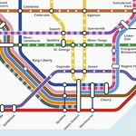
Exhibit A - GO Transit System Map

If this isn't a mess of cartographic puke, I don't know what is.
Errors - for example, Highway 401 looks like a bus route goes out beyond Guelph.
Follow the line (if you dare!) - try sorting out the mess of bus routes between Meadowvale, Brampton and Bramalea. Or near Oshawa
Are they trying to be a geographic or a schematic map? The twists and turns denote a geographic map, but then there'll be errors all over. It needs to decide. Also try to figure out your bus route.
And labels are really haphazard - parts of the Milton and Bradford lines look really bad.
York Region Transit
The System Map isn't as hard to follow, but I find it still pretty bad. Labels are done really badly (circles on route lines lead to labels).
As for the route list, why show little circles that show a subway or a Viva hook-up? Why not a frequency guide (or would this embarass YRT?) that would be more useful. The map should show you the connections, not some pointless legend/table on the side. On the back is a Viva-only system map. Why bother when the whole system is on the front?
Best maps:
Brampton - colour coded lines, streets labelled well, nice, colourful map. Route frequency guide included on back (which is very useful).
Mississauga - not bad, only labels major streets and those that have routings, but otherwise easy to follow. Less colourful than Brampton's (ie no land use coding at back), which isn't distracting from the information needed on the map. Missing frequency guide though.
Exhibit A - GO Transit System Map
If this isn't a mess of cartographic puke, I don't know what is.
Errors - for example, Highway 401 looks like a bus route goes out beyond Guelph.
Follow the line (if you dare!) - try sorting out the mess of bus routes between Meadowvale, Brampton and Bramalea. Or near Oshawa
Are they trying to be a geographic or a schematic map? The twists and turns denote a geographic map, but then there'll be errors all over. It needs to decide. Also try to figure out your bus route.
And labels are really haphazard - parts of the Milton and Bradford lines look really bad.
York Region Transit
The System Map isn't as hard to follow, but I find it still pretty bad. Labels are done really badly (circles on route lines lead to labels).
As for the route list, why show little circles that show a subway or a Viva hook-up? Why not a frequency guide (or would this embarass YRT?) that would be more useful. The map should show you the connections, not some pointless legend/table on the side. On the back is a Viva-only system map. Why bother when the whole system is on the front?
Best maps:
Brampton - colour coded lines, streets labelled well, nice, colourful map. Route frequency guide included on back (which is very useful).
Mississauga - not bad, only labels major streets and those that have routings, but otherwise easy to follow. Less colourful than Brampton's (ie no land use coding at back), which isn't distracting from the information needed on the map. Missing frequency guide though.

