News   Nov 22, 2024
 704     1 
News   Nov 22, 2024
 1.2K     5 
News   Nov 22, 2024
 3.3K     8 

Transformation AGO (5s, Gehry) COMPLETE

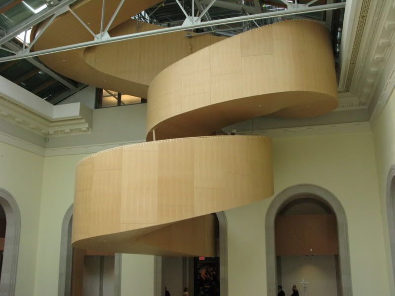
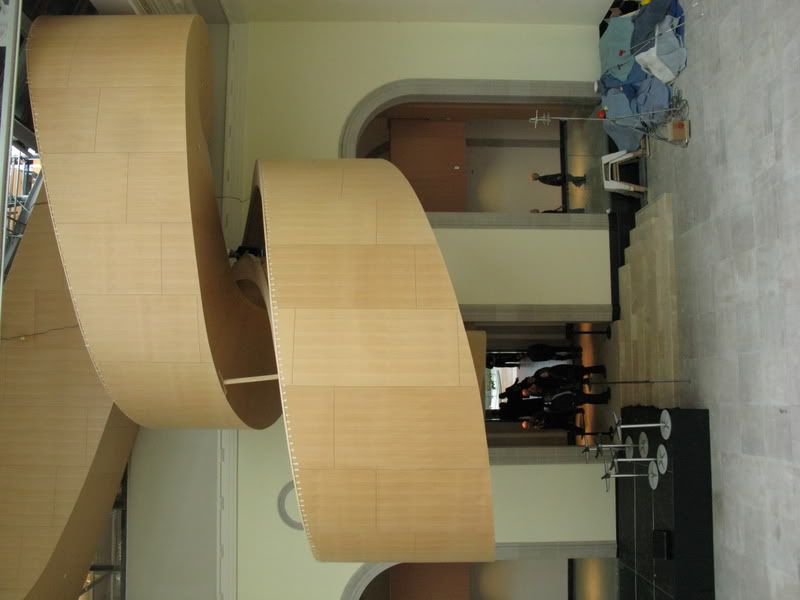
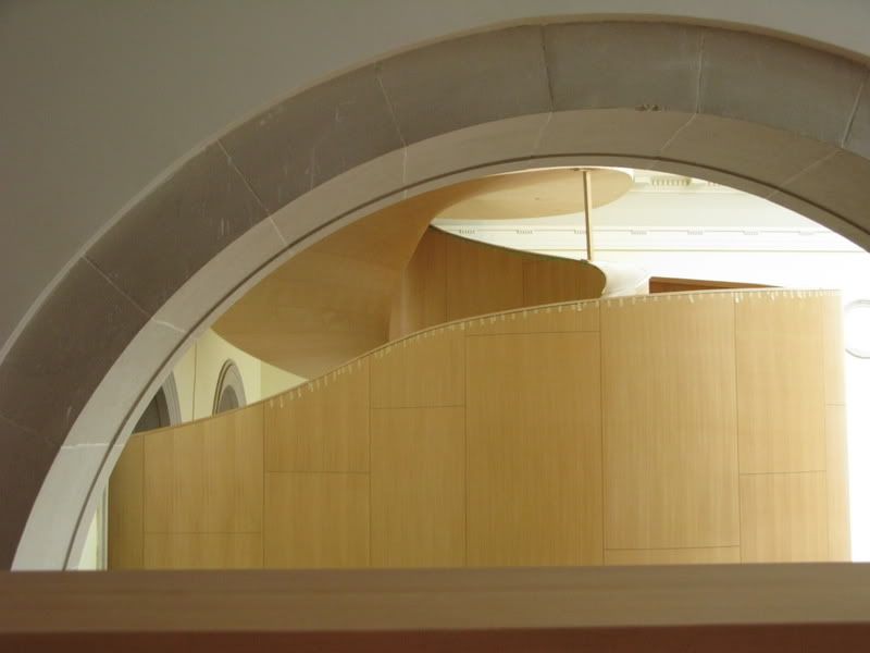
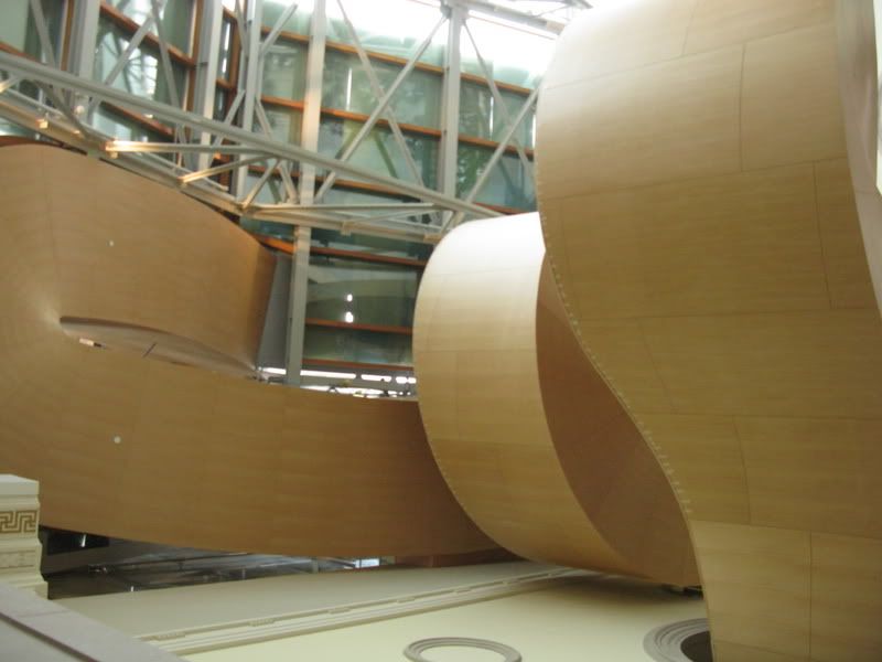
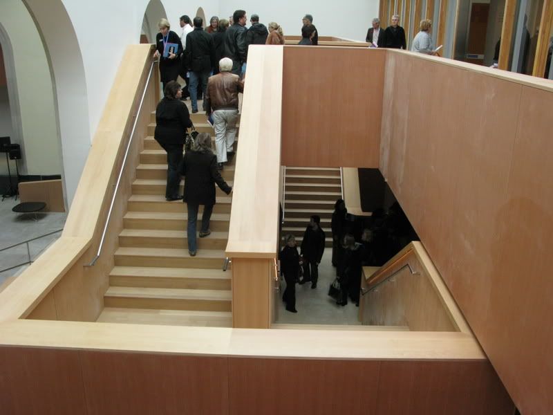
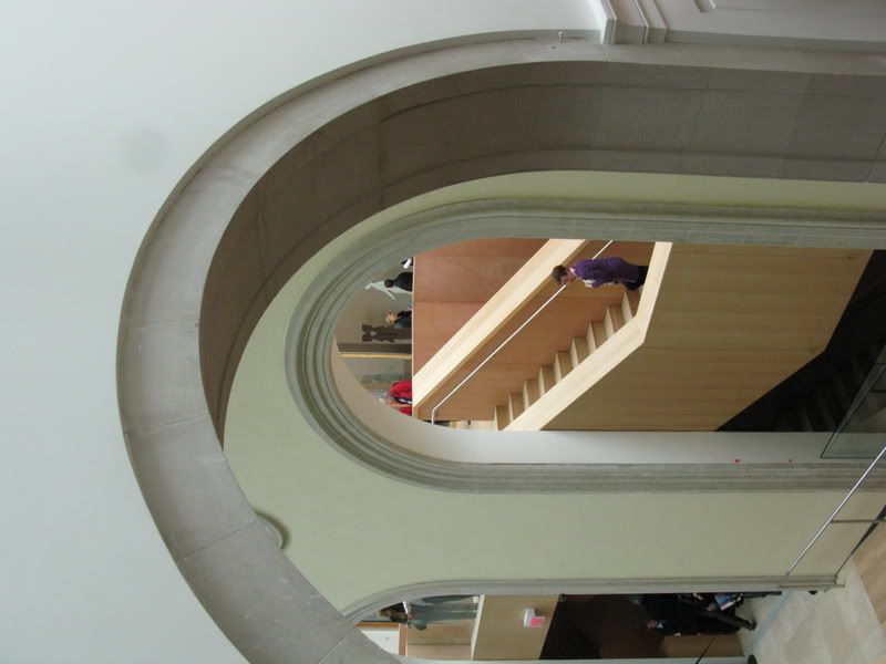
I find much less to celebrate in the spiral staircase overlooking Grange Park than I'd hoped for.

Instead of a joyously loose pirouette of form - emerging from the building and zipping back into it - it has more of the character of a clunky Soviet tractor cab.

Looking forward to seeing the galleries, and how they're installed, very much indeed.
 
Does every single interview have to prove he is in fact Canadian? Or that he grew up around the corner at 15 Beverly? I think it is great that he has been given the opportunity to build here, but I feel slightly nauseous when I hear the same question and statements repeated over and over again about his childhood years..While I don't doubt they were influential, his super-successful career is a result of his relocating to California (LA).

While I highly respect his work and think he has made massive contributions to architecture, I know for a fact that had he stayed in Canada, he would have almost certainly never accomplished what he has today.

On another note, I am really looking forward to seeing the changes and have been informed by some people working on the project, that it is in another league now.

p5
 
I find much less to celebrate in the spiral staircase overlooking Grange Park than I'd hoped for.

Instead of a joyously loose pirouette of form - emerging from the building and zipping back into it - it has more of the character of a clunky Soviet tractor cab.

Looking forward to seeing the galleries, and how they're installed, very much indeed.

I would have to agree with you. The staircases look horrible. I like the material used, just not she shape. They should be more rounded and less bulky.
 
Does every single interview have to prove he is in fact Canadian? Or that he grew up around the corner at 15 Beverly? I think it is great that he has been given the opportunity to build here, but I feel slightly nauseous when I hear the same question and statements repeated over and over again about his childhood years..While I don't doubt they were influential, his super-successful career is a result of his relocating to California (LA).

While I highly respect his work and think he has made massive contributions to architecture, I know for a fact that had he stayed in Canada, he would have almost certainly never accomplished what he has today.

Totally. It would just be better for all involved if everyone just ignored that he is from Toronto and that he, in fact, existed at all prior to moving to California.
 
Last edited:
Does every single interview have to prove he is in fact Canadian? Or that he grew up around the corner at 15 Beverly?

p5

p5connex...he lived in toronto, and down the street from where he's at the fore front of a 1/4 billion dollar reno.

it influenced the design. it's not superfluous. people are going to talk about it.
 
Agree totally with the Gehry media attention: tiresome. Besides, that's not even his real last name!

1.jpg
 
Does every single interview have to prove he is in fact Canadian? Or that he grew up around the corner at 15 Beverly? I think it is great that he has been given the opportunity to build here, but I feel slightly nauseous when I hear the same question and statements repeated over and over again about his childhood years..While I don't doubt they were influential, his super-successful career is a result of his relocating to California (LA).

While I highly respect his work and think he has made massive contributions to architecture, I know for a fact that had he stayed in Canada, he would have almost certainly never accomplished what he has today.

On another note, I am really looking forward to seeing the changes and have been informed by some people working on the project, that it is in another league now.

p5

He lived here until he was 18 (or 20, not sure). Those form some of the most influential years of ones life. While the same questions might be getting tiresome, I don't think questions pertaining to his early years here should be off limits at all. They're part of what made him the architect he is today.

While he likely may never have been the renowned architect he is today had he stayed here, he may not have ended up as one had he grown up somewhere else.
 
I would have to agree with you. The staircases look horrible. I like the material used, just not she shape. They should be more rounded and less bulky.

I never really saw their appeal in the first place. On their own they looked nice, but I they seemed tacked on for no other reason than to have a "Gehry".

I agree, the final (or close to final) product does seem cumbersome.
 
I went to the AGO this morning. There is still A LOT of work to be done. I think it's virtually guaranteed that it won't all be done by Nov 14th.

There was a breakfast held for donors this morning that my girlfriend and I attended. I was impressed the most with all the woodwork inside the museum. The serpentine staircase in Walker's Court is gorgeous! It will definitely become the focus of the gallery.

Arriving at AGO, one is greeted by an outstanding wooden ramp that sparks memories of Chicago with its reminiscence to the Millennium Park to Grant Park bridge in the windy city. Cuts in the floor, intertwined with the ramp allow a view to Ken Thompson's ship models in a gallery below.

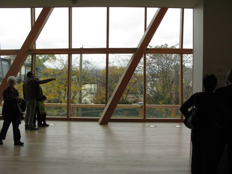
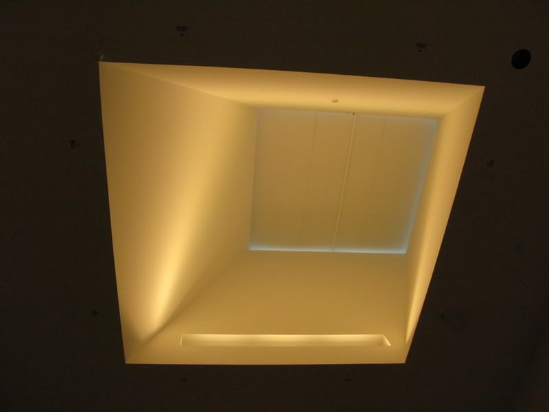
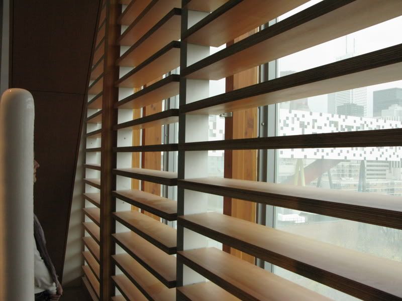
The interior of the new modern art wing is quite nice with the wooden blinds on the windows facing Grange Park, generous spaces and sun wells that allow natural light into the gallery throughout the 5th floor ceilings.
The only caveat is that the massive windows facing the park are virtually blocked. An opportunity for viewing the city from the gallery – a beautiful vista granted by OCAD's Alsop building next door – is interrupted by those wooden blinds and dotted glazing. You get a peak at the city, but it doesn't go beyond the tease. That's too bad.

For the preview today, both organic stairs were closed off. The only access to transit between floors was via a single elevator at the back. Eventually, staff recognized the problem and began using the large service elevator instead.

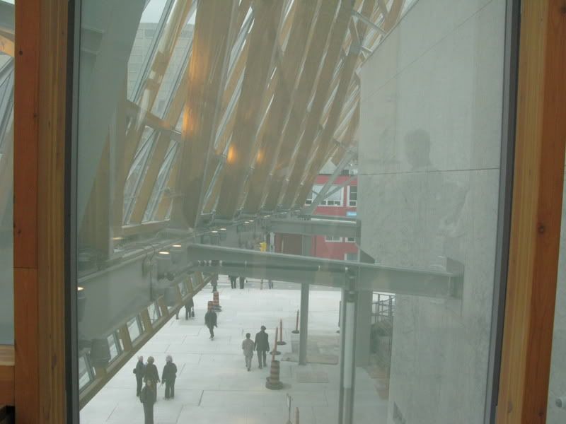
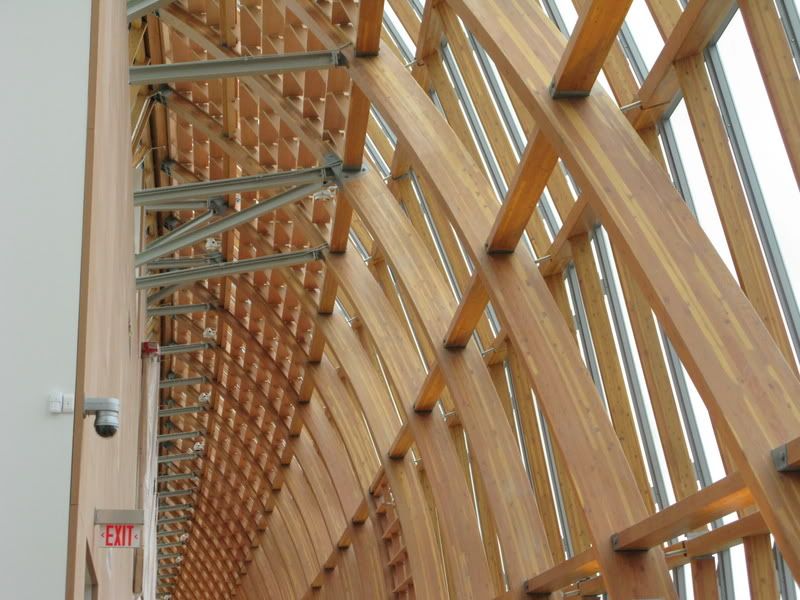
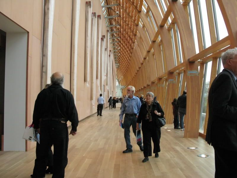
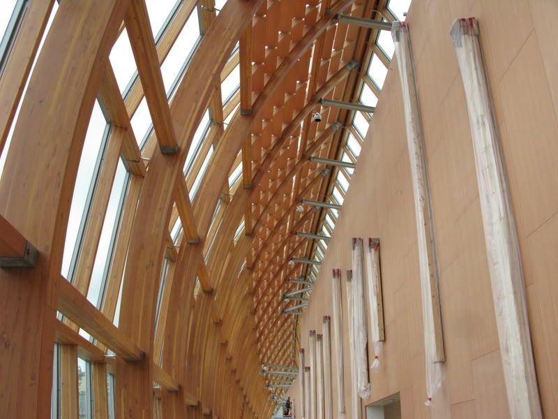
The sculpture gallery is impressive and allows much more visibility to the city below. All that wood just sings "Oh Canada!". The ribbed structure feels like the inside of the hull of an upside down ship.

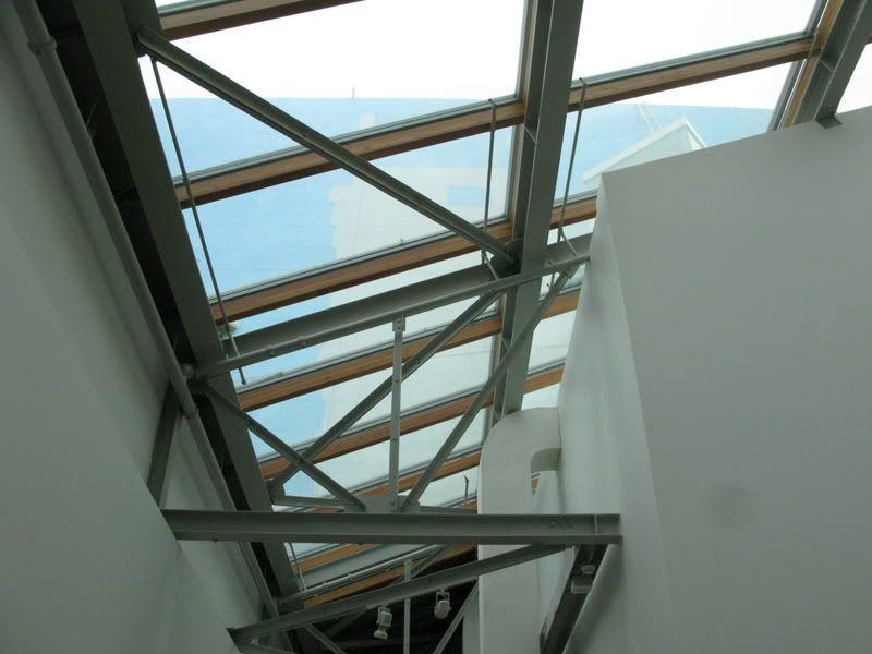
The biggest disappointment – one that I expected when I saw the original drawings years ago – is the glass roof above Walker's Court. When walking into the court, one's eyes are immediately drawn to the light source from above. Once there, the sight isn't as rewarding as the invitation would lead you to believe. The metal trusses and ordinariness of the triangular structure disappoint. For Gehry – and a quarter Billion dollars – you'd hope to see a beautiful pièce de resistance, a glass sculptural ceiling worthy of the place it is in. Gehry's DG Bank (Berlin) comes to mind.

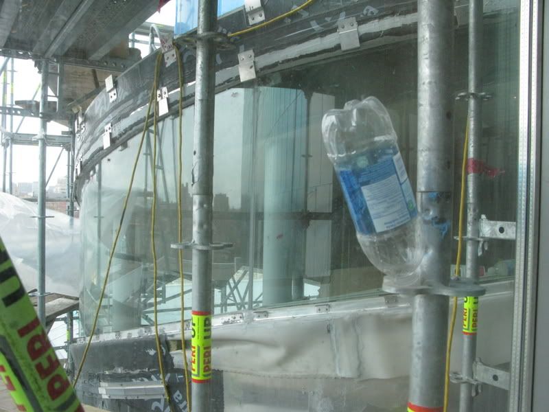
The main attraction turns out to be the one you can see from the outside. The Galeria Itália's massive expanse of curving glass with its tears on either end will no doubt transform this part of Dundas.

Come to think of it, it already has.
 
Last edited:
I just got back from the Members' Preview and the new AGO is everything I'd hoped for and more. There are still a number of things that aren't completed (both spiral staircases and some of the display cases for the model boats) but most of the collection is up and what a spectacular home they have! How objects are displayed is as important as the objects themselves (ROM, please take note!). The Thompson Collection alone is worth the price of membership. "The Massacre of the Innocents" is so luminescent I thought I was approaching a high-definition slide;the light comes from WITHIN the painting.

The one incomprehensible and unforgivable mistake made was the gutting of the main floor of the Grange in favour of a Members' lounge. Awful! Sacrilege! Why?!
 
The members lounge is the reason why I plan on getting a membership there. For as little as $90 a year, it is worth it.

The ROM is missing such a feature and that may prevent me from renewing my membership there next year.

As a member, I would like a place where I can take my laptop, sit back and write about my experience there or simply use the space to get away from the crowds on a busy day.

EDIT: ... in fact, I think I should let William Thorsell know my thoughts. Does anybody know where I can email him?
 
Last edited:
The members lounge is the reason why I plan on getting a membership there. For as little as $90 a year, it is worth it.

The ROM is missing such a feature and that may prevent me from renewing my membership there next year.

As a member, I would like a place where I can take my laptop, sit back and write about my experience there or simply use the space to get away from the crowds on a busy day.

EDIT: ... in fact, I think I should let William Thorsell know my thoughts. Does anybody know where I can email him?

A membership lounge would have been appropriate anywhere else in the AGO EXCEPT in the Grange. The Grange provided an harmonious view of what life might have been like for a certain class in 19th century Toronto. They've destroyed that.
 
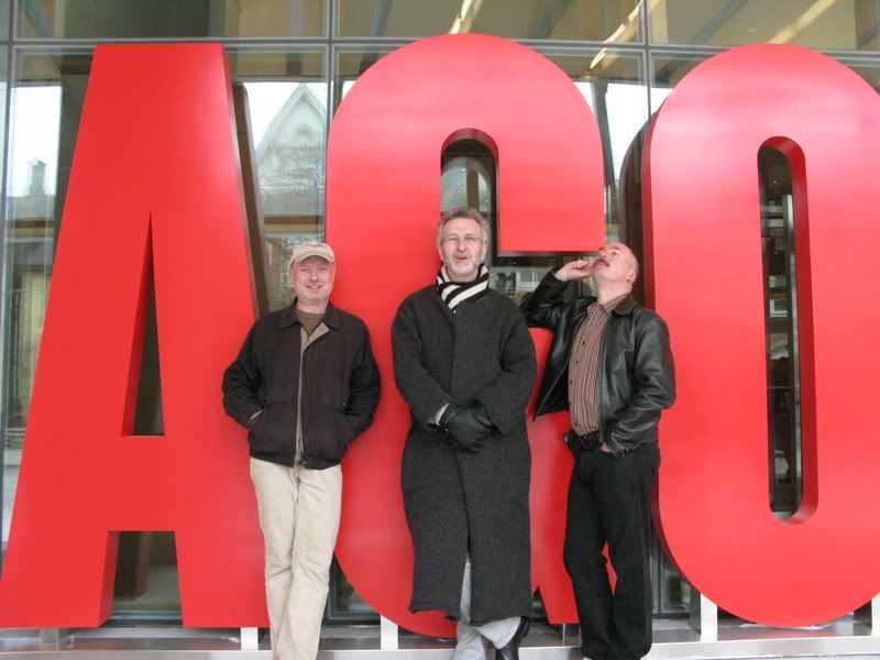
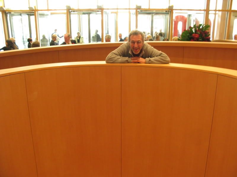
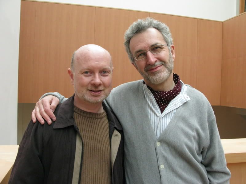
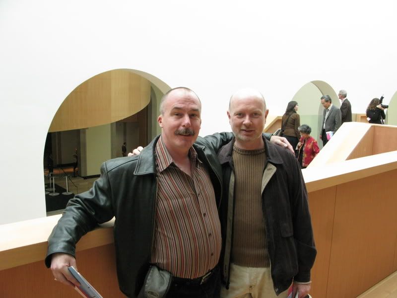
Archivist, Interchange42 and Urban Shocker do the AGO

A few pics from the AGO visit earlier today. Lovely to see all the art again, and the building is a stunner. Though none of the fun staircases are open yet, and there are occassional gaps in lighting and installations, the spaces are amazing, the flow is massively improved, and the gallery seems to me about twice the size of what it used to be. The materials used are rich and elegant, and the art is displayed beautifully.

It is strictly forbidden to take photos inside, so these 60 or so are somewhat blurry for the most part.

Outside the Gallery in the line to get in, and a few shots on the small winding ramp just inside the main entrance. You can see that we are giddy with anticipation.

AGO01.jpg


AGO02.jpg


AGO03.jpg


AGO04.jpg


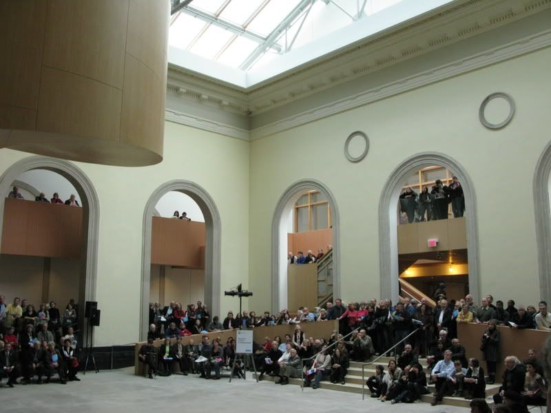
The Walker Court and its new staircase. Not open to the public yet, but beautiful and works nicely in the space. I did find some of the views upwards from the promenade that surrounds the court and looks down into it to be cluttered (some ungraceful metal supports here) - and the skylight into the court is still partially covered. But you really do become aware of the court as you move through the galleries and it becomes a means of orienting yourself in the gallery.

AGO05.jpg


AGO06.jpg


AGO07.jpg


AGO08.jpg


AGO09.jpg


AGO10.jpg


AGO11.jpg


AGO12.jpg


AGO13.jpg


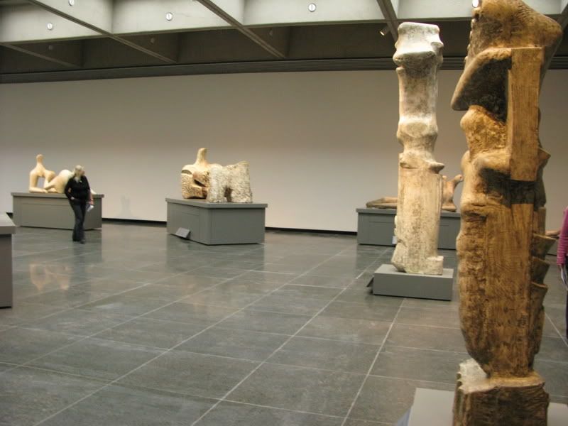
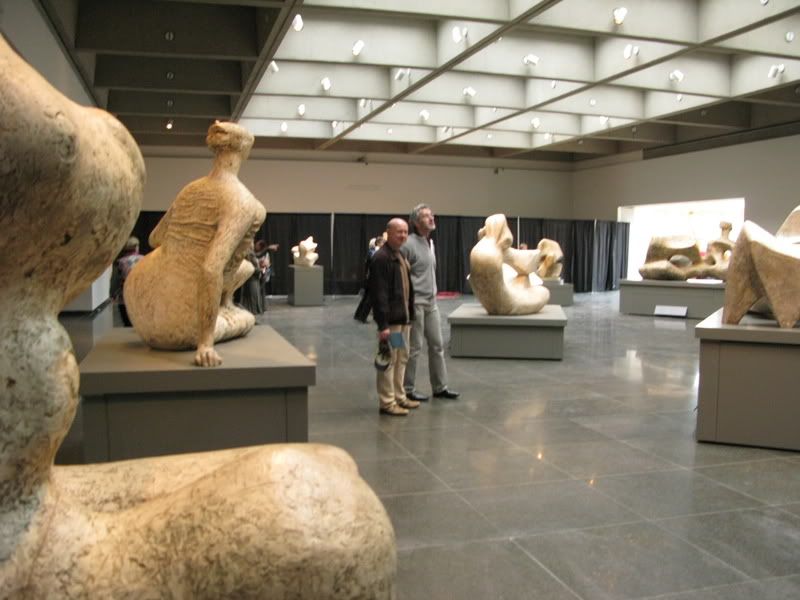
The Henry Moore Sculpture Centre is largely unchanged, but it was lovely to be back in the space again.

AGO16.jpg


AGO17.jpg


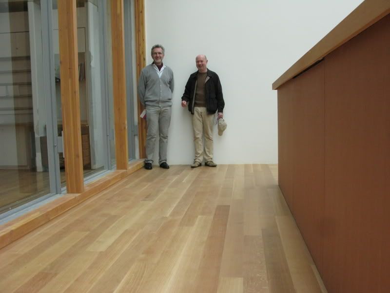
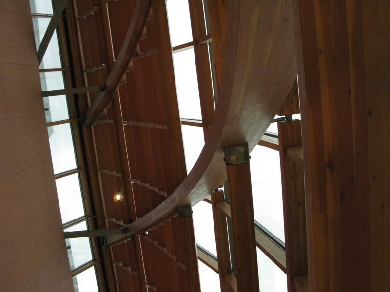
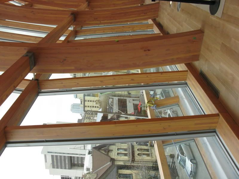
Here are some views inside and out from the Galleria Italia. The artwork on display here is still being installed. When you are inside, it's all wood, almost like a solid wall on the outside, just gorgeous.

AGO18.jpg


AGO19.jpg


AGO20.jpg


AGO21.jpg


AGO22.jpg


AGO23.jpg


AGO24.jpg


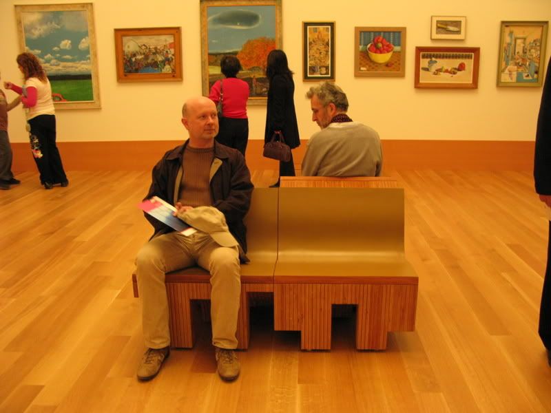
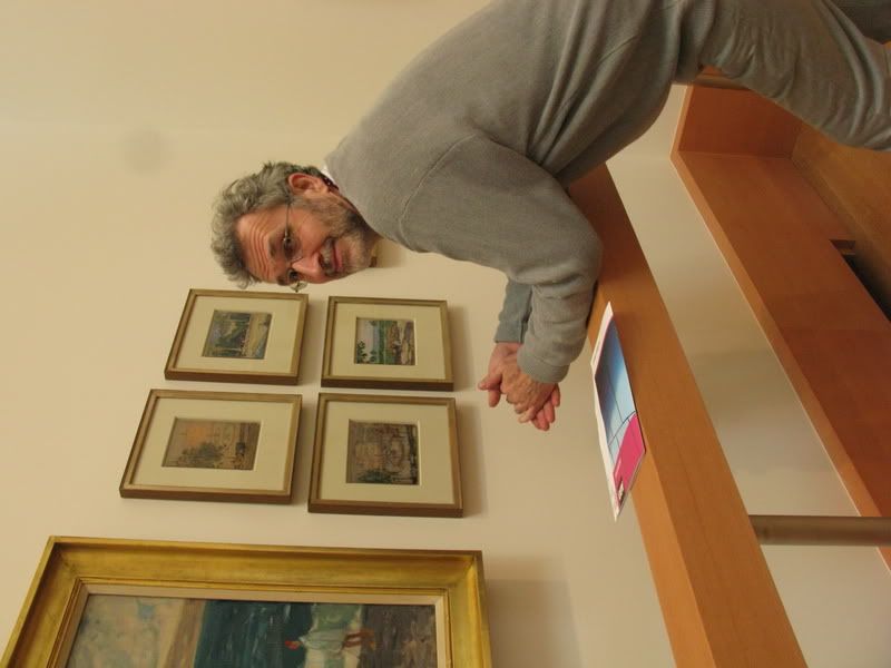
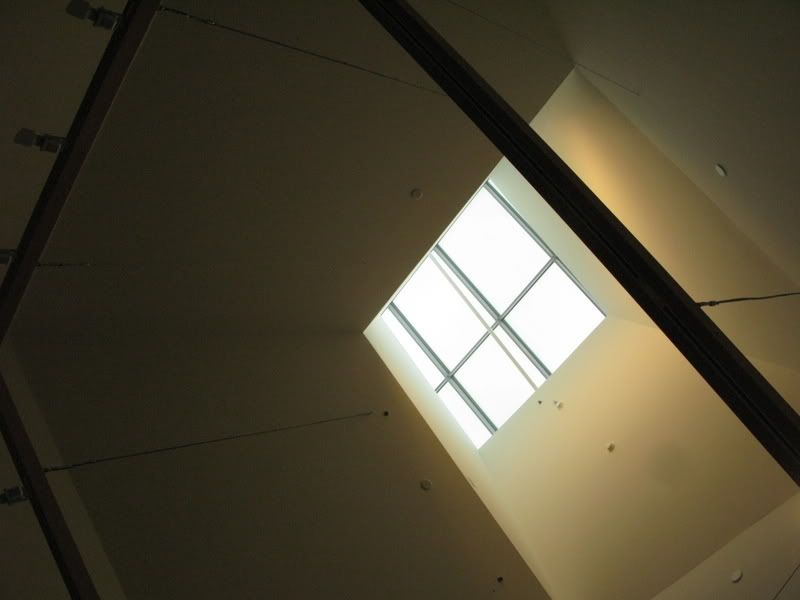
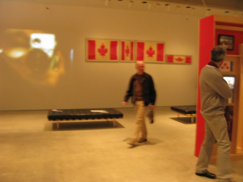
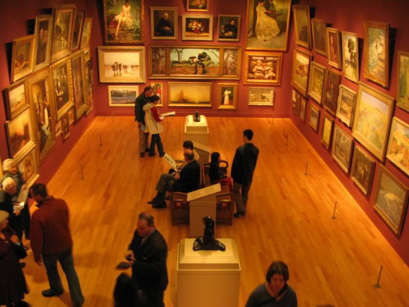
Various shots on Level 2 in the Canadian Galleries. We really loved the railing in two of the galleries that supports you as you peer closely at the works. They are installed with geometric precision, if you pay attention you will note that there are all kinds of balances between the positioning and numbers of paintings. The Gehry chairs are handsome but not truly comfortable. Skylights peek out of the rootop at odd and pleasing angles.

AGO14.jpg


AGO15.jpg


AGO25.jpg


AGO26.jpg


AGO27.jpg


AGO28.jpg


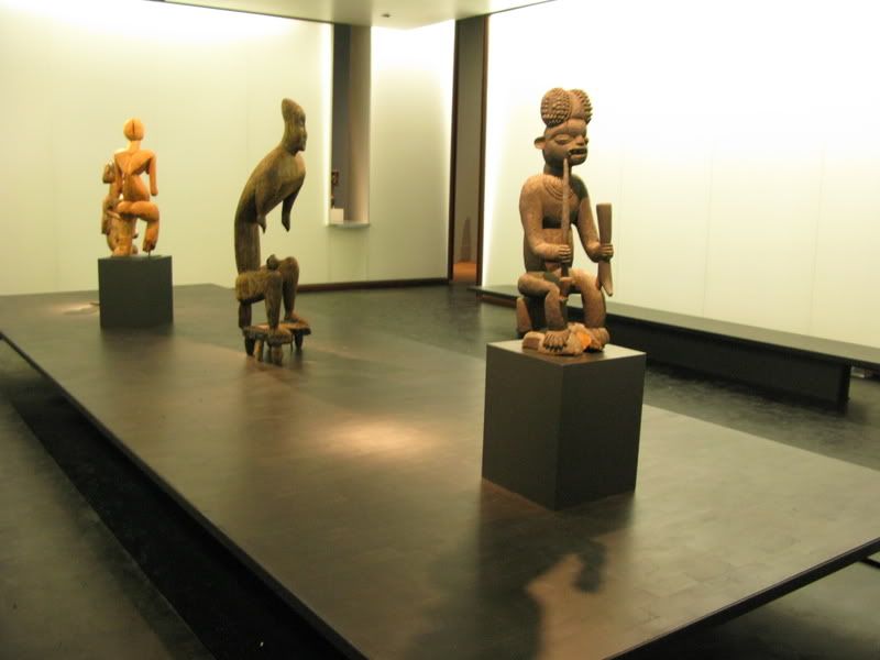
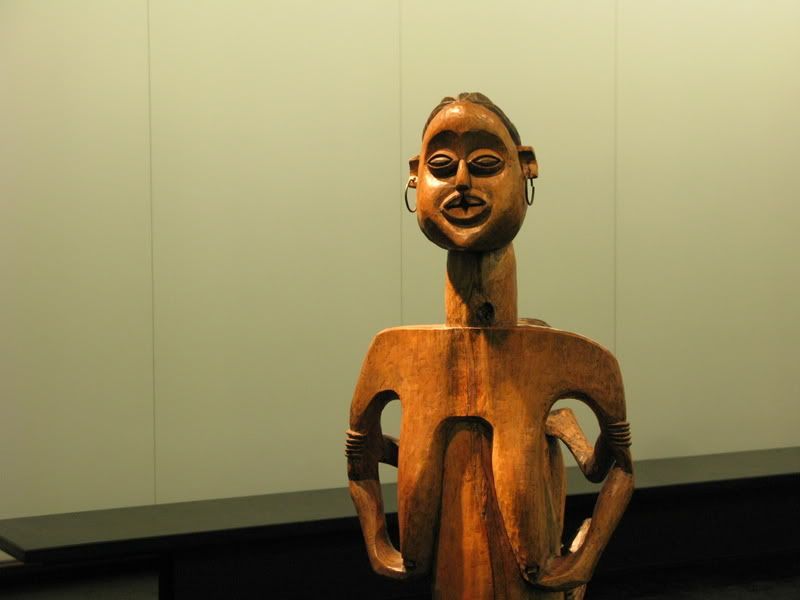
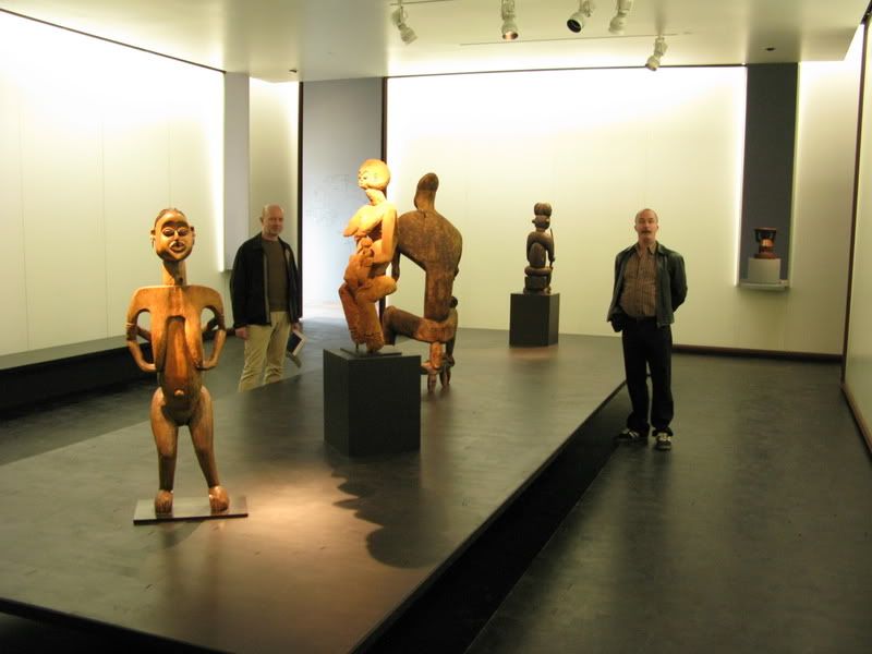
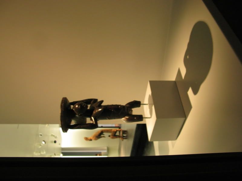
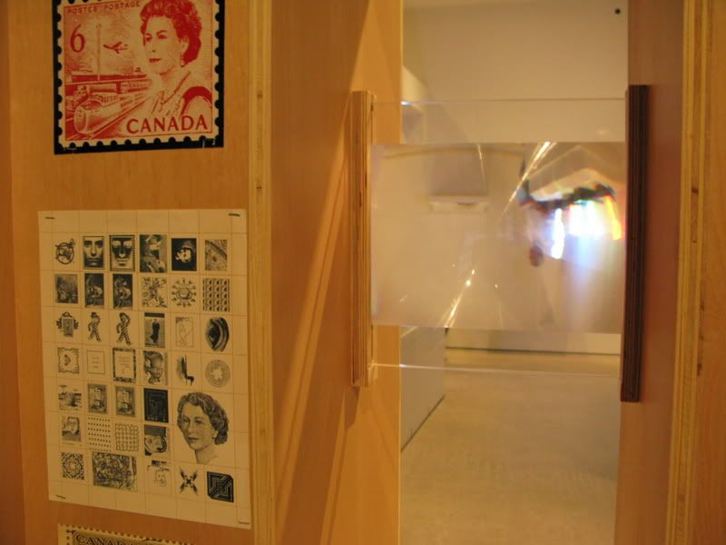
The African gallery was stunning and sparsely populated with art, giving each piece room to breathe. I was taken by the small angled windows that opened to other rooms in the gallery. Here, the floor is dark coloured wood, and there is metal used throughout, quite different from other galleries in the area.

AGO29.jpg


AGO30.jpg


AGO31.jpg


AGO32.jpg


Up the elevator to the contemporary galleries. Staircases not functional yet.

AGO33.jpg


AGO34.jpg


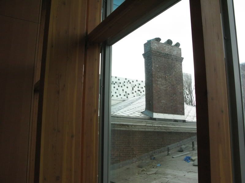
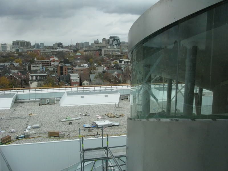
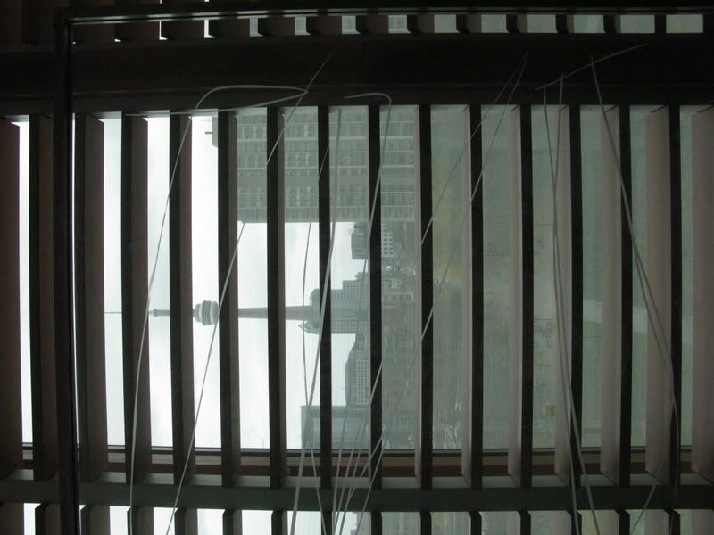
Views out the louvres towards Grange Park and glimpses of OCAD on a dreary day.

AGO35.jpg


AGO36.jpg


AGO37.jpg


AGO38.jpg


AGO42.jpg


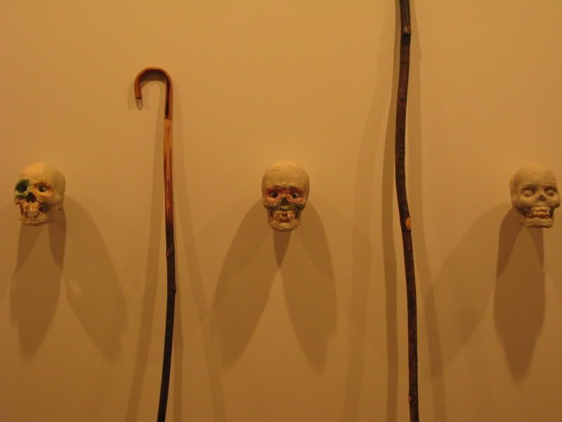
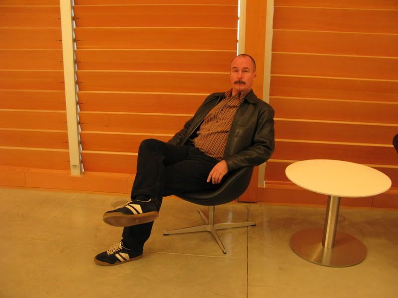
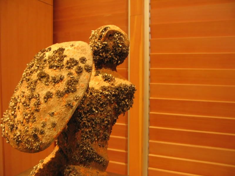
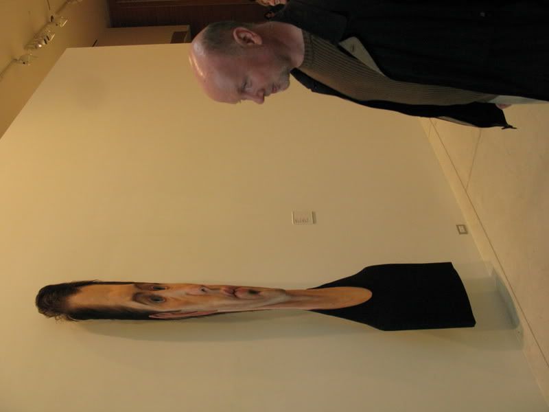
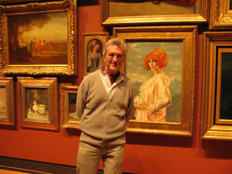
Some art and your correspondence in front of the louvres. This artwork was dropped into Lake Ontario for a period of time, the better to become encrusted with mussels. How clever is that?

AGO39.jpg


AGO40.jpg


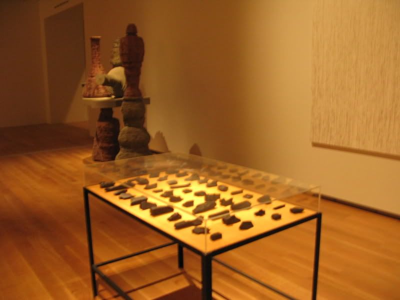
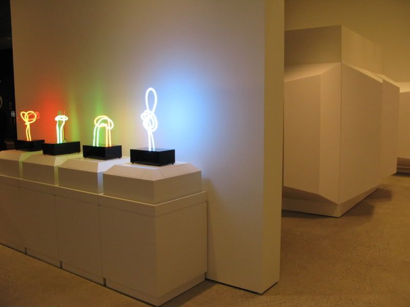
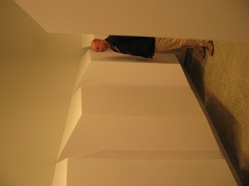
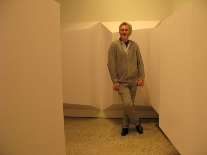
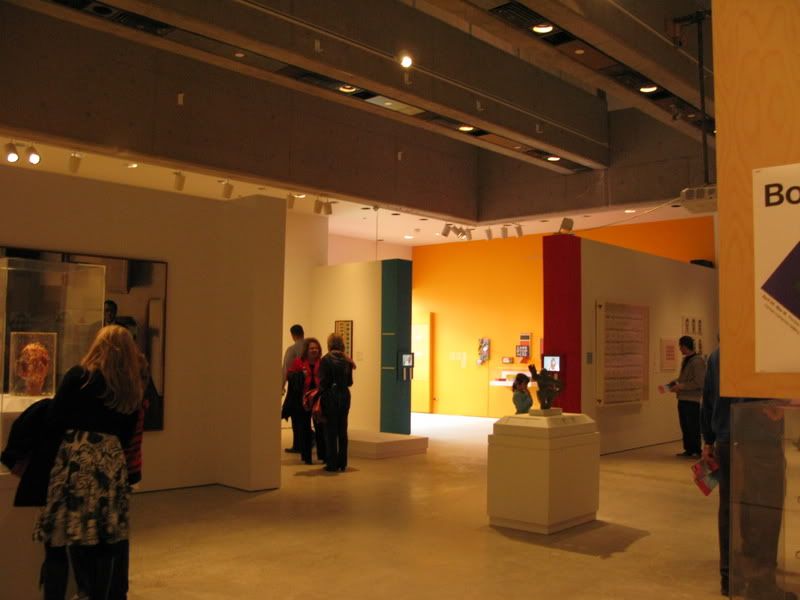
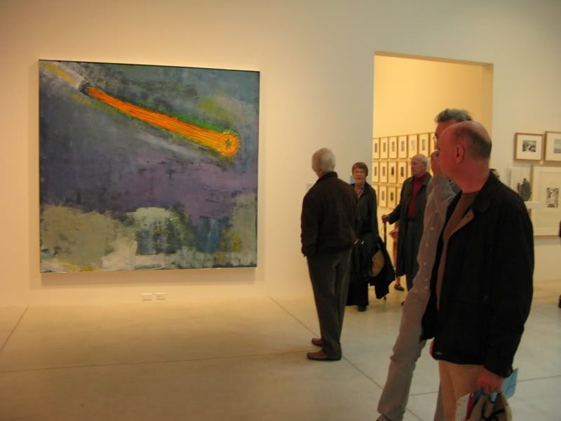
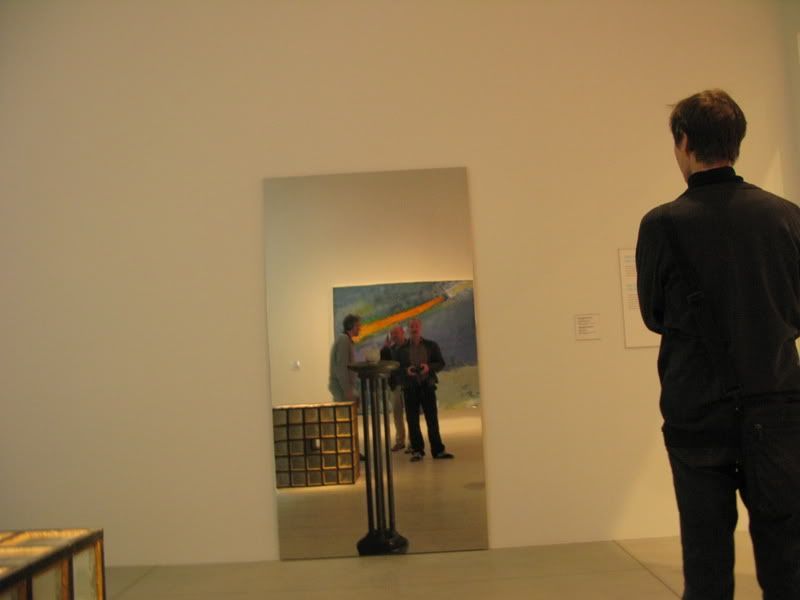
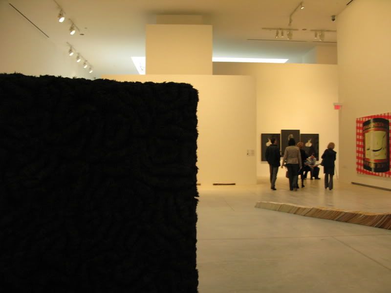
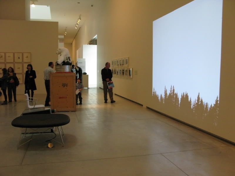
Contemporary galleries on the uppermost floors were great spaces, broken up in intriguing ways, with a kind of zaniness to them which was pleasingly disorienting after the mathematical precision of the Canadian galleries. Lots of amazing new art on display, almost overwhelming. There was a large cube of iron filings that I took to be fabric, and touched it, leaving quite visible imprints of my fingers. I was mortified until I saw that many others had made the same mistake. A fabulous, confusing work of art. It will need some repairs, shortly, however.

AGO43.jpg


AGO44.jpg


AGO45.jpg


AGO46.jpg


AGO47.jpg


AGO48.jpg


AGO49.jpg


AGO59b.jpg


AGO51.jpg


AGO53.jpg


AGO54.jpg


AGO55.jpg


AGO56.jpg


AGO57.jpg


AGO58.jpg


This charming little room has its own balcony.

AGO50.jpg


By the time we finished the two contemporary floors, we were exhausted and overwhelmed, though happy. Still, we returned to ground level for a quick pass through of the older European art. Again, beautiful galleries with stunningly displayed works, great colours, a variety of materials used, beautiful lighting against deeply threaded cloth. Interchange initially took the Massacre of the Innocents for a projection of the piece, so intense was it's lighting.

AGO61.jpg


AGO62.jpg


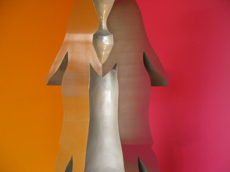
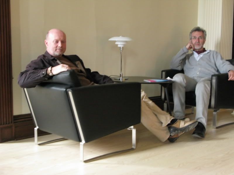
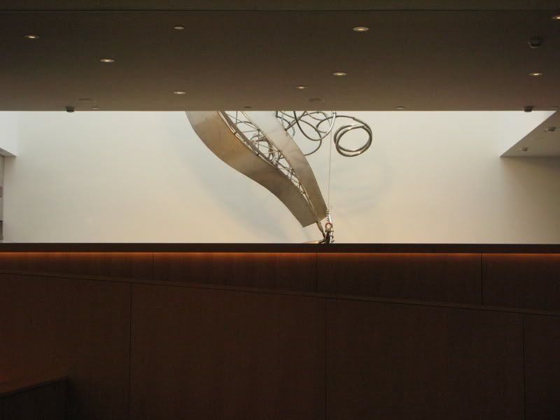
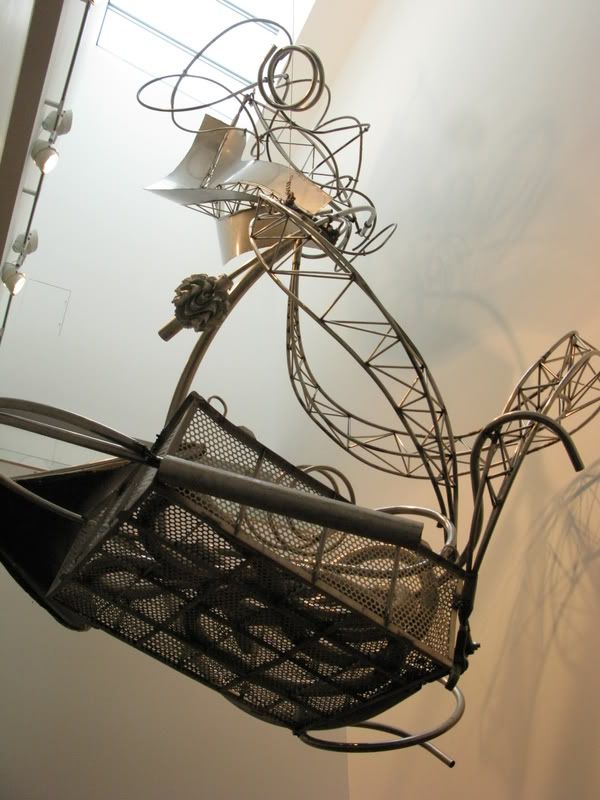
One blurry shot in the Members Lounge in the Grange and two of a sculpture in the restaurant.

AGO60.jpg


AGO63.jpg


AGO64.jpg


I laughed, I cried. I ran and dug my arms deep into the arms of my fellow UTers and dragged them to see works. It was lovely for all of us to be reintroduced to old favourites, and to see so much new art, in a glorious new setting. For Interchange, even his envy over the Tate Modern has been assuaged somewhat. We all left, wanting to return.
 

Back
Top