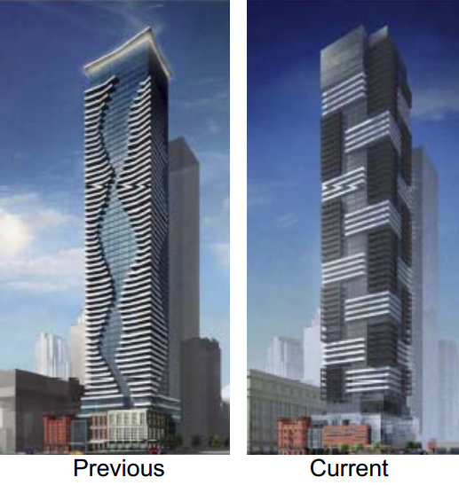
Toronto YC Condos -- Yonge at College | 198.42m | 62s | Canderel | Graziani + Corazza

Toronto may be the only city in the world (certainly the only "alpha" city) that consistently uses 2nd and 3rd rate local architecture firms to design its tallest buildings--and then value engineers their already crappy designs!! It's just astonishing how little the city demands of its developers. Even regional cities like Calgary are showing more vision by getting A-list international firms to design their tallest. Actually, forget Calgary--Mississauga is doing better in this regard than Toronto.

I know I'm not saying anything new here, but I just feel a need to add to the chorus of disgust registered here in the hopes that maybe someone amongst TPTB will get the message.

You have to consider the average of everything being built than a couple stand out towers. In both cases, Toronto is well ahead of Mississauga and Calgary. The Bow was a one time event that ended up being value engineered once Encana sold it to the REIT. The urban setting is a disaster but, the tower still turned out nice. It just isn't that jaw dropping corporate campus originally intended by the CEO of Encana.

All things considered, F+P has been very active in Toronto. Westbank is bringing their international stars to Toronto too.
 
I'm not going to speculate if the lead architect sleeps well at night. They work for the developer and the developer works for the investors. There don't see a reason to switch up the status quo if the buyers/renters continue to make these development successful. I'm not implying this isn't short sighted .
Plus, the architecture firm hopes to be a regular client of the developer.

The developer may decide to look elsewhere for future projects if their architect creates additional costs due to their inventive designs.
 
I feel bad criticizing from afar as an ex-pat, but I've followed UT for almost two decades and I've watched the butchering of Toronto condo architecture which seems to be rewriting swaths of neighborhoods with the same shitty disregard for detail - using window-wall and excessive use of spandrel and I am saddened. I am only excited by a few forward-thinking projects that could maybe make up for it. The One, Ghery, YSL and 1Yonge. They could take away a bit of attention to massive banal infill.
 
I feel bad criticizing from afar as an ex-pat, but I've followed UT for almost two decades and I've watched the butchering of Toronto condo architecture which seems to be rewriting swaths of neighborhoods with the same shitty disregard for detail - using window-wall and excessive use of spandrel and I am saddened. I am only excited by a few forward-thinking projects that could maybe make up for it. The One, Ghery, YSL and 1Yonge. They could take away a bit of attention to massive banal infill.

You likely echo the feelings of a lot of people. I find consolation by telling myself that all of these buildings can be re-clad, upgraded, improved 20-30 years from now. Surely they'll start falling apart by then.

488 University Avenue will look nothing like the original building. If we can do that, even the most pedestrian coma inducing building can be re-worked. Till then, just squint/blur your vision when you walk by them. That's what I do.

Well, we've got something to look forward to in 2031: the completion of the DRL and the approximate period when these spandrelized filing cabinets will be due for a reclad.
 
So much action--present and planned--on this stretch of Yonge. And who says balconies aren’t used? The workers seem to be enjoying theirs at lunchtime at the Teahouse site.

YCcondo800.jpg
 

Attachments

  • YCcondo800.jpg
    YCcondo800.jpg
    831.9 KB · Views: 417
I feel bad criticizing from afar as an ex-pat, but I've followed UT for almost two decades and I've watched the butchering of Toronto condo architecture which seems to be rewriting swaths of neighborhoods with the same shitty disregard for detail - using window-wall and excessive use of spandrel and I am saddened. I am only excited by a few forward-thinking projects that could maybe make up for it. The One, Ghery, YSL and 1Yonge. They could take away a bit of attention to massive banal infill.


Window wall use is unfortunate but, the key word here is "massive". You'll find very few places that have put up 40 residential high rises a year for the last 15 years that doesn't have a whack of mediocre design and/or twins.
 
I wouldn't be holding out any hope on reclads. The condo corps will do everything they can to extend the life of the window wall systems and will be look for the cheapest options when the time actually comes to reskin. The boom has also been going on for two decades now. There are hundreds of towers over 10 to 15 years old now. Does Cityplace's 2001-2003 built Matrix/Apex towers look like they are nearly ready for a reclad?
 
The only possible redeeming feature of this building - the red cladding - is total shit. Is there nothing we can do to prevent these God-awful developments from happening in the future? Why are people only concerned with height when design and materials are far-and-away more impactful in the experience of a building? This building makes me sick.
 
the older design that looked like an amateur child of one bloor e would have looked much better than this design.
 

Back
Top