Toronto YC Condos -- Yonge at College | 198.42m | 62s | Canderel | Graziani + Corazza

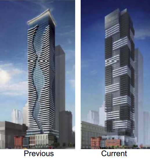
I just noticed this project as I walked by the notice on Yonge last night. I have to say I'm thrilled the DRP rejected the current design. The tower wasn't terribly remarkable, but the base looks horrific.
 
Probably because it's a group of different people with varying opinions... a "panel". Just because an issue is listed doesn't mean it's anything more than a suggestion.

I did, however, get a laugh at Canderel and G&C's expense. As professionals, it's sad they need to be told:

"Go back to basics and follow required density/height/setbacks and design within those
limitations."

That should be the FIRST thing they would do when creating a parti for this site. (Unfortunately, developers are not interested in context or creating buildings that fit the constraints of a site; rather they choose arbitrary heights according to the profit margin they seek in the project.)

Anyways, I will say that this new design is very interesting and I actually quite like how it looks from that small rendering.
 
Last edited:
I did, however, get a laugh at Canderel and G&C's expense. As professionals, it's sad they need to be told:

"Go back to basics and follow required density/height/setbacks and design within those
limitations."

That should be the FIRST thing they would do when creating a parti for this site. (Unfortunately, developers are not interested in context or creating buildings that fit the constraints of a site; rather they choose arbitrary heights according to the profit margin they seek in the project.)


Do any developers anywhere in the city ever have to "follow required density/height/setbacks and design within those limitations"? Then why should Canderal have to? It's not sad that they need to be told that because they, and other developers, invariably get away with it. What's sad is our impotent planning regime, and its absurdly low as-of-right height and density restrictions.
 
Last edited:
That's fair and I would also agree with that. I wish we had more of a backbone and a clear, accessible process for planning as opposed to the developer-driven mess we have right now. Several western European countries do and the results they derive from developers are of a much higher quality.

But in my opinion, Canderel profits greatly (look at all of their developments in that same area) and I think it's ridiculous they would try to shoe-horn 60 floors on to this very small site.
 
Last edited:
Do any developers anywhere in the city ever have to "follow required density/height/setbacks and design within those limitations"? Then why should Canderal have to? It's not sad that they need to be told that because they, and other developers, invariably get away with it. What's sad is our impotent planning regime, and its absurdly low as-of-right height and density restrictions.

In this case, they were attempting to sneakily piggyback on a nearby proposal, much like what happened in the Entertainment District and on College Street.

From the DRP:
- Do not replicate approved development that does not abide by built form and urban design guidelines and requirements (e.g. tower immediately west of site).
 
But does a building need to be "graceful"? I can think of some really great designs that are clunky and all the more interesting for it.
 
But does a building need to be "graceful"? I can think of some really great designs that are clunky and all the more interesting for it.

+1

I'd much prefer this to yet another Pinnacle, Maple Leaf Square, or Festival Tower. This one looks like it belongs in a big city core, the others not so much. This design is unapologetic and a breath of fresh air, tbh.
 
Last edited:
What a 180 from the previous design, though the massing seems unchanged. This might shape up to be something very nice.
 
I don't like the way it resolves at the top, but I still greatly prefer the redesign to the original. The podium of the redesign looks like it could also use some work tho, to help break up the giant wall of glass that it seems to be presenting at ground level.
 
To be honest I like both designs but I understand why the design is so reversed. The first one appreciates flow and seamless integration whereas the new render is more focused on contrast. Either way I wouldn't have minded either and just hope it ends up looking like the render (if accepted).
 

Back
Top