Toronto X The Condominium | ?m | 44s | Great Gulf | a—A

Suggestion:

From now on all references to post-2009 exterior cross-bracing will be referred to as "EPIC BIEBER BEAMS"

Request official ruling from Mods.
 
i'm gonna bieber blast all of you :p!. i wasn't speaking in skyscraper terminology. i was using the regular meaning of "modern" a.k.a. "contemporary". nonetheless. The Bow has encorporated a "contemporary" version of the X beams as they've added sorta chrome accents to the beams to make them more visually appealing (as X beams do have a structural role in the building).

Can i say 21st century instead?
Here's what i think is a 21st/contemporary interpretation of implementing X beams into a skyscraper.

Photo by Boris2K7 at SSP
IMG_6946.JPG

http://forum.skyscraperpage.com/showthread.php?t=179351&page=73
 
Any "Bieberian" architecture would involve a green roof with ivy spilling over the top just like bangs
 
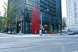
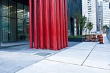
Re: Art: much as I enjoy Dark's work, I hope that this particular example ( together with whatever he does for X2 ... ) doesn't become neutralized by the location and seen mostly as a colour coordinated fashion accessory for the buildings.
 
It sure is eye catching from most every vantage point, but I found it particularly dramatic this past weekend coming up off Mt. Pleasant and onto Jarvis Street.
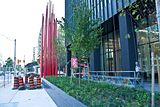
They're making good progress this week with the landscaping, interlocking brick and sidewalks. Hopefully the fences will be down by the weekend or early next week and the west lane on Jarvis re-opened allowing us to fully enjoy X unrestricted.
 
The sidewalks along Jarvis and Charles Street are nearly complete as is the landscaping. Once the last pieces of fence come down and cones hauled away this is going to look smashing at street level.

Click on the thumbnail to enlarge, then click again on the image for full size.

 
While I like the lobby and the lighting, for a condo it looks too much like the mies downtown. It's all office and no warmth, no welcome home vibe.
 
While I like the lobby and the lighting, for a condo it looks too much like the mies downtown. It's all office and no warmth, no welcome home vibe.

Bay Adelaide North (if it ends up being office/residential) will probably be even more office-like :p!. also from the outside.
 
Another pic of the lobby taken from Kijiji.

0944k9_20.jpeg

No Barcelona chairs? What kind of philistines put this together?

simuls said:
While I like the lobby and the lighting, for a condo it looks too much like the mies downtown. It's all office and no warmth, no welcome home vibe.

You just associate it with offices. In reality, it's a minimalist aesthetic with rich materials and great lighting that would be quite comfortable to call home, especially when bathed in warm evening light. Imagine waiting in that lobby and seeing the city covered in snow in the winter. The lobby would definitely seem like a warm and homely place -- comfortably detached while still tuned into the surrounding world.
 
You just associate it with offices.

You might very well be right in that it's simply an aesthetic association, but I, myself, have a minimalist aesthetic and in my own spaces always try to inject some organic life into it. Minimalism on its own can be too sterile.

In the above picture, it's not really the minimalism that makes it feel like an office building, but things like the striped tile on the floor instead of a continuous surface, the very office like make up of the furniture vs something just as modern and clean lined but inviting, and the horizontal fluorescent lighting that is recessed vs having it hang down in some sort of interesting pattern that suggest some human creativity was at play. There's no joy or life in the above space.

Like I said, it's still a great looking space, a cool building and I'm angry I didn't buy here in march of '09 when I almost did and backed out.

Those are good points. It could still be warm and homely but I can now see that there are elements that make it more sterile and institutional than it should be. The chairs are definitely a clue that there wasn't much passion for details in composing this space. It follows the "disappointing Miesian" theme that started with that big mechanical box on the roof.
 

Back
Top