AlbertC
Superstar
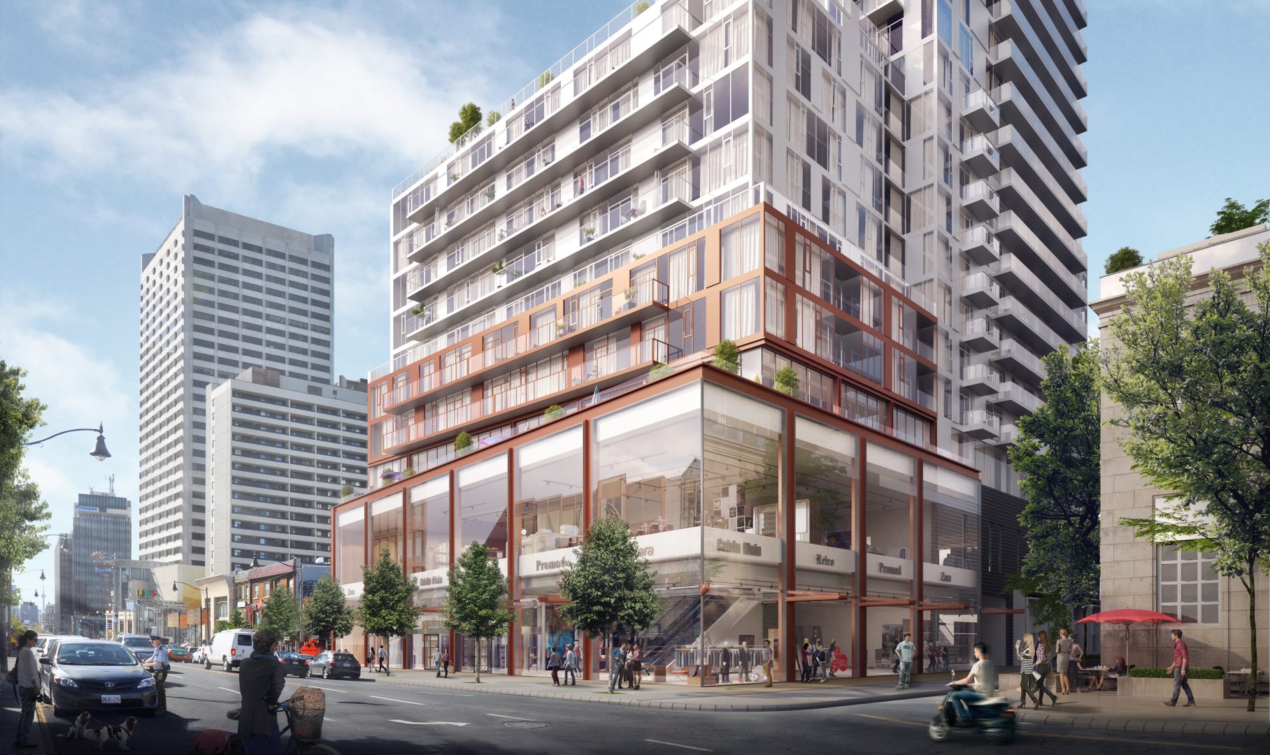
Reddish-brown cladding to the top isn't necessary IMO. If they went with a proper white tone and more articulate spandrel arrangement like the U of T: Woodsworth College student residences, instead of the mint toothpaste we ended up getting, then this would have been a much better looking finished product.
 www.gh3.ca
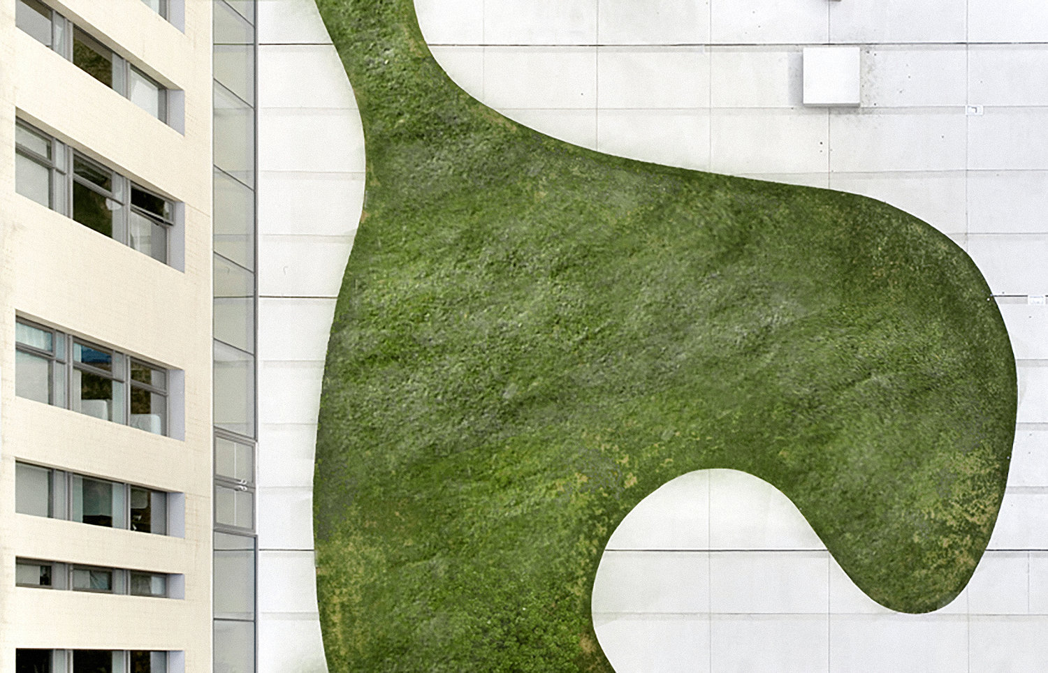
gh3* — Woodsworth College Residence and Academic Building
The Woodsworth College Student Residence is the first building in nearly a century that the University of Toronto has realized along the Bloor Street edge of the campus. The student residence performs a dual role within the urban realm. It stands as a gateway anchoring the north end of the world ren
www.gh3.ca