.dwg
Active Member
I mean, the contrast is so extreme that it is jarring.
The crappy part is Concord Adex. The well-done part of it is a different developer.
I mean, the contrast is so extreme that it is jarring.

They are going to use them for coin parking meters....LOLToronto's signature, sidewalk treestumps are pretty monstrous too. Another A+ for our public realm.
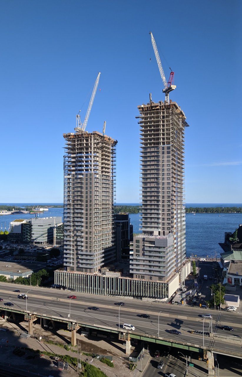
I much prefer these to the Daniels Waterfront towers or Minto's Yorkville light grey million-mullion special.
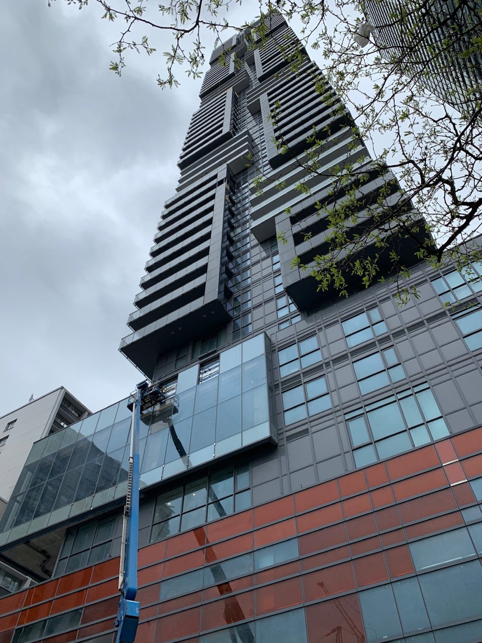
Daniel's """City of the Arts""

Daniels Waterfront - City of the Arts | 156.05m | 45s | Daniels | RAW Design
This is just about the worst advertisement for Daniels. Even Wallman was smart enough to put their offices in one of their best buildings (Tableau). Daniels on the other hand, preferring to save their best projects for places like Erin Mills, decides to include their head office in a project...urbantoronto.ca
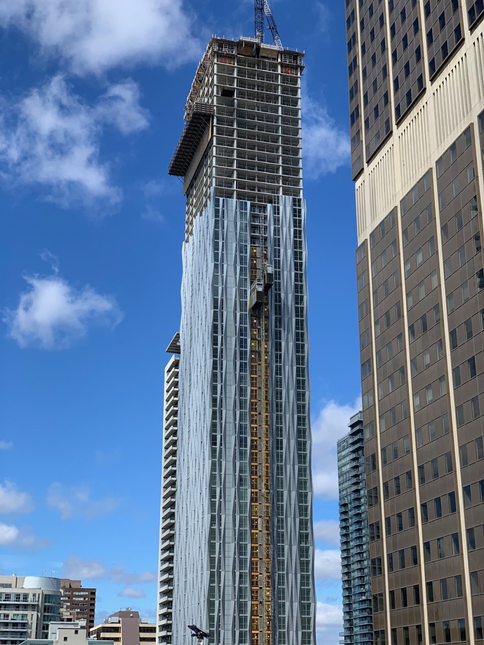
Canderel's YC Condos

YC Condos -- Yonge at College | 198.42m | 62s | Canderel | Graziani + Corazza
Today:
Bazis's One Yorkville

Tridel's Form Condos

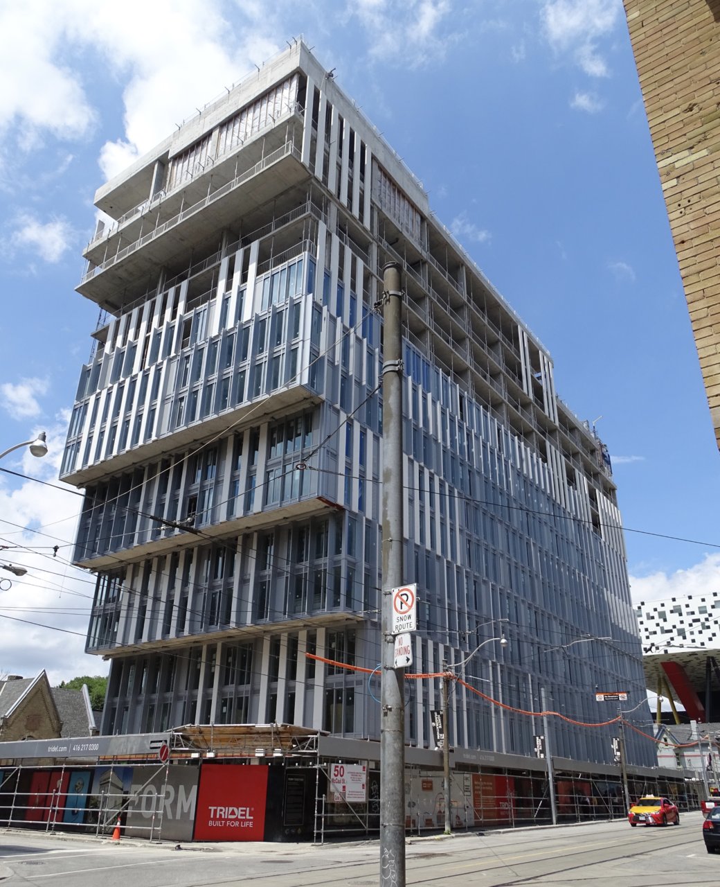
Form Condos | 50.59m | 14s | Tridel | a—A