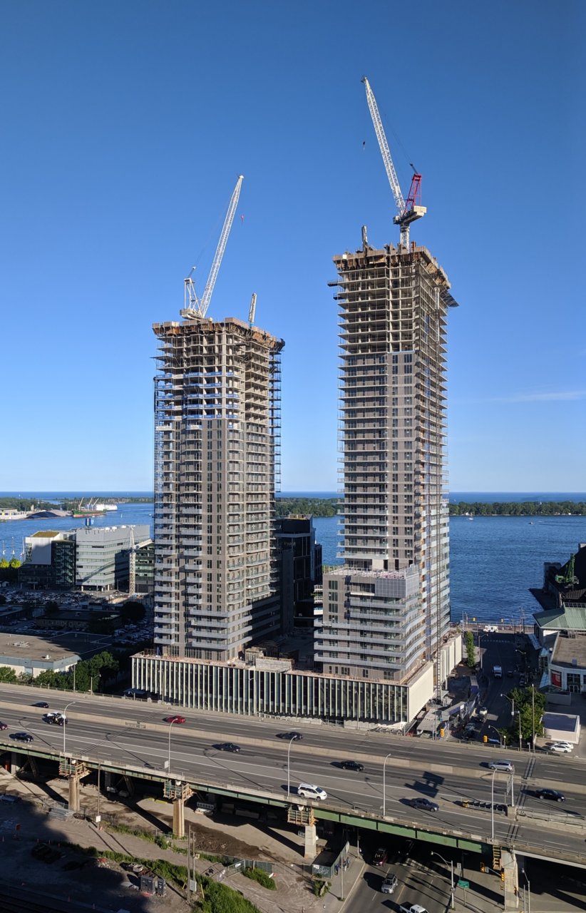
Toronto West Block Est. 1928, The LakeShore, and The LakeFront | 130.75m | 41s | Choice Properties | a—A

I'm going to say heresy, but I think the proportion of the windows (not floor-to-ceiling) + the consistency of the facade (no stray floors of spandrel like on 1 Yorkville and some Tridel projects) + the greater contrast between the darker glass and white spandrel makes it work slightly better than other white spandrel towers (i.e. 300 Front) as here, the white spandrel no longer reads as space that's supposed to be glass, but instead as a separate design element.

Obviously they could have done much better, of course. Definitely agreed that a fritted balcony glass would have helped, and let's see how the crown turns out.
 
I was walking down Niagara St. yesterday evening and glanced up and saw these towers, wasn't expecting to see them from there, monstrous.

193747
 
Unpopular opinion but I still don't mind these towers. I think the white is nice enough for a tower like this and provides a good contrast to the majority dark or blue that surrounds it. The spandrel is placed well, too. At least to my eye.

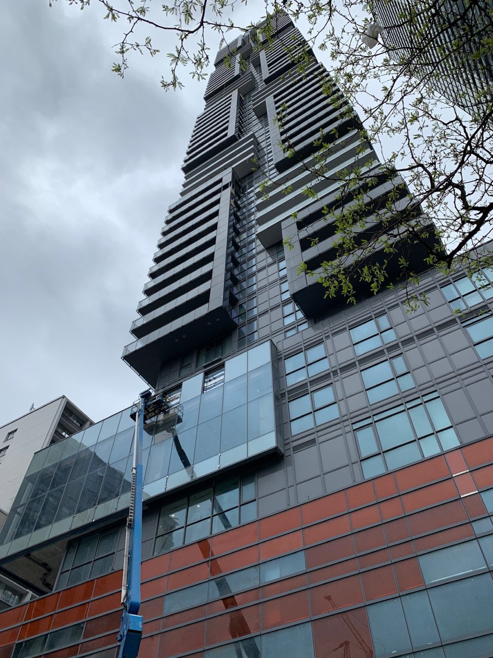
I much prefer these to the Daniels Waterfront towers or Minto's Yorkville light grey million-mullion special.
 
I much prefer these to the Daniels Waterfront towers or Minto's Yorkville light grey million-mullion special.

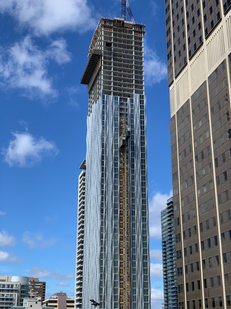
Pretty much- that light grey spandrel+mullion dinner special is especially awful as some sort of lukewarm attempt at blending in with the glass. It's neither-nor, and also fails at reflecting its context (too light). As a result, it usually feels very cheap and plasticky.

Worse is when the spandrel and window spacing is inconsistent, meaning that there's no rhythm across the facade.

Looking at this project again- the architects of record are IBI Group right? Some of their recent window wall projects (i.e. the Livmore) have turned out decently well IMO, as they seem to use window wall as window wall, and not a substitute for an all-glass curtain wall.


Some wonderful recent instances of the architectural deceit of pretending a spandrel wall = a full glass wall. Wasn't the whole point of the modern movement to accurately make the facade reflect both the program and the materiality? Here, there's a fundamental disconnect between the design intent, and the interiors.

Furthermore, the insistence of having a design that reads as a glass wall, and a refusal to pay for even something that can attempt to replicate said design (i.e. shadow boxes, reflective spandrels) produces a square-cube-in-round-hole situation that's deeply unsatisfying from a design point of view.

Daniel's """City of the Arts""
9513-50470.jpeg


img_20190630_190212-02-jpeg.193280


Canderel's YC Condos
urbantoronto-1511-32679.jpg


9545cf70-7871-49d0-83c1-32063f13dd59-jpeg.189091


Bazis's One Yorkville
urbantoronto-9081-31211.jpg


5e54a1d2-aca4-45cd-94f9-57472eff0f18-jpeg.182871


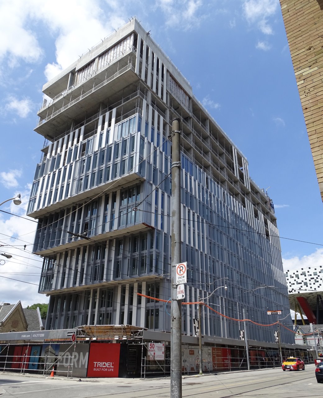
Tridel's Form Condos
7414-68168.jpeg


fullsizeoutput_276b-jpeg.191682

 
Last edited:
Do we assume that this area of the Gardiner will be given a little bit more than a fresh luck of paint as soon as Concord is done with the building structure here, and the City can move in the equipment? I would do that before finishing off the cladding of the new buildings.

42
 
It's not that you made them look good in those shots @G.L.17, but somehow you made them not look terrible! Impressive!

42
 

Back
Top