Toronto West Block Est. 1928, The LakeShore, and The LakeFront | 130.75m | 41s | Choice Properties | a—A

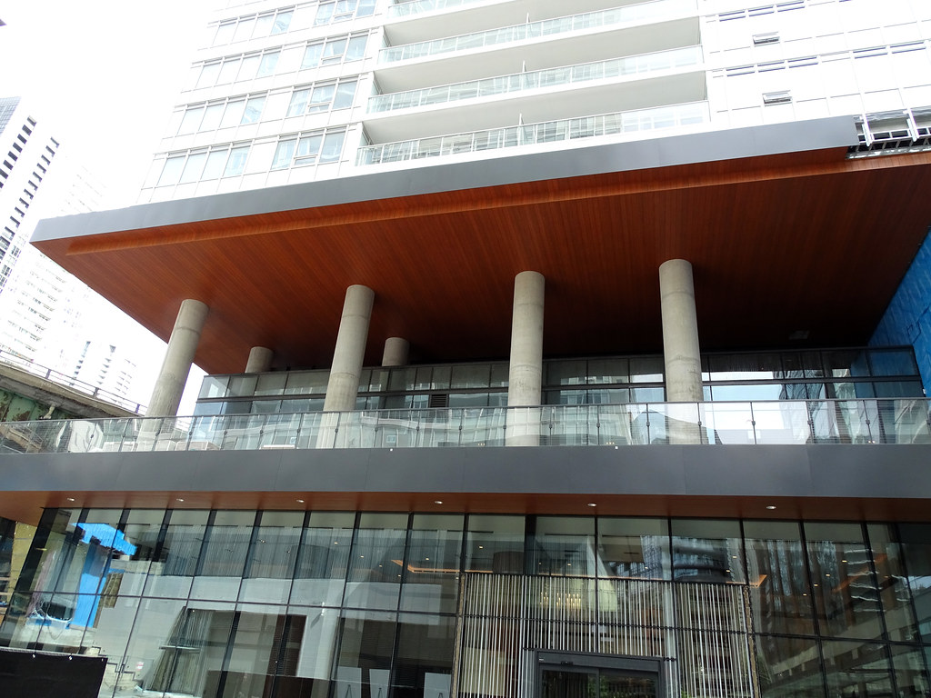
I dont think i'll ever forgive Concord for screwing what could've been a perfectly designed complex. How we can go from a 10/10 on one side, to a 1/10 on the other will never cease to amaze me.
I would of put it at -1/10. And one of those projects that looks okay if you don't look up too much. /sigh
 
I dont think i'll ever forgive Concord for screwing what could've been a perfectly designed complex. How we can go from a 10/10 on one side, to a 1/10 on the other will never cease to amaze me.
Well it's a different owner and architect, for starters...
 
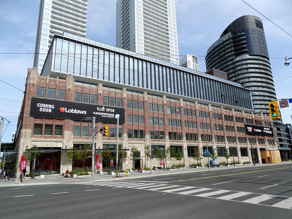
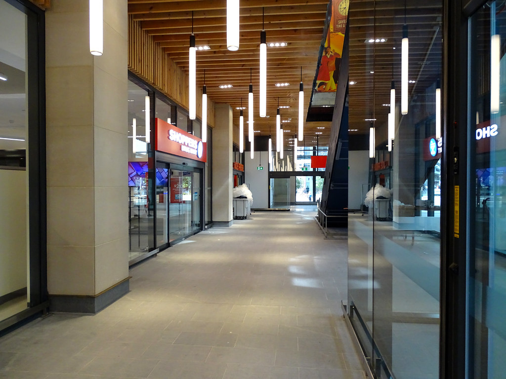
The clerk at the now opened Shoppers said Loblaws will open in two weeks.
 
Sun Sep 6, 2020

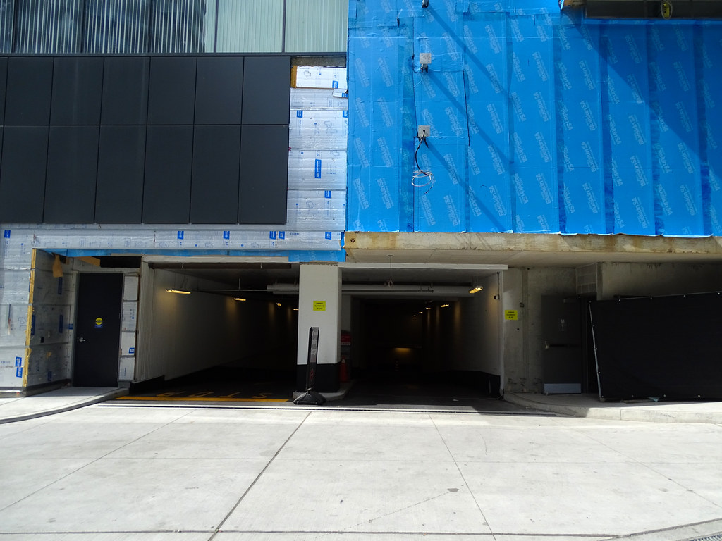
North and South entrance pics

C1451193-8654-4EDB-B11A-F4AE11D6AE3F.jpeg


88E37295-F117-4AFC-BA93-0951A35807AB.jpeg


667CABED-EA08-4C1D-BC63-7E3B4B29F084.jpeg


2F82E2F9-172F-4D7E-B53C-976B32640FFB.jpeg


E27F79AE-2BE4-4BA4-AA6E-723C2CBB3DE2.jpeg


07D7055E-F8C9-4F71-9D66-F84FC05B8FC1.jpeg


23CBA1C5-4ED1-4254-BEF5-63BA30A70658.jpeg


B1272CA5-26EA-4325-989E-13E559BAB397.jpeg


B24470AF-56BC-41B6-80FC-13A8C7AE82B3.jpeg


5027E9FF-5652-4C7C-8324-66EFE15A0087.jpeg


A44715BF-1260-4F21-B4AC-5D3F357DAAC7.jpeg


7C1AE27F-81A6-4111-B6ED-079DECB74031.jpeg
 
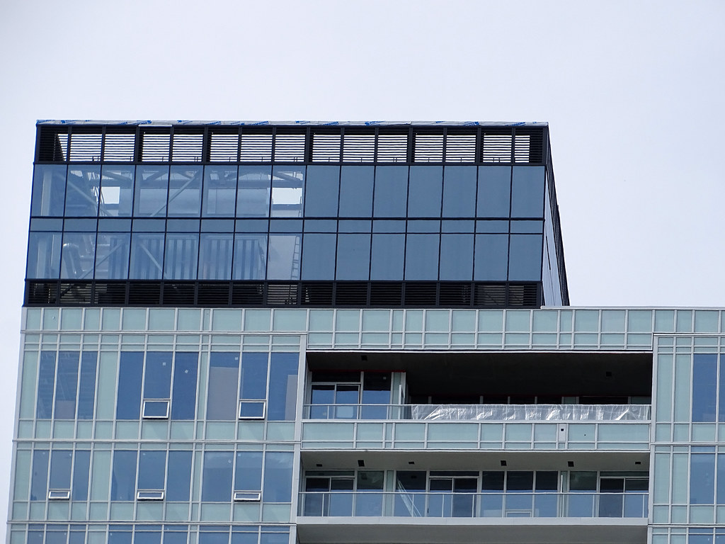
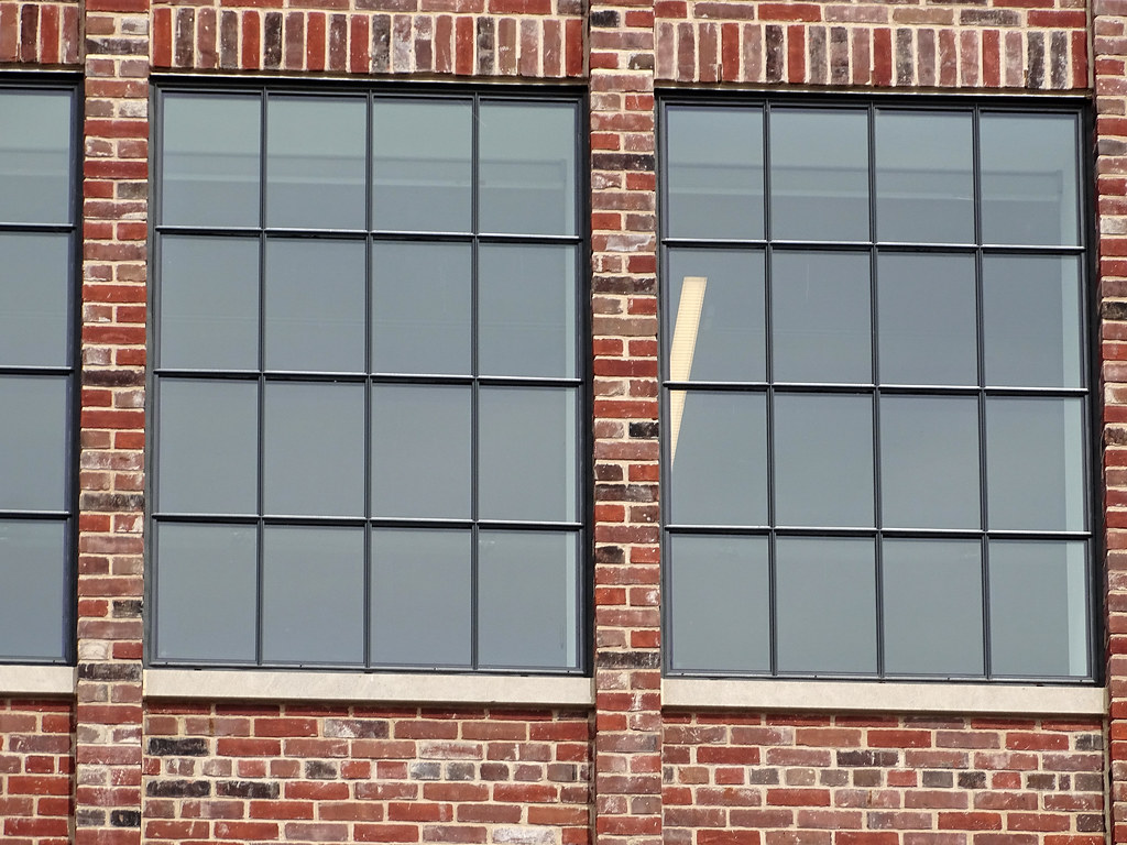
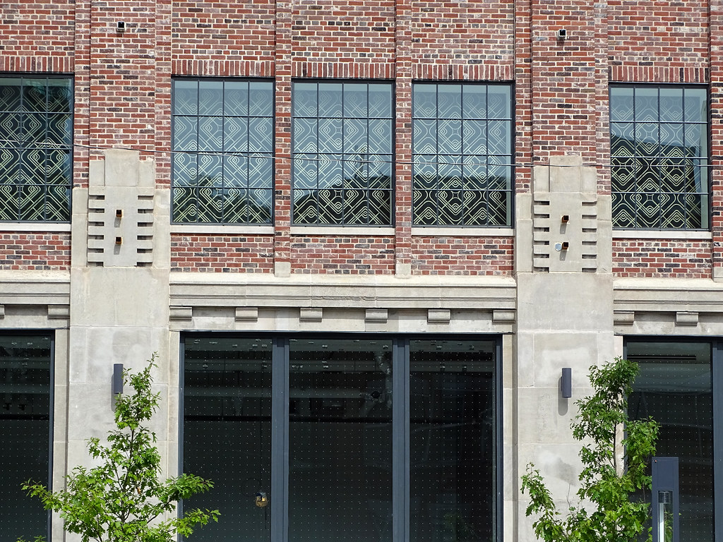
Shot the site today and impress with the out come of the old building. Based on what I was seeing early on with the window cause me some concerns, but end up not been bad as I fear. I wish they did the same thing with the 3rd floor window as the other 2 floors. Not a fan of the extension to the building. This is one if not the best rebuilt heritage face building I have seen so far. Not a fan of using only a part of a building to the point it would have been better to scrap it 100%. The BA tower is a good example of this,

As for bike parking, I hope it gets install as people will be biking and this goes against the car think mind that people will drive to shop there than walk or bike.

The whole project is an example of too many architects and owners working on one project when it should been one with a main architect calling the shot on the other projects.

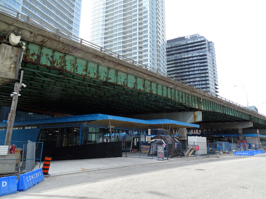
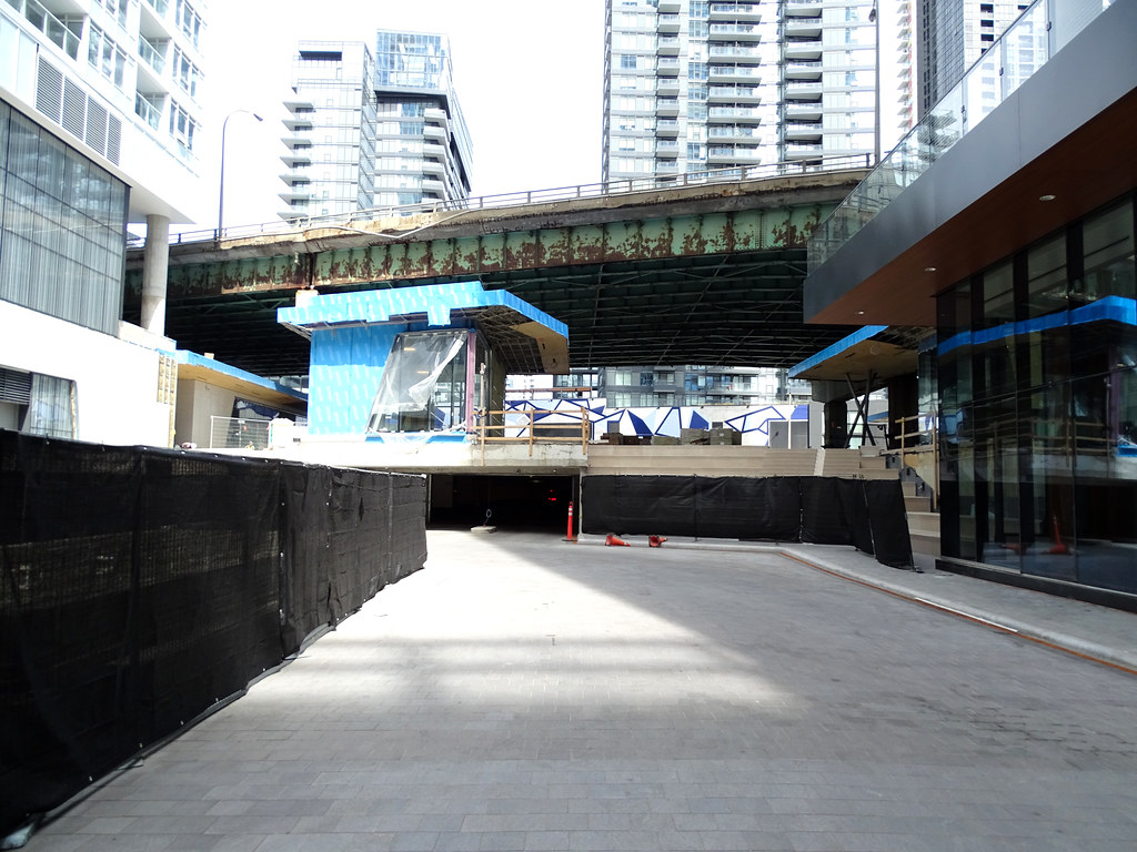
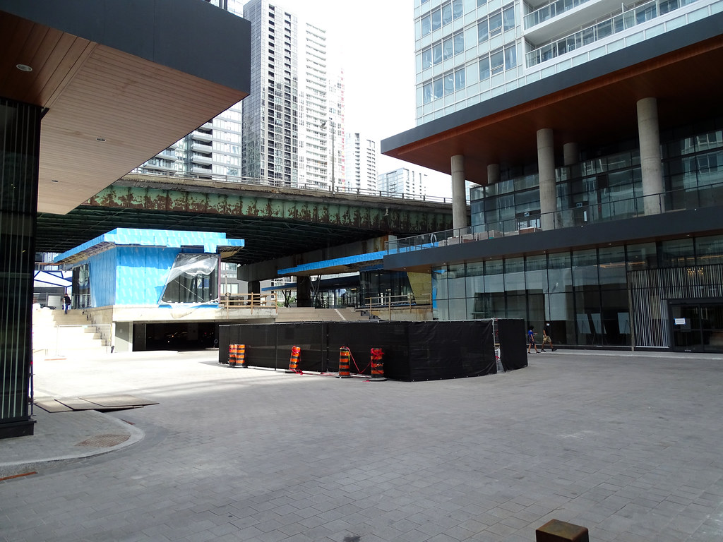
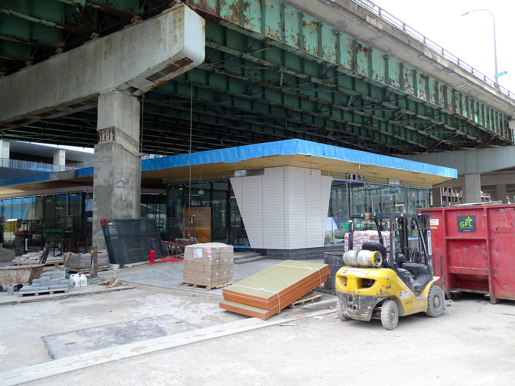
The buildings under the Gardiner is a good idea, but lost what they are and the look of them. Not a fan of the towers.

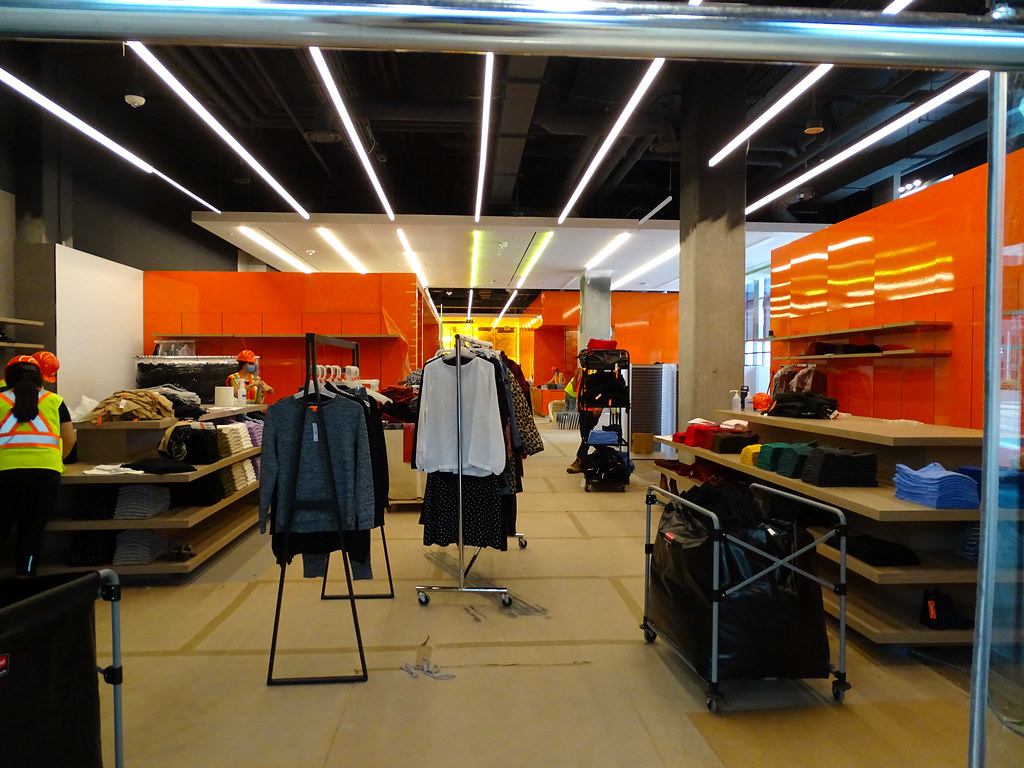
The workers look out of place at Joe Fresh with their hard hats and safety vest on while stocking the display.

They had people on due for the Public Parking and no signs saying they exist at this time. Also, the area is unfinished.

Will post when I get to them as I end up shooting a lot more than I though and will take time to stitch them as well tag them.
 
No bike parking out on the street for whatever reason. I wanted to check it out quick but couldn’t find anywhere

It's all in the central plaza - there's 50 bike parking spaces in there specifically for the retail
 
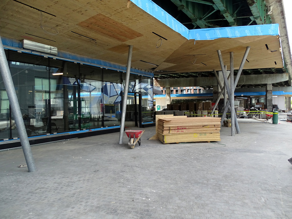
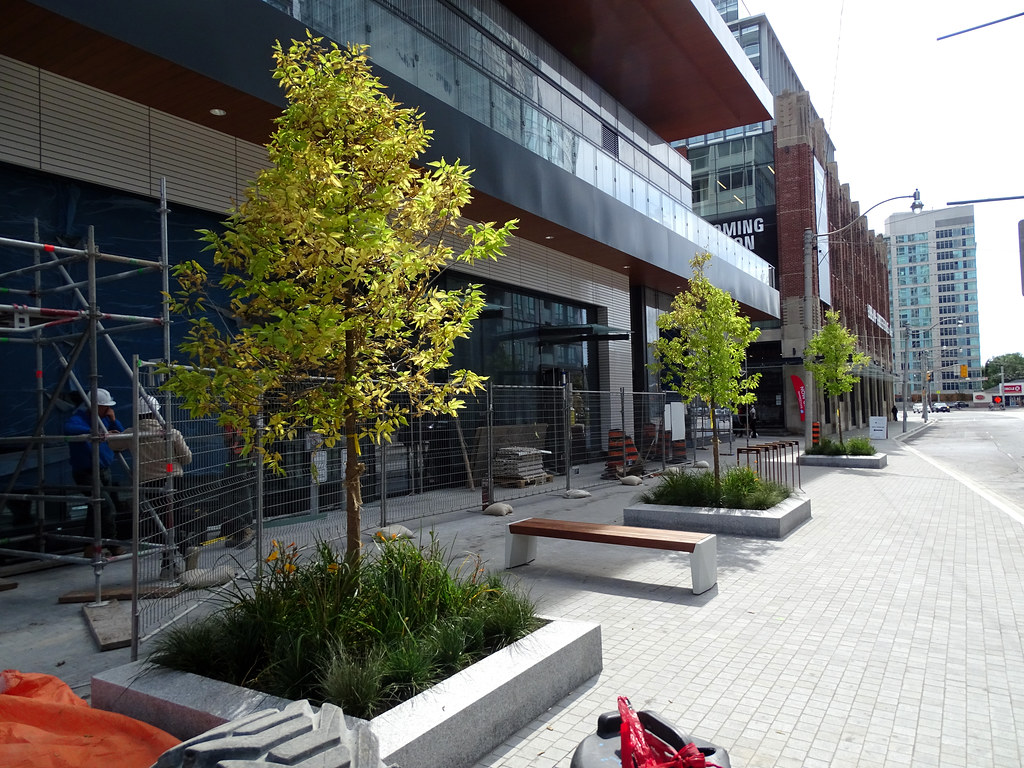
The interiors are a pleasant surprise. There's even a proper ceiling; never thought we'd see a day when that was optional. The double row trees is great although I'm surprised they didn't think to bury the overhead wiring. They're in a bizarre spot too. You don't put a lamp post in the middle of a sidewalk. If that's where the electrical below is, you move it. It would be nice if we built things right the first time around.

It does look worth the trip though. They did a good job on the interiors.
 
Last edited:
Looking at Drum's bottom photo, I note that there is a section of exposed rebar on the bent support for the Gardiner and the rest of the concrete does not look too good either. No doubt the City will finally get round to dealing with these bents (and the road itself) in that section but it REALLY might have been easier for everyone if they had done the section of the Gardiner work directly above this site BEFORE it was finished.
 

Back
Top