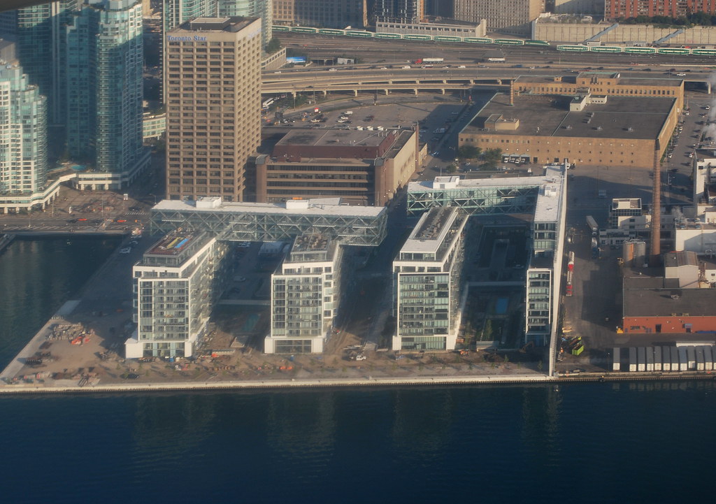
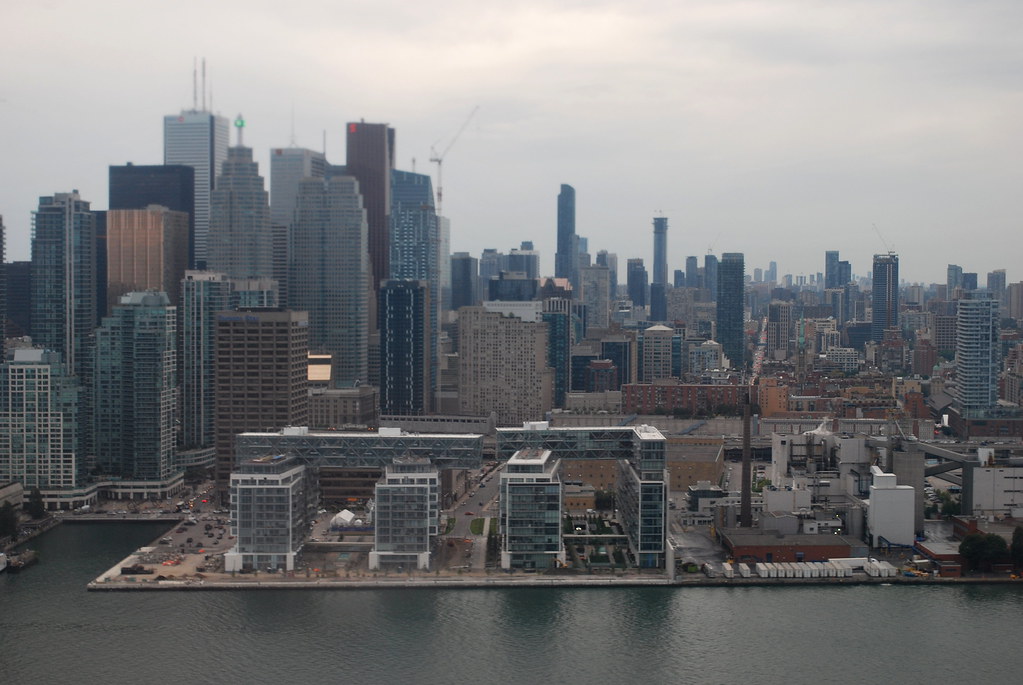
Toronto Waterlink at Pier 27 | 43.89m | 14s | Cityzen | a—A

They probably should be waiting, at this point, for the beginning of fall.
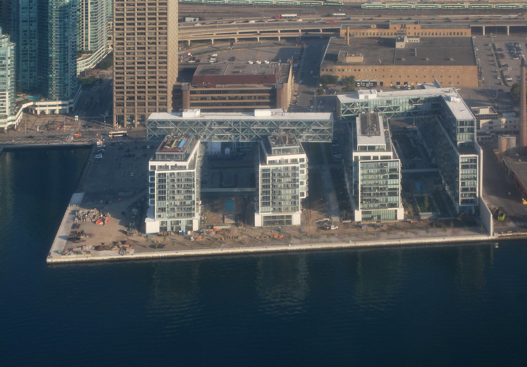
Fall will be here sooner than you think. This heat will break shortly and cooler times will be upon us.
 
They've started putting these pieces on the first two buildings. Do not look like the renderings. Orange?
image.jpeg
image.jpeg
 

Attachments

  • image.jpeg
    image.jpeg
    2.7 MB · Views: 1,529
  • image.jpeg
    image.jpeg
    1.1 MB · Views: 1,428
I'd consider that quite close to the renderings:

Waterlink1ExtAer960.jpg
WaterlinkTowns960.jpg


42
 

Attachments

  • Waterlink1ExtAer960.jpg
    Waterlink1ExtAer960.jpg
    250.7 KB · Views: 1,380
  • WaterlinkTowns960.jpg
    WaterlinkTowns960.jpg
    268.6 KB · Views: 1,373
I don't know about you guys, but I do not find these criss-cross glass boxes attractive at all, considering their prime location at the edge of the waterfront.

What's even more horrible is the 2nd Phase Taller tower which looks like a messy pile of blank Glass slabs which will be a fixated ugly structure at the waterfront till the end of time.
 
Last edited:
I don't know about you guys, but I do not find these criss-cross glass boxes attractive at all, considering their prime location at the edge of the waterfront.

What's even more horrible is the 2nd Phase Taller tower which looks like a messy pile of blank Glass slabs which will be a fixated ugly structure at the waterfront till the end of time.

I don't like the 'glass boxes' as you put it, but I find the upcoming tower pretty interesting. The current condo's, when walking by just looks very busy and unappealing to me. I think from afar the overall shape is not so bad though.
 
I don't know about you guys, but I do not find these criss-cross glass boxes attractive at all, considering their prime location at the edge of the waterfront.

What's even more horrible is the 2nd Phase Taller tower which looks like a messy pile of blank Glass slabs which will be a fixated ugly structure at the waterfront till the end of time.

I'm a big fan of that criss-cross action. A nice bit of dynamism that flies in the face of staid, formulaic glass box construction. The spans across the tops are particularly cool. Be nice to own a suite in there. As for the tower, I don't find that ugly at all. I quite enjoy these contemporary nods toward angularity.
 
I walk around there often and have viewed a number of units as well. The design of this project has been divisive among my friends. Some love it, many think it is too busy and looks old.

I do like the architecture overall, but mostly from a distance. Up close from the street, the buildings have a big grand presence. The 'top' sections are impressive. The buildings look great from the water.

However, I'm not a fan of how the balconies look up close. It creates a cluttered feel and I could almost imagine lots of clotheslines with white shirts and briefs blowing in the wind. There aren't any of course, but the design elicits that sort of image for me.

Going inside some of the units, I would say that only the very best units near the water and Western water facing side give good bang for the buck, and that's a lot of bucks! The units that face each other do not give me a sense that I'm getting what I would pay for considering the prices. The water views from these are 'ok', but not the best. The Harbour square cluster of condos offer better views at a slightly better prices in my opinion. Layouts are a bit tight in the sub-800sqft range. I've viewed 2 larger units on the Western side, and they have fantastic layouts and views...for well over $1.5M.

I'm 'ok' with the new tower. It's a bit plain for my tastes, but not terrible.
 
However, I'm not a fan of how the balconies look up close. It creates a cluttered feel and I could almost imagine lots of clotheslines with white shirts and briefs blowing in the wind. There aren't any of course, but the design elicits that sort of image for me.

Thanks, that's a lot of what I wanted to convey in my previous post but failed to put into words. Walking by, I just don't like how the buildings turned out. It looks very busy and cluttered as you so well described.
 

Back
Top