You are using an out of date browser. It may not display this or other websites correctly.
You should upgrade or use an alternative browser.
You should upgrade or use an alternative browser.
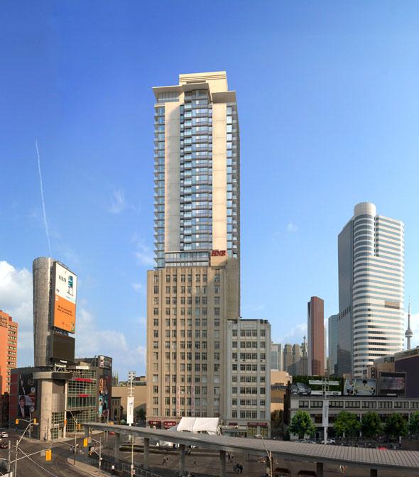
Toronto Velocity at the Square | 122.52m | 40s | HNR | P + S / IBI
- Thread starter Mike in TO
- Start date


Gphorce
Active Member
What even is that material? It looks like the surface of a golf ball.
someMidTowner
¯\_(ツ)_/¯
Precast concrete with small indentations.What even is that material? It looks like the surface of a golf ball.
torontologist
Active Member
Do our developers have so little pride in this city that they won't even pick attractive colours for their spandrel monsters?
Another reason to avoid Dundas Square
Another reason to avoid Dundas Square
stjames2queenwest
Senior Member
Ya I don't understand if using spandrel why not use attractive colours
Torontovibe
Senior Member
Do our developers have so little pride in this city that they won't even pick attractive colours for their spandrel monsters?
Another reason to avoid Dundas Square
YES!
maestro
Senior Member
Do our developers have so little pride in this city that they won't even pick attractive colours for their spandrel monsters?
Another reason to avoid Dundas Square
Less about attractive colours and more about better colour matching.
This is an amateur production here and, in those cases, you never know what to expect.
maxpower
New Member
Out of curiosity, what other options do they really have in terms of color? I'm genuinely curious as to which direction you guys would take, assuming that you couldn't change the design of the structure itself but had some say in the colors of spandrel being used.
maestro
Senior Member
http://www.uniglass.com.sa/english/index.php?pa=prod_1_6
See matching spandrel to vision; a step I would say most residential developers don't really budget for partly because buyers don't seem to care.
See matching spandrel to vision; a step I would say most residential developers don't really budget for partly because buyers don't seem to care.
Bogtrotter
Senior Member
I think it would have looked more appealing had they matched more of the spandrel to the reflective vision glass- perhaps carrying it horizontally across. Another element that doesn't quite work is the pinkish siding. What is that anyway- precast? If it was matched more closely to the HNR building or even Pantages it may appeal more. I don't have issue with the precast entrance, had they used that instead of the pink siding it would be more harmonious all around. It has turned out to be a bit of a mishmash, with the more palatable east side of the building not viewable from busy Yonge or the public square- which is unfortunate.
maxpower
New Member
Thanks for the responses! Is there a higher cost associated with matching spandrel to vision? Why not just do that? I agree that would look a hell of a lot better than this crossword puzzle look they now have.
Light
Active Member
It's not "bad, bad", neither is it a master piece. But after all, it's in the perimeter "background" of Toronto's flashiest (literally with all those nearby giant screens) area. So a more muted design scheme probably made sense.
ponyboy
Active Member
the render from the database had a much nicer yellow precast, lighter grey spandrel, and better incorporated the mechanical box. Maybe it will look better when finished.
maxpower
New Member


steveve
Senior Member
Today:
