You are using an out of date browser. It may not display this or other websites correctly.
You should upgrade or use an alternative browser.
You should upgrade or use an alternative browser.
Toronto Velocity at the Square | 122.52m | 40s | HNR | P + S / IBI
- Thread starter Mike in TO
- Start date
Toux
New Member
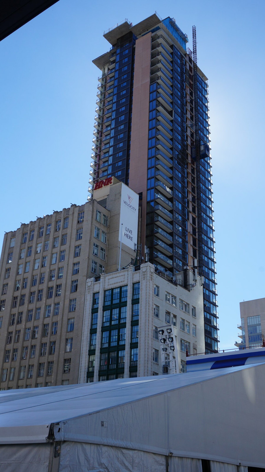
While it certainly isn't an architectural gem, I don't see anything inherently awful about the ground floor. It looks like it is largely vision glass, has double height ceilings, retail frontage (hopefully not a bank/nail salon/subway, (insert other standard Toronto condo retail)...), and from earlier photos has a (relatively) interesting dimpled precast framing the space. Is it great? No. But I would gladly take this over many other recent ground floors we've seen go in around the city.
G.L.17
Senior Member
maestro
Senior Member
While it certainly isn't an architectural gem, I don't see anything inherently awful about the ground floor. It looks like it is largely vision glass, has double height ceilings, retail frontage (hopefully not a bank/nail salon/subway, (insert other standard Toronto condo retail)...), and from earlier photos has a (relatively) interesting dimpled precast framing the space. Is it great? No. But I would gladly take this over many other recent ground floors we've seen go in around the city.
It's just really boring and commonplace with a fair amount of spandrel too.
It's not just really boring and commonplace with a fair amount of spandrel too. It's so much less/more too.
42
42
Bogtrotter
Senior Member
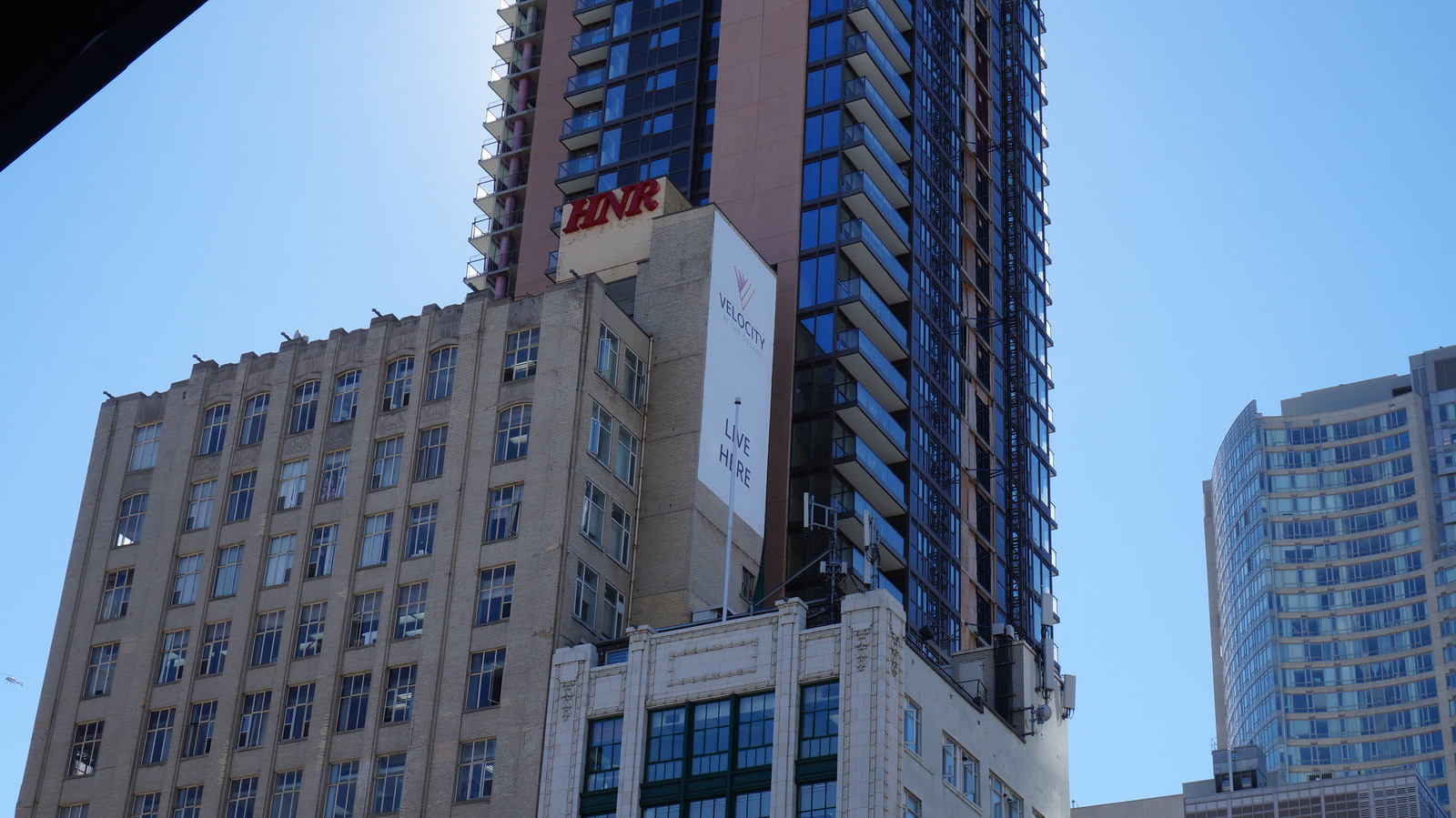
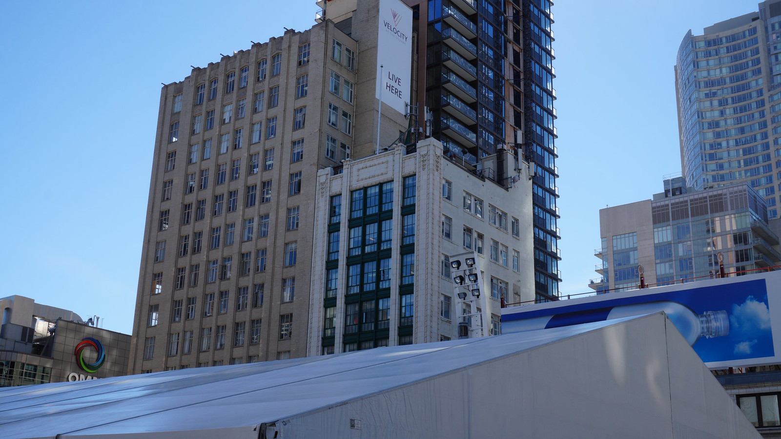
I think the east facade and entrance are fine- simple and tasteful. The rest of the building is more on par with 300 Front aesthetically, the bottom line and economy prevail. A shame too considering its prominent location behind a historical building- people, particularly visitors, tend to look up and around in this area.
khris
Senior Member
The crane is coming down today.
rdaner
Senior Member
agoraflaneur
Active Member
TheKingEast
Senior Member
zcczcczcc
New Member
I think what bugs me most about this building is the name. "Velocity" would imply some sort of action, movement or excitement... this building has none of that.
P23
Active Member
I think the east facade and entrance are fine- simple and tasteful. The rest of the building is more on par with 300 Front aesthetically, the bottom line and economy prevail. A shame too considering its prominent location behind a historical building- people, particularly visitors, tend to look up and around in this area.
Yeah, it's odd. The best side of the building is facing Victoria and not the square. I'm hoping they cover it up with static ads or something, that would be an improvement.
maestro
Senior Member
It just gets better and better. A monstrous elevator overrun most likely to be covered by pink stucco surrounded by fenced in cooling towers and a diesel generator.
Automation Gallery
Superstar
Hahaha oh well, unless you're a bird not many will notice itA monstrous elevator overrun most likely to be covered by pink stucco surrounded by fenced in cooling towers and a diesel generator.
maestro
Senior Member
LMAO >> you don't know how to fly?!?


