Toronto Union Station Revitalization | ?m | ?s | City of Toronto | NORR

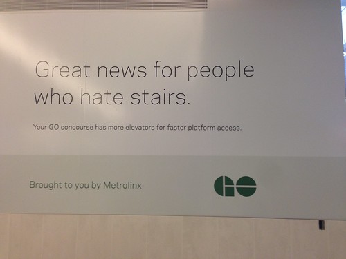
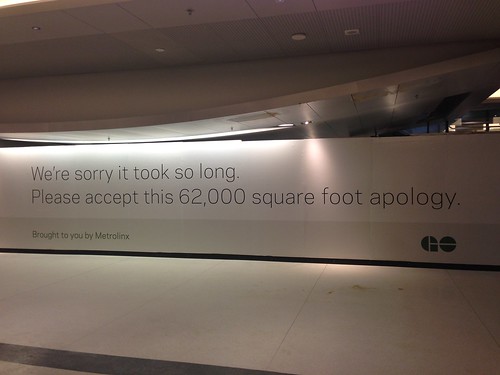
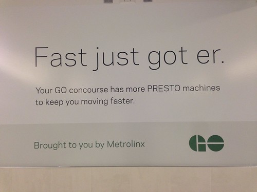
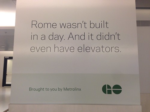
I went today to check out the new concourse this afternoon. My excitement for this day has been tarnished by the news about the Sheppard LRT, but at least Metrolinx had some good sense of humour to cheer me up. I triple-checked every nook and cranny to make sure I didn't miss any of these messages:

17295370825_84e603672d.jpg
17293538742_f8824a876a.jpg


17109161629_7a85778c9c.jpg
17109161379_b433d923a5.jpg


17087923037_78f7086b98.jpg
17295369635_8efaf4020a.jpg


17269419196_f6d981e8dc.jpg
16675124033_3be6971cc5.jpg
 
Thanks for the doing those quick mock-ups. I feel that with the orientation, and linearity of the signs, that option C is actually the best one to go with. If the signs were more rectangular and squarish in proportion, the circular elements would fit in better, especially since you would be able to make circles around arrows and numbers etc - for legibility's sake. That I agree the division as it stands is not good enough.

Already tweeted direct link to the above forum post which links directly to this thread. So Metrolinx'll read the replies, too. It's easy mods to existing signs (e.g. applying white stickers) ... I'm sure there's nearly-unamious agreement as almost everyone I asked, agrees on better separation between left/right halves.

Metrolinx does read their tweets and does the "essential/cheap items" rather quickly if they have direct control.
- They removed a forgotten "no parking" sign at Aldershot (my tweet, Metrolinx replied!) after a parking lot expansion
- They fixed a malfunctioning videoboard at Long Branch (my tweet).
...all because I tweeted to them!

As for further photoshopped mockups, I'll do some more tomorrow based on your forum suggestions (hint: Metrolinx, keep checking this thread daily, pass this thread around your office!). So, quick, fire your wayfinding suggestions away! Ideally, they should be quick cheap modifications of the existing signs. Redesigns are welcome for brainstorming (though I may not have enough time to photoshop those mockups, and Metrolinx may take longer/never for difficult suggestions).

(Yes, I like Suggestion D; the curves remind me of the "GO" logo)
 
there are doors to the TTC that do not require you to enter Bay (that should be the farthest East you can go inside the station once Bay closes).

Except this access involves stairs. There is presently no simple accessible route to the subway from York or VIA or the Great Hall for that matter, without passing through the Bay Concourse (imagine threading your way down the ramp in front of McDonalds with a wheelchair, pram or heavy luggage) then doubling back to bypass the stairs into TTC, only to find the ramp inside the subway has about four switchbacks.
It's onerous and poorly signed at that. A solution is needed before Bay closes, even if it is partly outside via the west/centre moat.
 
Last edited by a moderator:
The stairs between platform 3 and the Bay West teamway are currently closed. The exits to the skywalk, the stairs and elevator to the York concourse, stairs to the VIA and Bay concourses, and the exit to the bus terminal/Bay East teamway are all usable, but Bay West is boarded up as of today. If they reopen it that would be a great way to connect from York to TTC once Bay closes, but without it platform 3 is not going to be of any real use for connecting to the TTC.

Unless they reopen the Bay West-platform 3 stairs, the best way to go between York and TTC will be the north-side lower-level east-west corridor (the one that is under the great hall) from York to the point just west of the Bay concourse, where there are doors to the TTC that do not require you to enter Bay (that should be the farthest East you can go inside the station once Bay closes). I've attached a picture of the updated Union map (apologies for the shoddy MS Paint hackjob, but I think it shows what it needs) to better highlight that route as well as the currently closed platform 3 stairwell that would otherwise be helpful.

View attachment 45341

If that's the only door that will be open, its going to be *brutal* during the morning rush, with back ups due to crowding. I really hope someone has thought this through.
 
Here's a suggestion I am tweeting to @Metrolinx and @GO_Transit:

View attachment 45337

Also:
- Ideally, add small "8-9" wayfinding sign on the concourse entrance doors between Platform "6-7" and "10-11" entrances in York East teamway.
- Vertically-center all single-line text like "Air Canada Centre". There's inconsistency in other signs -- some single-line-text is vertically centered.

I don't think even your adjustments can save these signs, they're a convoluted mess. Really disappointing since Metrolinx is usually pretty good at this kind of thing.
 
St. Micheal's choir was in attendance in the concourse this morning. Also in attendance was GO's mascot, who has a very unfortunate resemblance to a certain internet meme.

Assuming my train maintains it's regular arrival platform (24 or 25), today was the last day I will use this concourse. I will instead stick with the new York East Teamway. The concourse has an odd walking path from those two platforms, and in the current configuration dumps yuou out in the middle of nowhere in the most. The north-west PATH extension is also kind of a time waste in it's current stub form. It might be useful if it started raining as you were on the way.
 
I whipped this up quickly just to show what a mess the original is and to give an idea of how it could be cleaned up.

attachment copy.jpg
 

Attachments

  • attachment copy.jpg
    attachment copy.jpg
    80.4 KB · Views: 1,067
Last edited:
If that's the only door that will be open, its going to be *brutal* during the morning rush, with back ups due to crowding. I really hope someone has thought this through.

There are definitely going to be some pinch points after Bay closes for reconstruction.

I believe there will be an accessible route from the subway via the Front Street Moat to the York Concourse, but it's not open yet as that section of the moat is still being worked on. I have put some calls into the City to find out when that part of the work is expected to be done, and will report back when I hear.

Whenever it does open, it's not going to be an easy passage owing to the amount of traffic I expect it will get. People, at least, are going to be able to choose from a number of different paths in the York Concourse, so patterns will shift somewhat. Routes include across Front Street and through the entry from the Great Hall, across Front Street at York and via the York East Teamway, and under Front Street via the NWPATH to the Front Street Moat west entrance. Can't remember if the tunnel to the Royal York has reopened yet.

42
 
I whipped this up quickly just to show what a mess the original is and to give an idea of how it could be cleaned up.

View attachment 45352

I like that. Particularly the use of the new TTC numbering (not sure why that wasn't included), and the non-duplication of the platform numbers to show wheelchair access. I also like the elimination of the pictograms, except for the ticket counter.
 
I like that. Particularly the use of the new TTC numbering (not sure why that wasn't included)

Except that the TTC logo has been removed! Everything else is identified by its logo. I don't think the line number is necessary on this sign. It's more useful on the signs at the subway station but at this location people would be looking for direction to the subway.
 
Except that the TTC logo has been removed! Everything else is identified by its logo. I don't think the line number is necessary on this sign. It's more useful on the signs at the subway station but at this location people would be looking for direction to the subway.

I think having "1" with "Subway" underneath is far more meaningful than the TTC logo with "Subway" in a smaller font underneath. The 1 draws your attention much more, and is much clearer. People don't really care that the TTC runs the subway, they just want to get to Line 1.

GO can't be identified with the number because the routes don't always stop at the same platforms. Personally, what I'd like to see is, rather than simply the platform number above each door, an LCD screen with the platform number on the top half, and whatever train is arriving next on that platform on the bottom half, and the departure time. Something like this:

13
12:43 Lakeshore West

That I think would help passengers immensely, especially occasional users, to let them know that they're going up the right set of stairs for the train they want to catch.
 

Back
Top