Toronto The Residences of 488 University Avenue | 206.95m | 55s | Amexon | Core Architects

The podium is disjointed, cheesey and very heavy-handed, like its overcompensating for the banal tower above. It doesn't feel like architecture so much as marketing "hook".

Thin out the "branches" and run them up the whole tower to the roof, similar to the Mode Gakuen Cocoon Tower, and maybe it'll work. Otherwise, this is not a worthy replacement for the existing building.
 
Last edited:
Apart from the podium, this thing is so painfully uncreative I really hate what it says about our city.

"Turning everything into a banal glass tower since 1999..."

No thanks.
 
Apart from the podium, this thing is so painfully uncreative I really hate what it says about our city.

"Turning everything into a banal glass tower since 1999..."

No thanks.

On the other hand, our pervasive legacy of boring, ugly and increasingly shabby concrete nonentities from the 60's and 70's - of which the current structure is a good example though by no means the absolute rock bottom - isn't exactly beautiful or creative.
 
There's nothing less creative than all-glass buildings in this city right now.

There is a balance somewhere in there. Heck, a renovation of the building that improves its street-level experience and adds some residential but keeps the existing facade or builds on the motif. In fact, I'd like more brand-new buildings that go up in this city to make use of concrete, and (quality) pre-cast, and composite materials, instead of just glass-glass-glass.
 
Ignoring the historical significance of this particular building for a minute; I agree to a certain degree but I find a glass tower in some areas can do wonder to provide contrast, its not as if this building is surrounded by other glass building, that's key !
 
I love the podium tree-branch structure but hate the rest of the tower. This would be one of my favourite projects in the city if podium design extended all the way to the roof
 
As mentioned in the UT news story, there are maintenance issues with the concrete exterior which probably requires expensive renovation or replacement regardless. And so blame the end users (who desire full views and plenty of natural light) for this being reclad entirely in glass. From a architectural/heritage stage point it's frustrating but it's the new reality for office space.
 
On the other hand, our pervasive legacy of boring, ugly and increasingly shabby concrete nonentities from the 60's and 70's - of which the current structure is a good example though by no means the absolute rock bottom - isn't exactly beautiful or creative.

Actually, as Toronto's premier example of highrise "Yamasaki modern", this one's scarcely in the boring/ugly omnibus wing, except to those Prince Charlesian among us who want to bundle *everything* from that period and in that bode thusly.
OTOH if you want truly boring/ugly spec banality, the quarter-century-newer Air Miles Tower across Dundas fits the bill...

Thusly? You don't have to be Prince Charles to despise brutalist architecture from the 60's and 70's...but it helps.

Duchy Originals all round, chaps.
 
The new proposed base is incredibly heavy-handed, would have worked as a thinner version. I also have reservations about the tower, since it look like curtain wall is along only part of the building with some very busy spandrel covering the rest.

I think this would have better: A very glassy extension of the base of the tower + retain the original pattern on the office tower + new glass tower above it.
 
Thusly? You don't have to be Prince Charles to despise brutalist architecture from the 60's and 70's...but it helps.

Duchy Originals all round, chaps.

He does preside over quick a wonderful purveyor of fine foods, no matter how limited his taste in architecture is. Pity.

42
 
Actually, as Toronto's premier example of highrise "Yamasaki modern", this one's scarcely in the boring/ugly omnibus wing, except to those Prince Charlesian among us who want to bundle *everything* from that period and in that bode thusly.

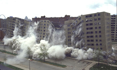
There may be at least a few who feel the high point of "Yamasaki Modern" was this:

Pruitt-Igoe-housing-007.jpg
 
I am pleased to see a building sans spandrel (or so it appears) for a change. The glass Looks great.
 
Last edited:
I'd rather see shape of the existing window panels recast in a new material, or improved enduring concrete, and reinstalled than what this render proposes. Newly done panels, plus a clean, well-done base intervention could make this tower look brand new all over again.
Surely there must be people who work in these buildings who don't really like floor-to-ceiling glass, and might prefer something that encloses them a bit? To alleviate that feeling of vertigo one can get near the edge, etc.
 

Back
Top