You are using an out of date browser. It may not display this or other websites correctly.
You should upgrade or use an alternative browser.
You should upgrade or use an alternative browser.
Toronto The Quay, Tower Three (was Maple Leaf Quay) | 66.44m | 21s | Pacific Reach | BDP Quadrangle
- Thread starter RC8
- Start date
Marcanadian
Moderator
This is heading to the Waterfront DRP on Wednesday:
AlvinofDiaspar
Moderator
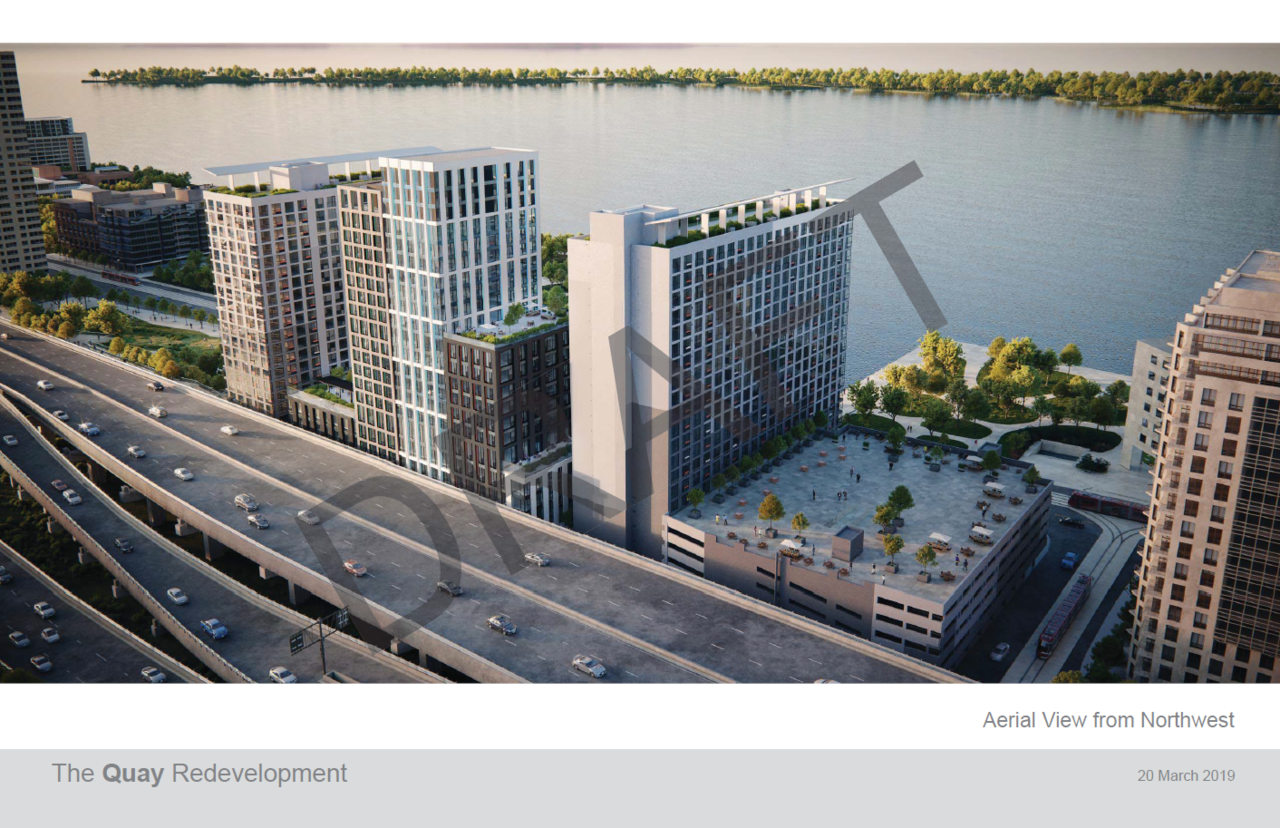
Presentation from the March WT DRP - HUGE improvement:

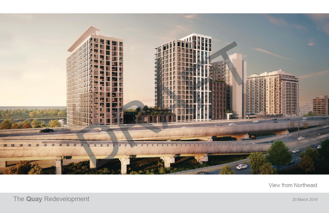
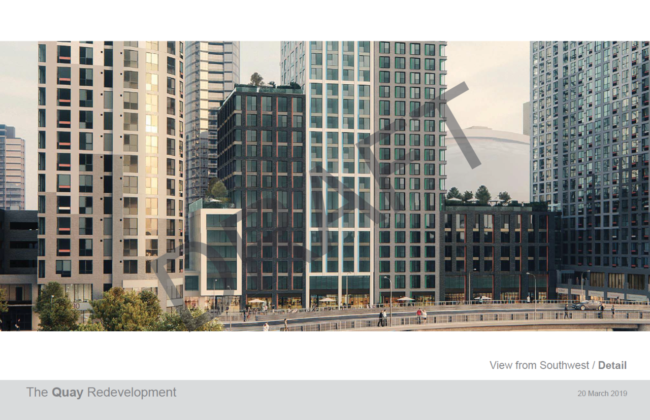
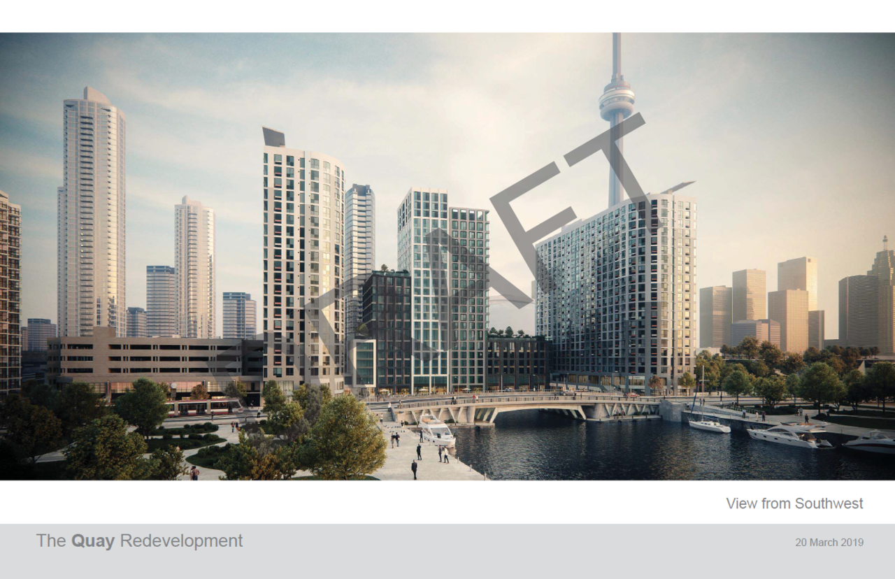
(Pacific Reach/Quadrangle)
AoD
(Pacific Reach/Quadrangle)
AoD
Midtown Urbanist
Superstar
Old:
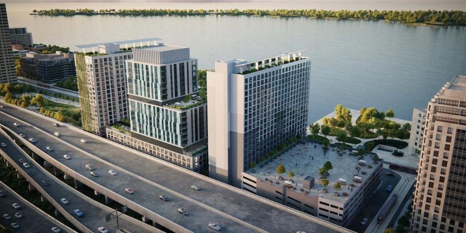
New:
New:
jje1000
Senior Member
I like that the new version breaks up the horizontal forms in favor of vertical lines, and instantly makes the space feel much more urbane.
Now, about that parking garage to the West...
Now, about that parking garage to the West...
Automation Gallery
Superstar
Much better, i assume that garage to the west will be developed one day with something similar
Lachlan Holmes
Active Member
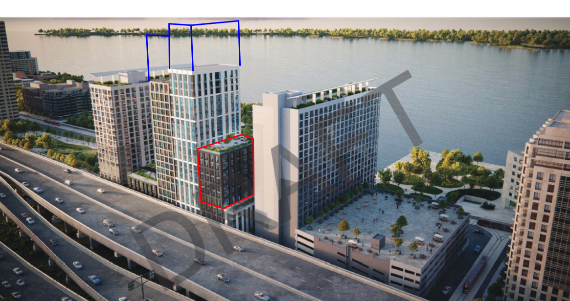
I agree, I like the new styling quite a bit. Personally though, I would've preferred if the west side (in red) was removed and additional height given to the tower (in blue). I can't get over the separation distance differences on the West and East sides.
Marcanadian
Moderator

Application Information Centre
Search for details about current planning applications and Minor variance and Consent applications. Application Information Centre For best results, please use the latest version of Microsoft IE/Edge, Google Chrome or Mozilla Firefox. As of July 30th, the Application Information Centre has...
ADRM
Senior Member
That's better -- I like that they're proposing to break up the massing.
maestro
Senior Member
I agree, I like the new styling quite a bit. Personally though, I would've preferred if the west side (in red) was removed and additional height given to the tower (in blue). I can't get over the separation distance differences on the West and East sides.
View attachment 177825
One of the things I like most about it is the consistent height. I also like the varied massing. I rather see some density lost and a thinner tower if separation is a huge issue. The towers are close together but, there's enough gap. I do think planners may disagree with me.
Contra
Senior Member
Those are some really beautiful render styles. Which we could see more in this style (less lens flare, overexposure and omission of neighboring structures).
jje1000
Senior Member
Personally I think the ground level needs to be more human-scaled and protected from the elements- maybe glass awnings and tree planters would work?
I recall the space is fairly exposed to both the sun and wind.
I recall the space is fairly exposed to both the sun and wind.
concrete_and_light
Active Member
Personally I think the ground level needs to be more human-scaled and protected from the elements- maybe glass awnings and tree planters would work?
I recall the space is fairly exposed to both the sun and wind.
I don't know the conditions here or where the sun usually is so it's conceivable to me that maybe this space will become if anything overly shaded with all the buildings around, but it seems like it might be pretty exposed and I find that in general from parks (aka fields of grass) to streets (wide deserts of concrete) Toronto loves to create big open way-too-sunny hostile spaces. I don't really understand it. I guess people like the sun, but for me going out when it's at all warm always feels like plotting a course between rare patches of shade or being extremely uncomfortable.
Generally otherwise I really like this though, including that possibly too sunny water area. Great to see this car free kind of pedestrian small-scale zone with shops and stuff that also connects with the lake coming in under the street activated even more. It's kind of an interesting space.
Speaking of the cars though, they're out back with a vengeance. It continues to be hilarious to me that Toronto's as a city is like no we *insist* on building a cyberpunk dystopia cityscape where we have a crumbling elevated highway rumbling right next to cheaply-built luxury-priced condos, but it seems like that's where the city is heading whether that's a good idea or not (and hey, I like cyberpunk so I've embraced it lol) so we might as well build right up to it and integrate it. And I just realized it will provide some blessed shade!!
isaidso
Senior Member
Lots of mistakes were made along the lake so it will be interesting to see how they plan to mitigate it. This is a big improvement but I doubt that area near the ferry terminal will can ever recover.. unless they take those buildings down.
jje1000
Senior Member
I don't know the conditions here or where the sun usually is so it's conceivable to me that maybe this space will become if anything overly shaded with all the buildings around, but it seems like it might be pretty exposed and I find that in general from parks (aka fields of grass) to streets (wide deserts of concrete) Toronto loves to create big open way-too-sunny hostile spaces. I don't really understand it. I guess people like the sun, but for me going out when it's at all warm always feels like plotting a course between rare patches of shade or being extremely uncomfortable.
Generally otherwise I really like this though, including that possibly too sunny water area. Great to see this car free kind of pedestrian small-scale zone with shops and stuff that also connects with the lake coming in under the street activated even more. It's kind of an interesting space.
Maybe just a line of trees along the rear of the basin- mainly to soften the lines?
I found the space sort of bleak-feeling when I was there- it felt like a semi-enclosed circle of brick and concrete pavers that was sort of windy, empty and barren. I also wonder if there might be some opportunity to remove the railings and have some stairs down into the water.