Marcanadian
Moderator
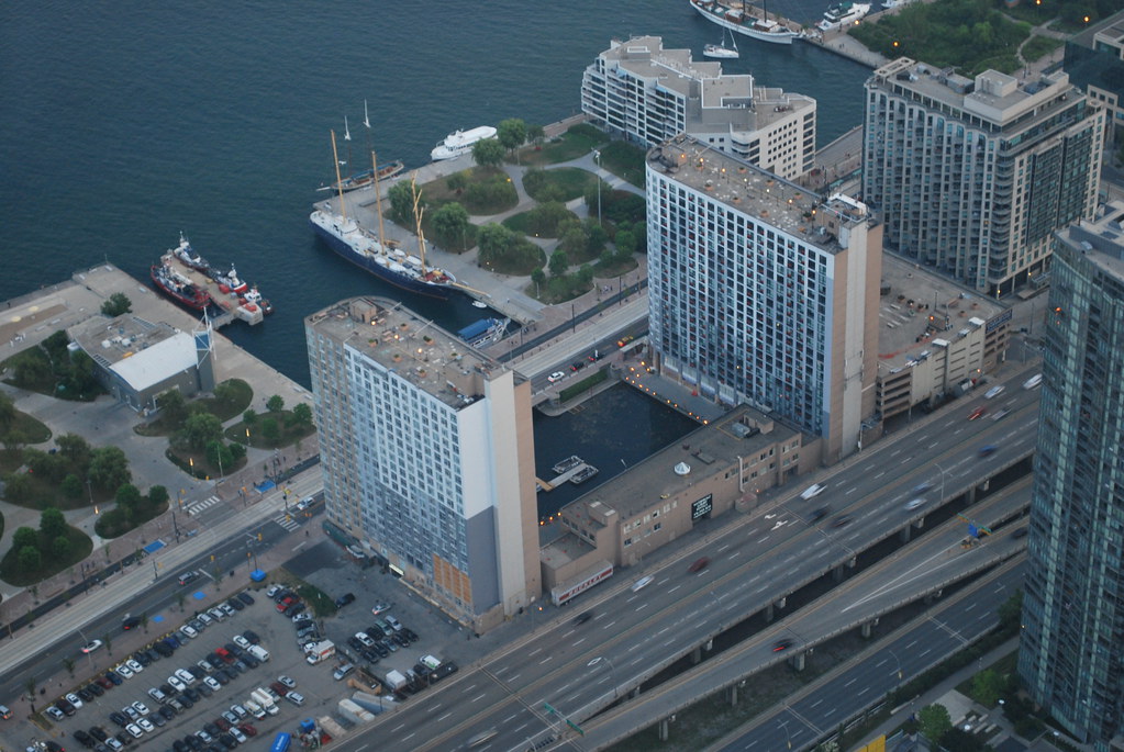
 Toronto by Marcus Mitanis, on FlickrToronto by Marcus Mitanis, on Flickr
We've got a front page story up on the recladding here.
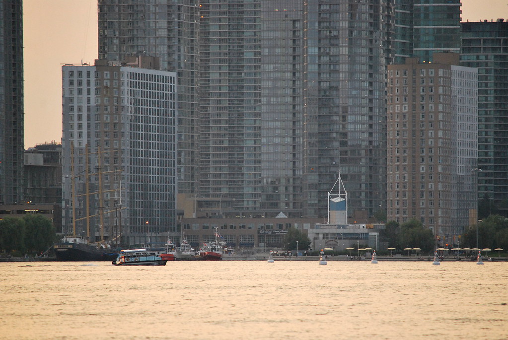
Here's the receding-evening-light-but-not-quite-sunset view of these buildings from Queens Quay a few evenings ago:
42
 CN Tower by Marcus Mitanis, on Flickr
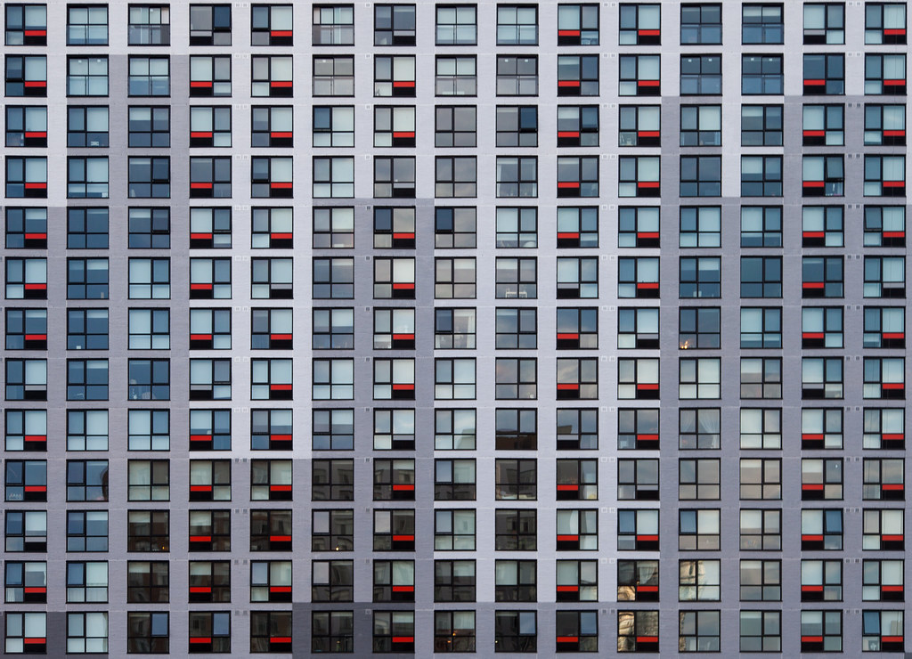 Maple Leaf Quay
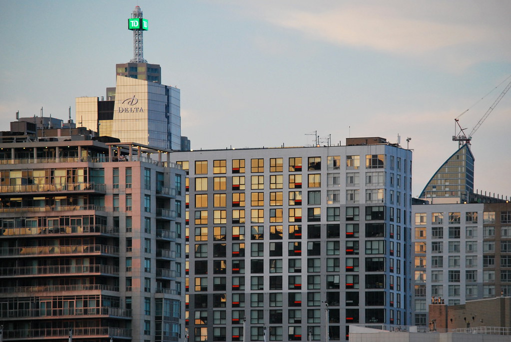 Toronto


