Tuscani01
Senior Member
Kidding!
I did know the son through some friends who lived in the building. Didn't ever try the restaurant until the son took over. Didn't really like it anyway and wasn't surprised that it shut down. Seemed like they were closed more often than they were open even before they closed down.
I did know the son through some friends who lived in the building. Didn't ever try the restaurant until the son took over. Didn't really like it anyway and wasn't surprised that it shut down. Seemed like they were closed more often than they were open even before they closed down.


 Concord CityPlace
 Maple Leaf Quay
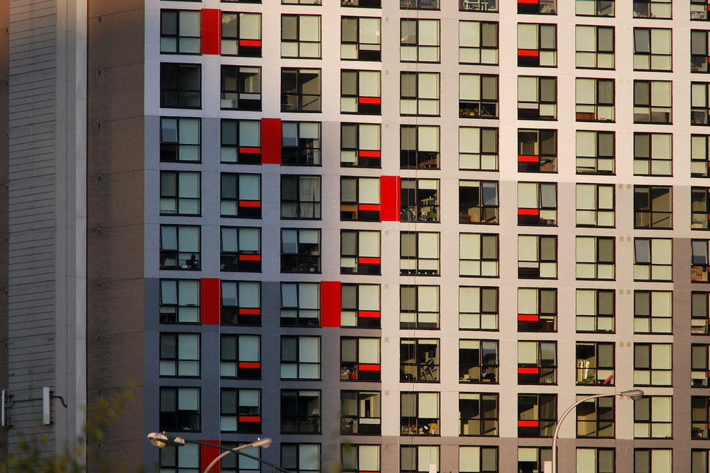 Maple Leaf Quay
 Maple Leaf Quay