Toronto TeaHouse 501 Yonge Condominiums | 170.98m | 52s | Lanterra | a—A

10 seconds in paint:

501yonge25jan13.png


Add some colour, texture (brick or embossed metal--stylized animals as the art component? or even via LCD panels) to create some more variety.
 
Good progress is being made on the podium design, and I think this proposal is definitely heading in the right direction. The contemporary retail units (on the northern part) features the black framing that reminds me of the fashion boutiques on Bloor/Yorkville. It's hard to tell exactly, but the units on the southern portion appear to exhibit a different design scheme at grade that provides a more established/familiar presence to the streetscape.
 
Last edited:
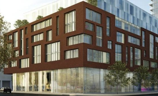
I'm liking the rework of the podium by aA here. It's a nod to our internationalist/modernist past and present, with a current thing about it. Liking the trees too, happily I get the feeling that they aren't just render trees. Let's see how the storefronts look in real life.

The success of this is obvious to people like me who have lived just eastward of this development. This architecture tips its hat to the very delightful buildings and atmosphere of Alexander St., and at the same time is ever so slightly reminiscent of the old Westbury exterior. In other words, aA has recognized that this is not just a condo development, it is something that must plug into the neighbourhood at large that already exists in the area. That is the correct approach; no aloofness can be permitted in this development.

While I certainly respect others' opinions, I think this rework is intelligent stuff. Remember that not all "good" architecture grabs you right away, it takes living with it, finding the comfort zone with it, to understand its merits, and this proposal is in such a category. This is good urbanism.
 
Some posters have been prophesying that this project will help turn Yonge Street into Bay Street, but the more I look at that rendering, the more I'm feeling like this project would fit in perfectly on Bloor's Mink Mile. Ideally I'd like to see Yonge be a kind of hybrid of the Mink Mile and Queen West (between University and Spadina), connecting Dundas Square to Bloor & Yonge. One Bloor, Five Condos and this project are all good steps in that direction. And of course the historic rows all need to be maintained.
 
Looks too sterile and windswept for me. Why can’t they simulate storefronts?
This looks like it came from the suburbs.
I dont like whats there now, but across the street is interesting.

+1

They don't seem capable of moving passed their entrenched love of the International Style. Toronto is screaming out for some texture, colour, variation, and decoration in its new buildings. We currently have all of these qualities on Yonge. We need to recreate that while we re-develop the strip with more height above. This proposal is a sterile, forgettable block of retail.

The last thing we need is Yonge to end up looking like Bay Street. We can have height/scale AND visual interest/richness at street level. Perhaps aA doesn't know how to do retail frontages? Hint: you need to move beyond a wall of glass:

These Could Easily Be Built New with a 50 floor tower above
barneys.jpg


506b1f1db5005.jpg


The Yamaha Retail

Yamaha%20Ginza%20small.jpg


If they refuse to acknowledge any material beyond glass, at least make it beautiful

2316977267_acef977bc8_o.jpg
 
Last edited:
Unfortunately bland podium...

What's worse to me is that they're only providing 1s retail here. Why can't they add 2s retail (even just higher ceilings in the first floor will do!!) with floor to ceiling windows if they're so insistent on using glass?
 
Last edited:
Beautiful. Some channeled glass or perhaps a variety of different surface treatments would work really well here.

Channeled glass is just one of the most gorgeous materials. Yes please!

Also, I won't harp on about my idea for what the podium of this building should be any longer for now, since I've done lots of that, but I wanted to post an example of the "pastiche" of varied facades I envision for this proposal. I think an aA take on them (using brick and window patterns like Market Wharf, etc.) could look great here:

excuse the small photo:

ScreenShot2013-01-25at65511PM_zps37b06d98.png


+

ScreenShot2013-01-25at71152PM_zps504ef281.png


I also have a design in my thread in the Renderings section where I played with the idea of brick facades that sit in front of an otherwise all-glazing podium. :)

I know a few of you really like the cantilevered ends of the podium in this latest 501 Yonge rendering but it looks so overbearing and "looming" to me.
 
Last edited:
I believe at the last community meeting, this project was supposed to go back to design review about now. The height and mass of the south tower, and its proximity to the alley, were not aligned to standards. Any word on that?
 
I think an aA take on them (using brick and window patterns like Market Wharf, etc.) could look great here:

It's nice, but don't you think its far too pedestrian for our main street? Market Wharf's podium is great for its location, but Yonge deserves a more cosmopolitan big city feel. Yonge is 'Main Street Canada' and it should reflect that. This is a street where we need to step it up.
 
Last edited by a moderator:
I'd love to see something that leaves more sidewalk room and adds to the aesthetic with glass curves, much like the BMO does farther south near Queen Street.
 
It's nice, but don't you think its far too pedestrian for our main street? Market Wharf's podium is great for its location, but Yonge deserves a more cosmopolitan big city feel. Yonge is 'Main Street Canada' and it should reflect that. This is a street where we need to step it up.

I think you missed my entire point and just looked at the post of Market Wharf I posted. Look back and read through my ideas for this building's podium and then we can talk ;)
 

Back
Top