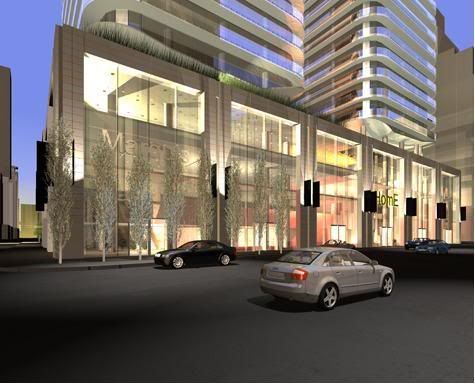
Toronto Sun Life Financial Tower & Harbour Plaza Residences | 236.51m | 67s | Menkes | Sweeny &Co

I have been to the south elevation:

These towers are not BOXES!

Yay!

One Tower is round the other is a box.

Big Daddy spoke with having this knowledge. That's why you should have waited before calling them boxes.

It's actually one box and one cylinder.

how does that make sense? The board says twin 70 storey towers... and last I checked twins in architecture meant identical... not fraternal. Or is the office tower a block and the residential towers are round ?
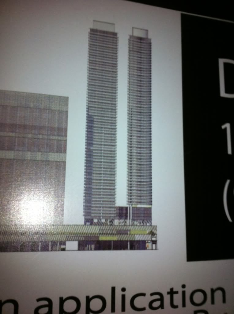
 
This should put a more positive spin on this project. A picture is worth a thousand posts. I'm excited to see them, and put an end to my scepticism.
 
Before I get to the south elevation - I give you

The North Elevation:

photo-2389.jpg


The round tower looks like it could be a spectacular design ( a la Absolute World) partially financed through the construction of the more cost efficient box which it has been paired with. Another thing of note, is that the round tower appears to sit on a special (custom built) podium to showcase its design. It has been put on a pedestal if you will.
 
Last edited:
hmm it doesn't look round to me ?

If it is it's just a simple circle, what's so special about that ?
 
hmm it doesn't look round to me ?

If it is it's just a simple circle, what's so special about that ?

A circle top down, a box sideways. Can we have some designs with a bit more articulation please? Maybe some glass not obstructed by balconies?

Anyways, it looks like an office building is going up beside these towers, which is good, and the podium certainly looks interesting!
 
This does look like aA work... it reminds me of their original plan for 21 Avenue Road... in that case they were square towers (like CASA) but with sleek, rounded corners.

Anyways... what a tall, slim project. Very sleek :). Also, I love the box roof features on top. Can't wait to see renderings.
 
Yes, Yes, 21 Avenue Rd exactly. These towers must be that exact design but taller.

That 21 Avenue Rd design was seriously glitzy. I'll see if I can find some old images.
 
Nothing groundbreaking but I see potential in these sleek elevation drawings. Podium looks interesting, and great to see some curves. The attention to detail in actual product will depend on what architecture firm designed these. Too preliminary for me to really have an opinion on this. But looking forward to detailed renderings, could be a sharp design.
 

Back
Top