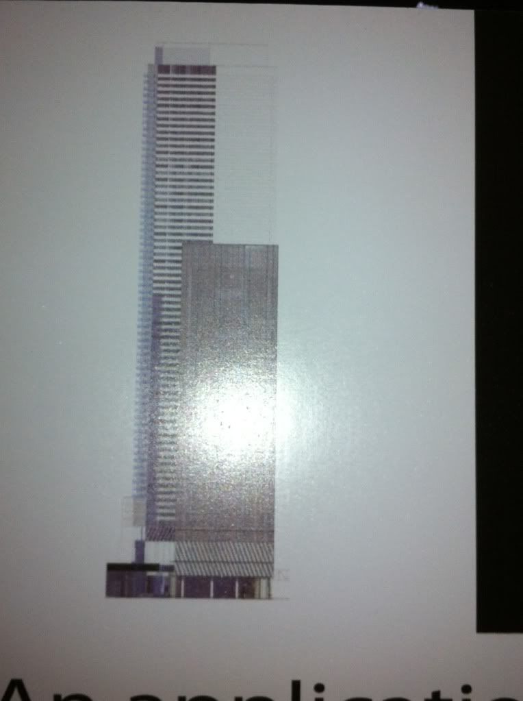
Toronto Sun Life Financial Tower & Harbour Plaza Residences | 236.51m | 67s | Menkes | Sweeny &Co

Well now, that's one tall POS.

So it seems they have decided to bypass the idea of using an architect, and have decided just to use an engineer to "design" their buildings.

The design criteria appears to have been "make it 70 stories tall and make sure it won't fall over for at least 30 years and wrap in some kind of material that doesn't cost too much and let's get out here".

I have to agree with Big Daddy on this one, assuming the render is anything close to reality. We can only hope this is a very preliminary sketch, and they actually find an architect with some vision to design something other than a tall box.

Jesus Christ... Seriously?

Hopefully the elevation drawing is misleading, and instead we get something that's actually interesting.

All of these people going crazy over one (blurry) west elevation drawing? It's not even the view from the south. Nor is it not a render with any 3D qualities. This is very preliminary, and we've gone through this kind of thing again and again. Is there no ability to learn from history around here? Not for some of you apparently. Have a little patience and some imagination for goodness sakes.
 
All of these people going crazy over one (blurry) west elevation drawing? It's not even the view from the south. Nor is it not a render with any 3D qualities. This is very preliminary, and we've gone through this kind of thing again and again. Is there no ability to learn from history around here? Not for some of you apparently. Have a little patience and some imagination for goodness sakes.

Indeed, it seems obvious that none of these people have bothered to read the previous posts. From a mere seven posts above Big Daddy's post:

The west residential tower shown is a slightly askew rectangle following the line of Lake Shore. The light-lined east residential tower is like a mis-shapened peanut (or liver-shaped) in plan. Looks like it has wrap around balconies similar to Ice.

This is corroborated by a close examination of the single elevation we have an image of (there apparently are additional elevations at other points around the project site, possibly including a site plan). It is clear that these are NOT simple boxes, the closer of the two residential towers has at least one non-perpendicular, possibly curved, side.

So I recommend that people avoid blowing a gasket until we at least have a complete set of elevations, and preferably also a site plan, to look at. I strongly suspect that we will be generally pleased with the design (most of us, anyways, there will always be a few people who will hate any given design).
 
All of these people going crazy over one (blurry) west elevation drawing? It's not even the view from the south. Nor is it not a render with any 3D qualities. This is very preliminary, and we've gone through this kind of thing again and again. Is there no ability to learn from history around here? Not for some of you apparently. Have a little patience and some imagination for goodness sakes.

Make sure you copy and paste this comment in the 406 Yonge thread.. Because you people are doing the exact same thing over there.
 
I don't think anyone is going to pop a vein because of it. There are more important things, like what's for dinner. For me it's just an observation and post. I have no plans to occupy 90 Harbour st. and demand a better building. I can't speak for others though.
 
photo-781.jpg

I can't think of many examples where a lousy render like this one – morphed into a beautiful building when the focus sharpened.

This is clearly another low cost exercise in building on the cheap. As was mentioned in previous posts, this is similar to several other projects proposed in T.O. that include two tall build’em quick condo towers and a smaller (likely not built in our lifetime) office building.

If, as you say, this building is may be more beautiful in future renders, what would be their risk in dazzling us now? Do you think they would propose a “stunner†like this in Dubai or New York or Chicago? You can only get away with this crap in Toronto.
 
Make sure you copy and paste this comment in the 406 Yonge thread.. Because you people are doing the exact same thing over there.

But in that thread, many are inferring the project's aesthetic failure based on G+C's piss-poor track record. That 'another' firm is handling this equally allows one to make a pretty informed judgement about its potential quality.
 
I can't think of many examples where a lousy render like this one – morphed into a beautiful building when the focus sharpened.

This is clearly another low cost exercise in building on the cheap. As was mentioned in previous posts, this is similar to several other projects proposed in T.O. that include two tall build’em quick condo towers and a smaller (likely not built in our lifetime) office building.

If, as you say, this building is may be more beautiful in future renders, what would be their risk in dazzling us now? Do you think they would propose a “stunner” like this in Dubai or New York or Chicago? You can only get away with this crap in Toronto.

Is there any way we can we make the posting of this line a bannable offense? Mods?
 
Sorry, but I can't see it qualifying as bannable. I don't think Big Daddy is trolling here. I think that he actually believes what he is saying. We cannot stop people from posting just because they choose to make pronouncements supported by little or questionable evidence.

42
 
Do we know who the architects are for this?

I actually think it looks like the ground level has lots of variation and something interesting going on-- I'm dying to see renderings of this now.
 
I can't think of many examples where a lousy render like this one – morphed into a beautiful building when the focus sharpened.

This is clearly another low cost exercise in building on the cheap. As was mentioned in previous posts, this is similar to several other projects proposed in T.O. that include two tall build’em quick condo towers and a smaller (likely not built in our lifetime) office building.

If, as you say, this building is may be more beautiful in future renders, what would be their risk in dazzling us now? Do you think they would propose a “stunner†like this in Dubai or New York or Chicago? You can only get away with this crap in Toronto.

How can you say this when the developer of this project is the same as the most expensive projects in Canadian highrise history ?


Do we know who the architects are for this?

I actually think it looks like the ground level has lots of variation and something interesting going on-- I'm dying to see renderings of this now.

urbandreamer seems convinced it is another Aa project.
 
This reminds me of the original one bloor proposal, if it's anything like that it can't be that bad.
There definitely is a interesting feature separating it from most boxes already around the city, and I'm exited to see the building in more detail
 
I can't think of many examples where a lousy render like this one – morphed into a beautiful building when the focus sharpened.

This is clearly another low cost exercise in building on the cheap. As was mentioned in previous posts, this is similar to several other projects proposed in T.O. that include two tall build’em quick condo towers and a smaller (likely not built in our lifetime) office building.

If, as you say, this building is may be more beautiful in future renders, what would be their risk in dazzling us now? Do you think they would propose a “stunner” like this in Dubai or New York or Chicago? You can only get away with this crap in Toronto.

This isn't a render. This is a lousy picture of an elevation drawing - of the west side, the freaking west side. The main meet-the-postcard-shooting-side will be the south side. We don't know what that looks like yet. What don't you get about that?

There is no point in Menkes dazzling us now. They'll try that during the marketing phase. This is their rezoning phase. They aren't trying to dazzle anyone yet, they're trying to get zoning approved based on a bunch of numbers and shadowing issues and the like.

If you're looking for Dubai, go to freaking Dubai. We don't need an amusement park for a city.
 
This isn't a render. This is a lousy picture of an elevation drawing - of the west side, the freaking west side. The main meet-the-postcard-shooting-side will be the south side. We don't know what that looks like yet. What don't you get about that?

I actually thought that Caltrane did a good job given the fact that it was night-time when he took the photo.

Register123 says that there is a south elevation along the Harbour Street side of the development site. So I am putting out a request for somebody to take a photo of that one as well -- and any other elevations or site plans that may be out there.
 
for once i agree with the cat. its too early to cast judgement based on a crappy elevation sketch. We just need to wait this one out.
 
I actually thought that Caltrane did a good job given the fact that it was night-time when he took the photo.

I didn't mean lousy like "Caltrane can't take a good shot" lousy, I meant lousy as in "just this soft focused photo marred by some flash, and there's only one of them" kind of lousy. No offence intended. Like they say in gangster movies. "Just one lousy shot!"
 

Back
Top