Toronto Sun Life Financial Tower & Harbour Plaza Residences | 236.51m | 67s | Menkes | Sweeny &Co

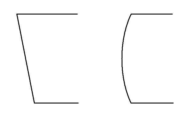
What is that bluish strip running up the left side of the 70s tower? Since we do not see the side of the office tower, it cannot be the side of the residential tower if the sides of the residential tower are straight, and at 90 degree angles to each other. So I conclude that either the sides are not at 90 degree angles, so the floor plate is in the form of a parallelogram, or at least one side is not straight but is in the form of a convex arc.
a.jpg


Or the residential tower is at an angle to the office tower.
 
Last edited:
The west residential tower shown is a slightly askew rectangle following the line of Lake Shore. The light-lined east residential tower is like a mis-shapened peanut (or liver-shaped) in plan. Looks like it has wrap around balconies similar to Ice.
 
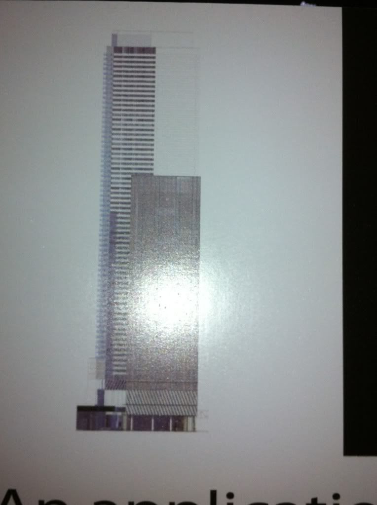
Scaling the plans I have and the photo of the elevation I come up with a height of 242m for the residentials and 154m for the office.
 
The west residential tower shown is a slightly askew rectangle following the line of Lake Shore. The light-lined east residential tower is like a mis-shapened peanut (or liver-shaped) in plan. Looks like it has wrap around balconies similar to Ice.

How did you find this out? This suggests that we might be seeing a taller variation of the old Nicholas 'peanut' that was rejected by the City a while ago, to the dismay of many forumers here -- at least regarding one of the residential towers, while the other residential tower might be more similar to a taller Burano.

I have seen enough to conclude that this design is not 'boring' at all, but instead has likely been deliberately designed to play off of the Ice towers with their curving sides.
 
Scaling the plans I have and the photo of the elevation I come up with a height of 242m for the residentials and 154m for the office.

Your highly scientific method didn't include reading 239.5m in the photo of the application board, did it? The office tower though, I'll give you credit.
 
All other design consideration aside, it's ****ing ridiculous that towers this prominent would sport massive exposed mechanical boxes.
 
Here is the best I could do standing on the pebbles at the base of the sign

photo-781.jpg

Well now, that's one tall POS.

So it seems they have decided to bypass the idea of using an architect, and have decided just to use an engineer to "design" their buildings.

The design criteria appears to have been "make it 70 stories tall and make sure it won't fall over for at least 30 years and wrap in some kind of material that doesn't cost too much and let's get out here".
 
Last edited:
I don't think that render is giving us a full representation of how that building will look. There may be some details we're missing due to the alignment of the three towers. I'm sure more detailed and complete plans will be made available from city planning shortly.
 
I have to agree with Big Daddy on this one, assuming the render is anything close to reality. We can only hope this is a very preliminary sketch, and they actually find an architect with some vision to design something other than a tall box.
 
For many years, since at least 2003, I've been saying on UT that I'd love Toronto to have a waterfront consisting of at least a dozen aA-style buildings--sort of like Chicago only with a unique Toronto style. A real shame it couldn't have been along that Etobicoke strip.

So I welcome a crisp modern aA design here!
 

Back
Top