Toronto St Regis Toronto Hotel and Residences | 281.93m | 58s | JFC Capital | Zeidler

Wow. I am underwhelmed. The old renderings were probably less realistic looking, but what really gets me about this is how short the building looks. The dome/spire appears to account for nearly 1/3 of the building's height. I sure hope that's an exaggeration. I'd like it better as a box, with no crown or spire, frankly. I don't think having the spire at the corner works as well without the height and setbacks towards it that there used to be. Also, on a different note, the horizontal lines on the north side make it look shorter than it is IMHO. The west side doesn't have that problem.
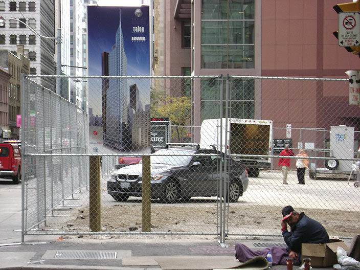
 
Not that renders are reliable but there appears to be the equivalent of 56/57 levels (double height levels counted as 2) plus 5 levels from the top of the roof slab to the bottom of the 1/4 onion dome plus the equivalent of 3 or 4 storeys of 1/4 onion plus... flagpole/spire.

So the revised tower appears to be the equivalent of 69/70 storeys (give or take) plus flagpole.
 
Forgot to post this pic...

No doubt interest in the press conference is high, given some folks even camped out all night for a glimpse of the Donald. :eek:


waiting.jpg
 
It looks like the BA cranes are saluting the ground-breaking (they've been like that for a half hour).
1552832283_b9cf548499.jpg

Ah, never mind, they're back to work. The crane operators must get a half hour lunch.
 
How many media personnel showed up at the event? I am sick that I couldn't get there today for the ground breaking. The luncheon at the National club before the event would have been fun as well.

Details and pictures folks! please :)
 
Love it or hate it you have to admit we don't have anything quite like it the CBD - I mean maybe if you count BCE but this one seems more elegant ... I'm referring to the spire of course.
 
I walked by around 1PM and there were a few people in the tents and one CTV news truck on the street along with a limo. Otherwise very quiet. The main event must have already passed.
 
I also prefer the new look... the proportions are better. Looking forward to this.

I completely agree about the 'proportions are better' part. If you're going to have a whoopdeedoo at the top, it might as well be somewhat prominent.

42
 
I like the new rendering as well. The added "T" logo is unique and helps with branding. Tourists will love it!

I haven't heard any news in the papers yet...interesting.

I imagine this building will go up quickly once it starts. I understand the parking is 'above' ground which means less digging to do.

:)
 
The "event" was at 12 noon. A few quick interviews and he's off, oiling his way across the globe to some other place in desperate need of vulgarly ostentatious Big Hair architecture.
 

Back
Top