Toronto Spectra at Concord CityPlace | 123.13m | 39s | Concord Adex | RAW Design

Thanks for the info. Is there retail all along here to Dan Leckie Way? I thought the restaurant may have been located at the corner across from the park.
 
Thanks for the info. Is there retail all along here to Dan Leckie Way? I thought the restaurant may have been located at the corner across from the park.

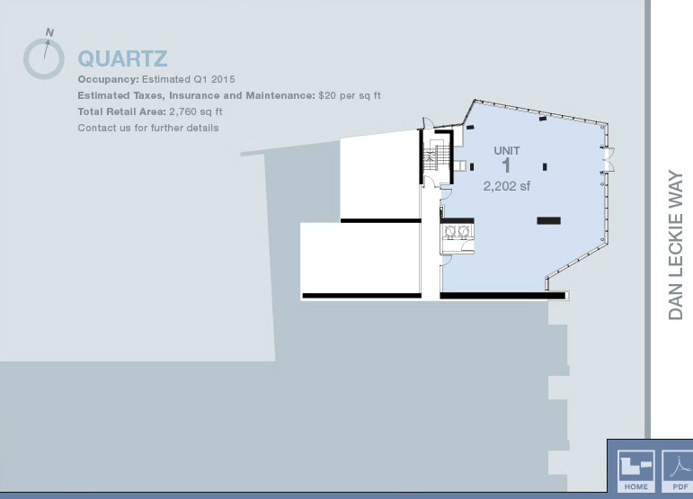
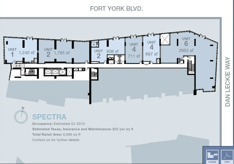
There is retail along the entire Fort York Blvd. frontage. The unit facing the park will also be a restaurant. It is currently the construction office for the site though. There is also a single retail unit at Quartz that faces the park, on Dan Leckie itself.

Here is the leasing diagram from Concord Adex's commercial leasing site:

 
Thank you very much for this plan. Unit 6 will likely be a chain but there's nothing wrong with having a decent chain restaurant here. Visited the new Library a few weeks back and it was packed.
 
Another wall of glass and another cold, generic experience at street level. I don't like it at all but I better get used to it because the same thing is going up on every street in Toronto, sadly. When is this city going to start building some stylish, interesting, attractive and animated retail spaces along its sidewalks? The sameness of all this new retail is just getting on my nerves.

Looking at those pictures, I have to agree. The street presence is terrible. Also, I don't know why people are so quick to judge this because Concord Adex is a subsidiary of a Vancouver company. So what? RAW is a local architect who designed this for Concord Adex, which is a local company, which was approved by the city. So really, who's to blame here?
 
Looking at those pictures, I have to agree. The street presence is terrible. Also, I don't know why people are so quick to judge this because Concord Adex is a subsidiary of a Vancouver company. So what? RAW is a local architect who designed this for Concord Adex, which is a local company, which was approved by the city. So really, who's to blame here?

It has nothing to do with Concord being a Vancouver company and everything to do with Concord have a track record of building mediocrity in Toronto. The architect is largely irrelevant when they are forced to work within the developer's financial constraints.

Concord used Kohn Pederson Fox, a respected international architectural firm, for Parade and it still turned out to be subpar. Conversely GWL used Page+Steele, which usually produces mediocre designs, for the new Southcore Delta and it turned out great. It's always comes back to the developer.
 
It has nothing to do with Concord being a Vancouver company and everything to do with Concord have a track record of building mediocrity in Toronto. The architect is largely irrelevant when they are forced to work within the developer's financial constraints.

Exactly. And that even applies to who the contractor is. Concord uses very good contractors (EllisDon and PCL), however these contractors are limited when it comes to the materials. And I have seen this first hand in Concord developments. They will use the cheapest type of material that's available and pass it on for the contractor to work with it. These architects and contractors are at the mercy of the developer. They have to work within the budget set forth by the developer.
 
WP_20150616_002 copy.jpg
 

Attachments

  • WP_20150616_002 copy.jpg
    WP_20150616_002 copy.jpg
    1.3 MB · Views: 1,129
Ah-hah! The first pieces of Variegation by Pierre Poussin, the same artist who created the blue Mitosis Courtyard pieces just the south at Panorama.

Thanks for posting those Slocro!

42
 
The funny thing is I haven't seen anything like these in Mississauga or York Region...

Not a fan of them though. I do like that Concord Adex has moved away from the massive podiums of earlier projects, but the the towers are pretty forgettable.

Same goes for the artwork in this project. Pretty forgettable. I miss the art contributions that came with the initial phases of the development. Cutting out shapes into sheets of metal just isn't doing it for me.
 
Same goes for the artwork in this project. Pretty forgettable. I miss the art contributions that came with the initial phases of the development. Cutting out shapes into sheets of metal just isn't doing it for me.

This art install of cut metal may not work here, but the one on Cherry street near Inglewood school is awesome
 

Back
Top