Toronto Ryerson's Mattamy Athletics Centre + Loblaws at the Gardens | ?m | ?s | Ryerson University | Turner Fleischer

Well, then you must really love Metropolis and Honest Ed's. I can understand that rough look in a discount store like Honest Ed's but I find it unacceptable in a supermarket that brags about having 400 kinds of cheese and upscale prices.

We all know that "industrial look" is just done to save money, no matter how you try to justify it. I think it's a cop-out.

Oh lord, really? Most buildings have walls too, but I don't like them all by any means. Are you incapable of seeing past one vaguely similar design theme? Then again, based on your knee-jerk reaction to the unfinished product, I think I know the answer already.
 
Well, then you must really love Metropolis and Honest Ed's. I can understand that rough look in a discount store like Honest Ed's but I find it unacceptable in a supermarket that brags about having 400 kinds of cheese and upscale prices.

We all know that "industrial look" is just done to save money, no matter how you try to justify it. I think it's a cop-out.

It really depends- the industrial look can be used as an excuse to save money, but if it's used in combination with quality materials and articulation, it can certainly beat more 'polished' designs.
 
It really depends- the industrial look can be used as an excuse to save money, but if it's used in combination with quality materials and articulation, it can certainly beat more 'polished' designs.

Drywall and drop ceilings can age badly and look dirty, whereas concrete ceilings are ageless. For a food store, I think it's a good choice.
 
^ Good point about the parking steveve. If eastbound left turns are allowed it could really slow down the streetcars, esp. on weekends. I wonder if the Hasty Market across the street will survive this.

There's a left turn lane that was built for eastbound left turns, between the streetcar tracks. Hoping the light cycles frequently enough to prevent too much queuing onto the streetcar tracks
 
Are they gonna leave those ceilings exposed like that, with all those ugly pipes and stuff everywhere. It looks like the inside of Metropolis, and since I consider Metropolis a disaster, it's not a compliment. Is that how you build an upscale food market? I hope they cover all that junk up.

MLG Loblaws looks okay, but I agree about Metropolis. It's a complete failure of design. No money spent, no imagination.
 
As of today the Maple Leaf logo is gone from the roof.

Iconic Maple Leaf logo going, going….gone

The blue Maple Leaf logo atop the Maple Leaf Gardens’ domed roof disappeared Wednesday, symbolically marking the end of an era.

The logo was permanently removed as part of a reconstruction project that will see former hockey shrine re-open next week as a supermarket, clothing store and liquor outlet.

It’s been more than a decade since the Toronto Maple Leafs of the National Hockey League played in the grand old dame on Carlton St.

More...........http://www.thestar.com/business/article/1091602--iconic-maple-leaf-logo-going-going-gone?bn=1
 
It really depends- the industrial look can be used as an excuse to save money, but if it's used in combination with quality materials and articulation, it can certainly beat more 'polished' designs.

That's true. Those who like the minimalist, unclad ceiling style should remember that if it's done carefully with an eye for aesthetics, it can be great and distinctive. It comes down to how the pipes are arranged, but the arrangement still matters. Yet like many aspects of modern design, it can just be used as an excuse for the worst stinginess. The minimalist "look" can be done purely to save money, resulting in an ugly mess that the builders will hope you'll think is modern design, except it's just their cheapness.
 
That's true. Those who like the minimalist, unclad ceiling style should remember that if it's done carefully with an eye for aesthetics, it can be great and distinctive. It comes down to how the pipes are arranged, but the arrangement still matters. Yet like many aspects of modern design, it can just be used as an excuse for the worst stinginess. The minimalist "look" can be done purely to save money, resulting in an ugly mess that the builders will hope you'll think is modern design, except it's just their cheapness.

Case in point: Toronto Death *harrumph* Life Square
 
As of today the Maple Leaf logo is gone from the roof.

Iconic Maple Leaf logo going, going….gone

The blue Maple Leaf logo atop the Maple Leaf Gardens’ domed roof disappeared Wednesday, symbolically marking the end of an era.

The logo was permanently removed as part of a reconstruction project that will see former hockey shrine re-open next week as a supermarket, clothing store and liquor outlet.

It’s been more than a decade since the Toronto Maple Leafs of the National Hockey League played in the grand old dame on Carlton St.

More...........http://www.thestar.com/business/article/1091602--iconic-maple-leaf-logo-going-going-gone?bn=1

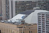
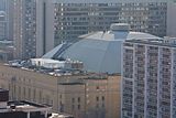
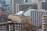
Work picked up on tarring and resurfacing the east roof (the south and north portions were done late last spring) and presumably the west roof now that the chillers and the HVAC appears to be in place. It's a heck of a mess up there but the west side is even worse.

Last call for the Toronto Maple Leaf's logo. Today [Nov. 17th]:


Today (a little hazy out) -

 
From the article: (But the Gardens isn’t out of the woods yet. MLSE is in litigation with Ryerson over the school’s apparent plans to use the rink for more than student hockey games.)

This is appalling. After the selfish and avaricious stance on the rooftop logo, this latest move upsets me greatly as MLSE bullies Ryerson and Loblaws from doing anything to preserve our heritage. This is corporate greed at its gworst.

On the other hand one can only be pleased with the developments here and I hope Ryerson wins its court case!
 
Last edited:
From the article: (But the Gardens isn’t out of the woods yet. MLSE is in litigation with Ryerson over the school’s apparent plans to use the rink for more than student hockey games.)

This is appalling. After the selfish and avaricious stance on the rooftop logo, this latest move upsets me greatly as MLSE bullies Ryerson and Loblaws from doing anything to preserve our heritage. This is corporate greed at its gworst.

On the other hand one can only be pleased with the developments here and I hope Ryerson wins its court case!

I totally agree and I hope Ryerson wins too. How the heck is a 2500 seat space (possibly expandable by a few hundred seats) competition for the ACC? Ridiculous.
 
And really, it might actually be a huge boost to have an event space like that in the neighbourhood. 2500 won't really compete with the ACC, but that probably could be converted for use for smaller concerts, festivals, conferences, etc. I'm sure the local businesses would appreciate having that many people dropping by every now and then
 
MLSE doesn't give a flying fig about neighbourhood or public perception interests. They are simply a money-making machine and care only about ensuring they control all aspects of their brand, and for them, "Maple Leaf Gardens" is part of the mythology that makes their brand.

It's a sad, infuriating reality that MSLE is not good for the city.
 
They were having an invite-only preview today when I went by. I'm sure pictures will start showing up on blogs and such soon
 

Back
Top