Toronto Royal Ontario Museum | ?m | ?s | Daniel Libeskind

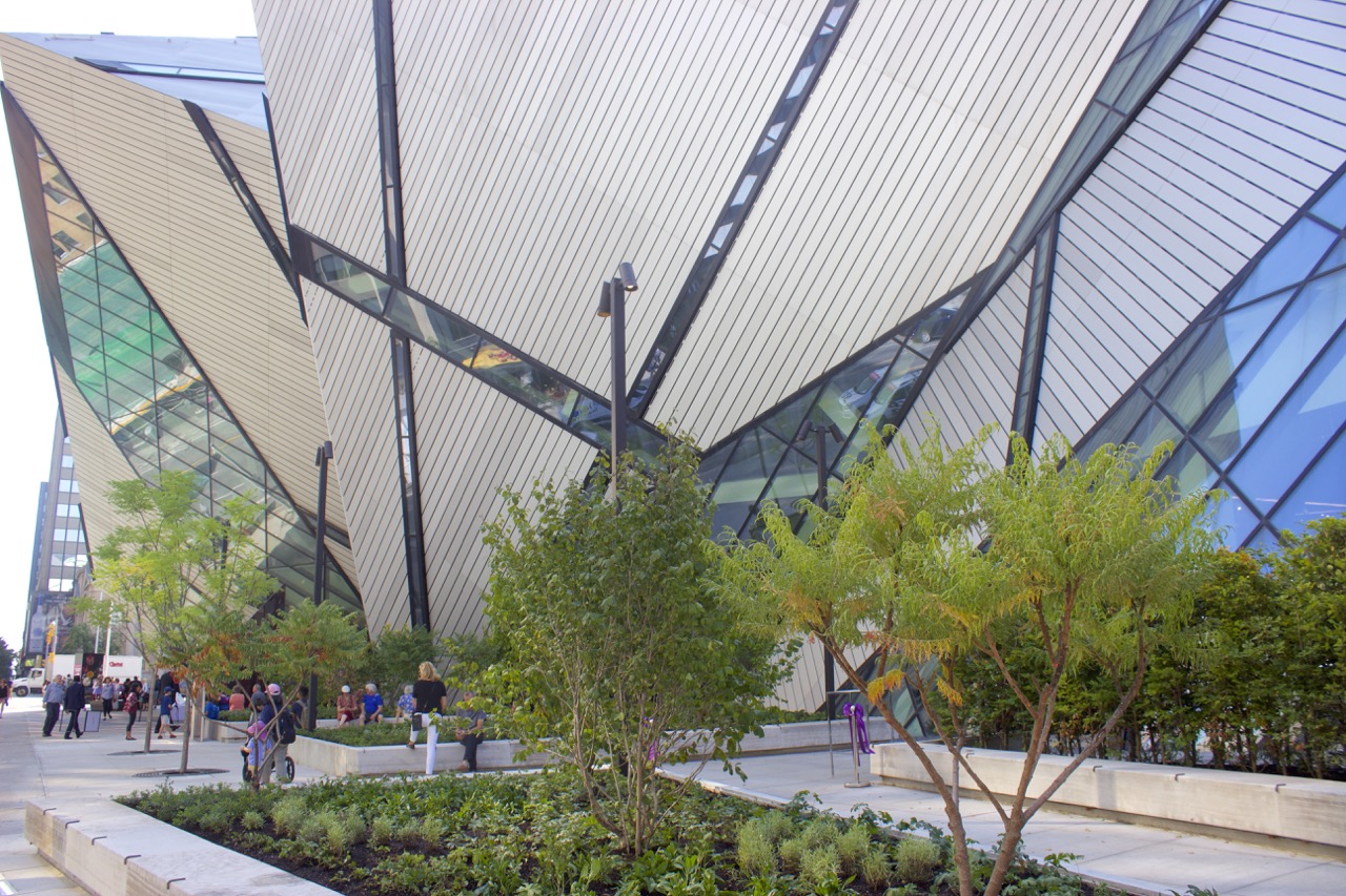
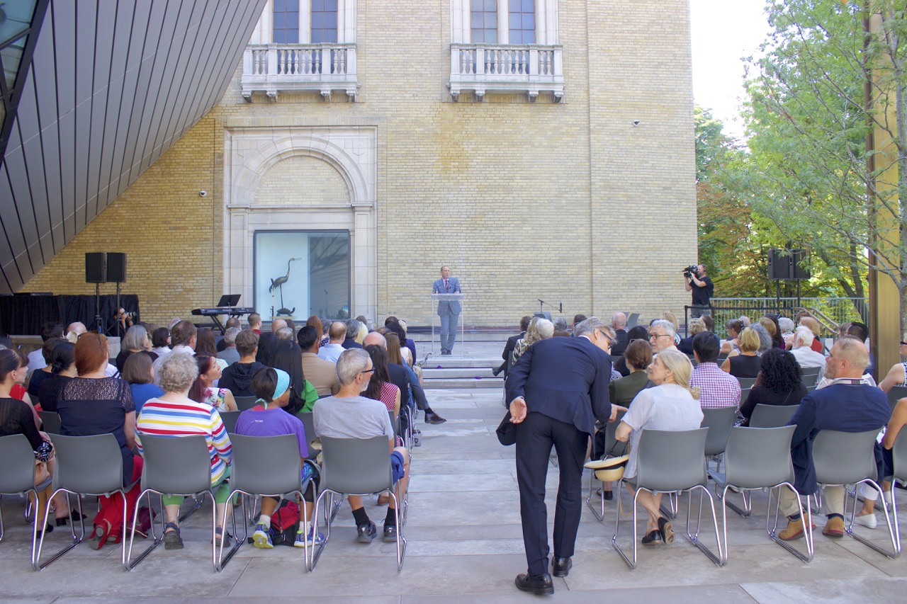
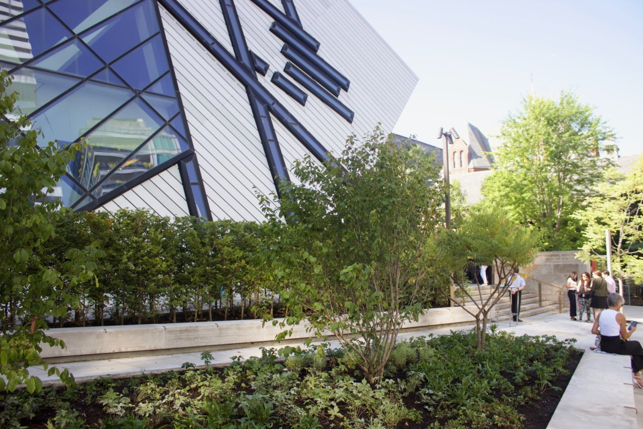
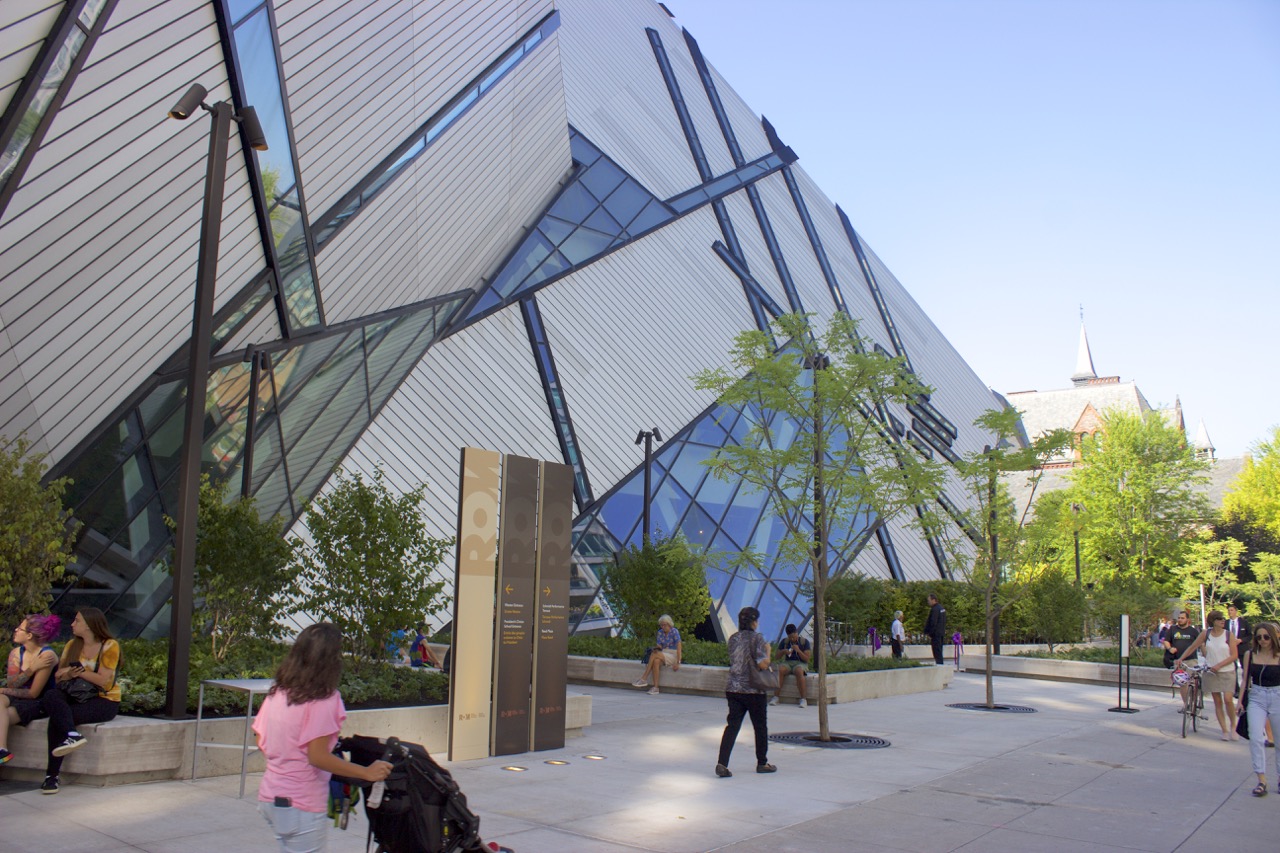
A few images of the space this morning.
IMG_1890.jpg
IMG_rom1923.jpg
IMG_1959.jpg
DSC02291rom.jpg
IMG_1864.jpg
IMG_1863.jpeg
_MG_1872.jpeg
IMG_2009.jpeg
IMG_2011.jpeg
 
We've got a front page story up about today's opening here.

Meanwhile, here are a bunch of other shots of mine that we did not include in the story:

DSC02324.jpg

DSC02360.jpg

DSC02326.jpg

DSC02332.jpg

DSC02334.jpg

DSC02346.jpg

DSC02358.jpg

DSC02359.jpg


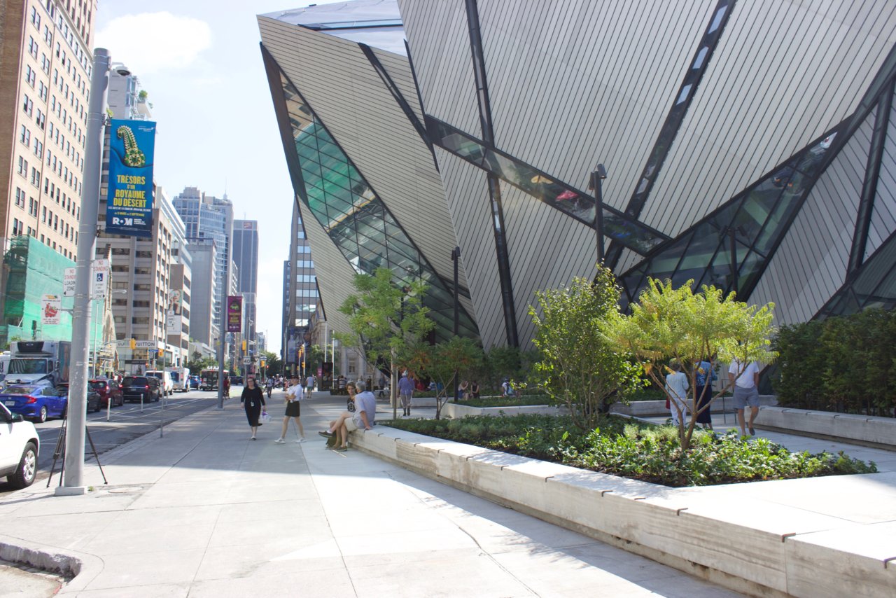
So, yeah, it's a terrific new space, very welcoming, a real improvement to the Bloor frontage. Now they just have to figure out what they want to do with the eastern third of it where the entrance is so that that part can be improved too!

BTW, here's our intrepid Ryan Debergh talking with ROM Director Josh Basseches:

DSC02313.jpg


And finally, here's an old friend at the opening, Urban Shocker, or Building Babel, aka Neil Cochrane. Great to see him again!

DSC02311.jpg


42
 
Welcoming it is, and I have to say it managed to hide/soften the imperfections of the Libeskind addition - but at the same time it felt the plaza distinctively un-edgy as an urban space. I felt more like an extension of the U of T landscaping...

Thankfully they haven't done anything to the space around the entrance yet - and I don't think this vocabulary will be as suitable there as it does on the western portion of the site.

AoD
 
I would say that I'd welcome a reinvisioning of the Crystal's Bloor entrance, it's a dark and cheap-feeling space at the moment.

The entire ground floor lobby needs to open up completely to the street- it can probably be done by recladding the ground level in glass, and making the entry portal more prominent.

The idea that there is something wrong with the entrance has been answered with the new plaza additions. The path to the ROM boutique entrance has been made obvious and prominent by the addition of the planters framing that path. You know exactly where to go, at a glance. In fact, most people were walking into the Boutique entrance because the new planters with a doorway at the end, call you in.

CAF49918-6BC7-42DB-8EDE-74B221A4EAC3.jpeg


The same should be done to the main entrance, which by the way has been made more obvious by the eastern edge of this new plaza.

DA519A29-B168-4434-8491-315378477682.jpeg


The new plaza creates a more obvious funnel into the entrance.

As I mentioned above, the ROM grounds people continue to scatter objects randomly that block the obvious paths to the entrance. Furniture placement requires more skill than the caretaker for the property appears to have. That trash can and the benches (not seen here) are in fact diverting people away from the entrance.

I’d like to see a continuation of the planters on the eastern third of the Bloor forecourt, creating a wide funnel into the entrance. If any work is to be done on the entrance itself, I’d opt for a more prominent canopy jutting out from the Crystal, perhaps we’ll lot to mark the entrance.
 
I've just been corresponding with some people at HPA (which is always nice) regarding some photography from the event this morning, and it's just caused me to reconsider the new work yet again… and I now feel like recording the for digital posterity:

The reworked plaza finally makes a virtue of the Libeskind frontage. It embraces it by extending its angles out into a public realm that is now kind. That's a big deal. There have always been some cool angles for photographers down here, but now the exterior of the building has been provided with spaces for interaction, spaces that encourage people to hang out, to pose, to feel a part of it. To illustrate that in small ways, I'm re-running a pic from the story, and I hadn't posted yet.

DSC02330.jpg
DSC02333.jpg


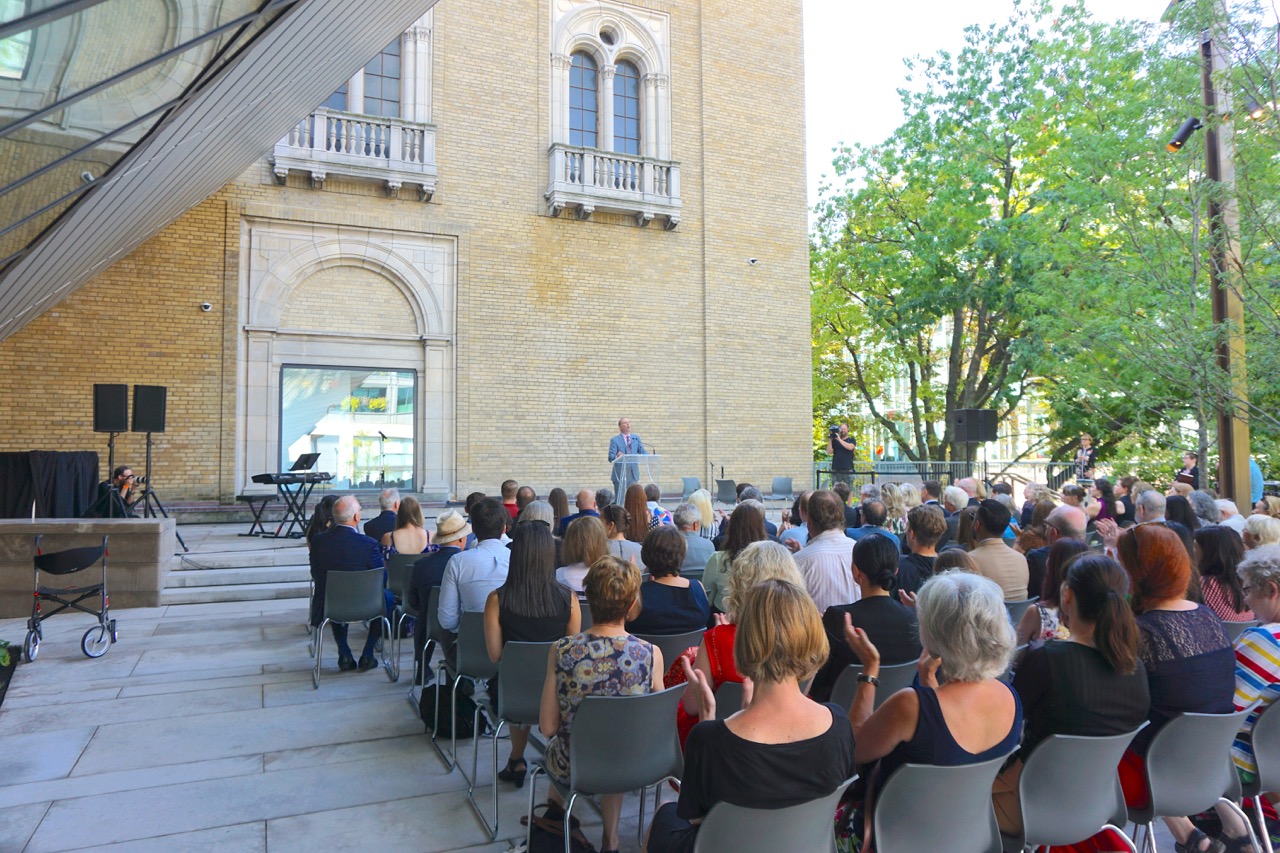
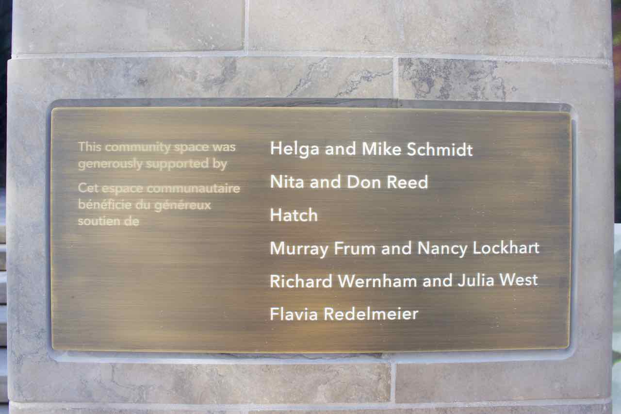
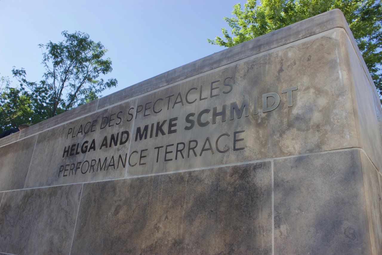
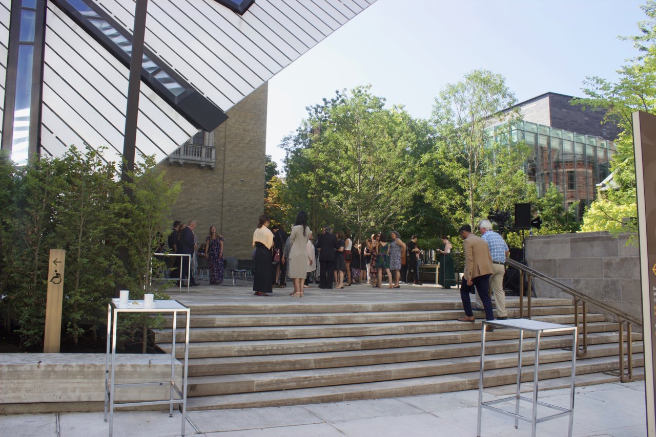
Finally, one more pic of the Schmidt Performance Terrace:

DSC02350.jpg


It'll be worth people catching some of the performances here over the coming weeks. Weekends from Sept 7 to 29 there will be a number of free concerts. I expect they'll update the list of what's on on this page.

42
 
The idea that there is something wrong with the entrance has been answered with the new plaza additions. The path to the ROM boutique entrance has been made obvious and prominent by the addition of the planters framing that path. You know exactly where to go, at a glance. In fact, most people were walking into the Boutique entrance because the new planters with a doorway at the end, call you in.

View attachment 199935

The same should be done to the main entrance, which by the way has been made more obvious by the eastern edge of this new plaza.

View attachment 199938

The new plaza creates a more obvious funnel into the entrance.

As I mentioned above, the ROM grounds people continue to scatter objects randomly that block the obvious paths to the entrance. Furniture placement requires more skill than the caretaker for the property appears to have. That trash can and the benches (not seen here) are in fact diverting people away from the entrance.

I’d like to see a continuation of the planters on the eastern third of the Bloor forecourt, creating a wide funnel into the entrance. If any work is to be done on the entrance itself, I’d opt for a more prominent canopy jutting out from the Crystal, perhaps we’ll lot to mark the entrance.
The entrance needs something, perhaps a design competition might help, to make it a positive experience and not what appears to be an afterthought. The new western spaces look terrific and merely add spice to what needs to happen next.
 
So, it took 12 years to install a few planters and a 100 person capacity patch of concrete 'performance space'?

I am less than whelmed..
The performance space is tiled in limestone, not concrete. Whelm up a little.

42
 
The performance space is tiled in limestone, not concrete. Whelm up a little.

42
Oh it's limestone?

Well that makes all the difference then!

What a fantastic 100 person capacity patch of limestone 'performance space'.

No wonder everyone looks so excited!
 
The seating area looks like concrete. Would have looked a lot nicer if they kept the granite seating - would look more rich and modern than the dull grey concrete. A few nice high-end benches for seating would have been a good addition.

This improvement is underwhelming.
 

Back
Top