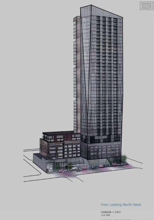
Toronto Pinnacle on Adelaide | 144.47m | 46s | Pinnacle | Hariri Pontarini

^Nonsense. Compared to Success, this building actually looks architecturally successful. It's light years beyond 90% of the area's highrises.

Tkip, do you ever read http://www.dezeen.com/ ?

In 1867, how did the "skyline" of Toronto compare to other English-speaking cities?
 
Last edited:
Wow, I hate to say it but I'm completely behind UD here.

You guys are completely off the deep end - not sure if you rolled out on the wrong side of the bed today - first of all there's really not much one can derive from the render - we need a lot more detail - and in this case, it's going to all be in the details. Seems to meet the street pretty well - one can argue for setbacks but I'm pretty sure that's not what any of you are going off on.

A design board - if one were to exist isn't to enforce every building be a architectural masterpiece - it's really for the small parts actually, how it meets the street, how it fits into the neighborhood.
 
the design was probably value engineered in response to the slowing real estate market.
It will be interesting to see how this will look with the Festival Tower on the same block.
 
This isn't Chicago (etc.) so I'm not sure why anyone thought this one could have a structural silicone curtian wall
 
When people in their 70's having lived in the era of great architecture pan modern towers for looking bland and dull, you know something is up.

You're right. I guess my 73 year old dad is spot on when he says great music ended in 1957.
 
Point is that people much older than us grew up when architecture was taken more seriously. And when a group of people in their 70's talk about how architecture has been watered down? And yes, music and the rest of entertainment has also been dumbed down as well.
 
Nonsense again tkip. People in the 70s didn't take architecture anymore seriously than younger folks today. I'd argue before the internet the average joe was even less informed about good architecture than today. Look what the old farts did to Toronto in the 1950s-1980s: knock down swathes of Victorian Canada, build ugly highways, strip plazas, pointless suburban streets with garages as the focal point and nasty pedestrian unfriendly bunkers like the HBC centre.

Nothing has been dumbed down--no body forces me to watch MTV or American Idol or whatever trash is on tv, nor do I have to read the Star, Metro or any other intellectually lightweight media source. I can read about topics that interest me online--Toronto's indie arts and cafe scene, interesting car design, contemporary architecture as it happens "live" around the world on sites like ssp/ssc/dezeen/etc--rather than a sanitized version approved by the few at the Toronto Telegram.

Youtube is amazing--so much good dance music from the 90s has been uploaded that the thought of paying for music sickens me.

Back on topic: Has A.Rez been dumbed down? Sure it has, as it's aimed at 400 or so investors, not designed around an individual like myself....:)
 
25 August 2010: I had an "enjoyable" time walking around taking photos of club district condos in the rain! :p

dsc02668k.jpg


I'm hoping this building gets built as it meets the street nicely (no small town podium here) and in fact looks rather nice, cheap out or not.
 
Recently, Urban Toronto had an opportunity to tour the presentation centre for The Pinnacle on Adelaide, courtesy of Anson Kwok, Sales and Marketing Manager for Pinnacle International. Mr. Kwok kindly filled us in on many of the details of this high-profile project at John St and Adelaide St W in the heart of Toronto’s Entertainment District.

Text by Doug Convoy Photos by Interchange42

Construction is imminent pending necessary permits from the city. Pinnacle aims to start digging by October. Excavation will be five levels deep. Site prep will begin in about a month with the relocation of the historic Richard West Houses containing The Fox & Fiddle to the parking lot on the east side of John. (Later, this will be moved back across the street and placed next to the heritage building at 86 John St, both of which will be integrated into The Pinnacle on Adelaide’s podium.)

Hariri Pontarini Architects continues to work closely with Pinnacle International in realizing its vision for the project in built form. Many elements from the original concept have been retained and refined, including the building’s overall massing and distinctive roofline, while others have been dropped, such as the angled support column in the podium and the chamfer in the northeast corner of the tower. The latter would have necessitated deep structural support cutting into important functional space as well as highly specialized and very expensive window-washing equipment.

Materials and cladding for the building’s exterior are still being finalized but the colours shown in the rendering and model are final, i.e. the cladding on the podium will be charcoal-grey to black. The podium will be representative of the area’s warehouse history and will be faced in brick or brick-like architectural precast.

The piazza at the foot of the podium on John St, designed by Janet Rosenberg + Associates, is being fine-tuned in concert with the Entertainment District BIA’s evolving scheme for the John St Cultural Corridor. The balcony railings at the lower northeast and southeast corners of the tower are being developed as art components for the building. The lighting design for the tower's roof is still evolving.

PinAdelaideRendering.jpg


A shot of the model representing the northeast corner of The Pinnacle on Adelaide at John St and Adelaide St W. (The black square at the top of the model is actually a speaker or air intake in the presentation centre’s ceiling and is not part of the building’s design.)

PinAdelaideP1160917.jpg


A close-up view of the model representing the lower north and east elevations of the building. The ‘artistic’ balcony railings at the lower northeast and southeast corners of the tower can just be made out.

PinAdelaideP1160899.jpg


A view of the model representing the south and east elevations of the building.

PinAdelaideP1160913.jpg


The tower’s glazed and angled roofline will be lit.

PinAdelaideP1160924.jpg


A close-up shot of the south and east elevations of the podium over the rooftops of the integrated heritage buildings. The piazza, designed by Janet Rosenberg + Associates, is partly visible at the foot of the podium. In line with Cllr. Adam Vaughan’s initiative for family-friendly units in new condominium developments, some suites in the podium will be separated by knockout panels. All other units will have concrete walls between them.

PinAdelaidePodiumpano.jpg


An image of the model representing the south and west elevations of the building.

PinAdelaideP1160914.jpg


The Pinnacle on Adelaide’s amenities area will occupy the top two levels of the podium. All common areas in the building, as well as the presentation centre, are designed by Chapman Design Group.

PinAdelaideP1160920.jpg


A close-up view of the building’s amenities area from the northwest.

PinAdelaideP1160919.jpg


A shot of the model representing the north and west elevations of The Pinnacle on Adelaide. The ground floor of the building will contain retail along Adelaide St W and John St.

PinAdelaideP1160916.jpg


That’s it for Urban Toronto’s coverage of The Pinnacle on Adelaide’s exterior. Please watch for our report on the building’s interiors in the Real Estate section.

PinAdelaideP1160942.jpg
 
The building's overall massing has not been retained. It's now a box with an angled roof. There's no way that this will be confused with the original:

4137755753_2f14ecdf17_o.jpg


At least Pinnicle admitted that they simply decided to cheap out. I truly hope that their decision to build on spec into a popping real estate bubble will seriously deter them from ever building more of their bland spandrelized schlock in Toronto.
 
I have to admit, I really like the massing of the podium and the way the building is laid out at street level. It's very interesting and engaging, and LIGHT years ahead of other proposals for the Entertainment District... think of the ground level of Bell Lightbox/Festival Tower, Cinema Tower, etc.

Excellent shots of the model. Thanks!
 
Ramako, the overall massing has been retained: the podium, including its two upper setback floors are still in the same relationship to the tower. What has changed, obviously, is that the two prominent chamfers are gone from the design, as well as the diagonal elements at the base of the podium. While it is regrettable from a skyline profile point of view that those unique elements are gone, I understand Pinnacle's reasoning for making the changes. While we can all moan that the developer ends up with a cheaper building to construct, there is another reason. As potential purchasers will find out, Pinnacle has saved the board quite a bit of money of the coming years. Only one window washing company in town is currently capable of cleaning the chamfered sections, and special gear would have to be purchased, installed, and maintained to make it work in those spots. While this building is no run-of-the-mill project, neither is it super-high-end like the Four Seasons et al, and the builder is trying to help the purchasers here with their future monthly maintenance costs. I think that unless you live in the L Tower for another example and are prepared to pay extra for the privilege of being able to scream 'Libeskind' when anyone is listening, you likely don't want to have to pay extra for window cleaning.

42
 
This is turning out to be quite the new neighborhood.
 
Interchange, what's going on with the little cut-out area on the ground next to the heritage buildings - you mention it'll be a piazza - any other details? And are they adding light fixtures around the building? And how can balconies be "public art"? Very interesting...

I think the building overall is fine, but HP's designs always seem a bit finnicky rather than stylish.

And those podium units whose balconies face onto the ass end of Cinema? I imagine they'll be hard to sell.
 
Last edited:

Back
Top