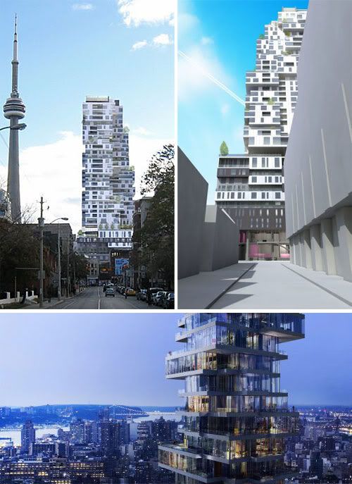
Top, A rendering of the Gansevoort condo/hotel planned for Richmond Street by Toronto architect Stephen Teeple. (HERZOG & DE MEURON / TEEPLE ARCHITECTS)
Bottom, The crown of Herzog & de Meuron’s tower, 56 Leonard St. in New York. Penthouses occupy full-floor glass boxes that have the effect of being staggered and shifted atop one another.
How Teeple's tower stacks up
A revolutionary Toronto tower design goes head-to-head with a deluxe New York project from Bird's Nest architects Jacques Herzog and Pierre de Meuron
JOHN BENTLEY MAYS
From Friday's Globe and Mail
October 31, 2008 at 12:00 AM EDT
A couple of weeks ago, I reported in this column on an intriguing new Toronto boutique hotel/condominium tower called Gansevoort. Designed by architect Stephen Teeple, the 36-storey project is a brusque artistic departure from the common run of new tall buildings we've been seeing around town during latest real estate boom.
It's neither a shiny modernist glass plinth, that is, nor a pastiche of yesteryear's deluxe apartment-block styles. Instead, Mr. Teeple has cast his building as a jaunty, jagged stack of horizontal chunks that tuck in and jut out as the structure rises, creating numerous terraces planted with full-sized trees.
If the architect's renderings are anything to go on, Gansevoort will be look-at-me architecture in the best sense: urbane, muscular and chic, and forcefully argumentative vis-Ã -vis the more timid recent residential projects in its downtown neighbourhood.
A short while after the Gansevoort column appeared, I received a press kit about a proposed tall building in lower Manhattan's Tribeca district named, after its address, 56 Leonard. The publicist's note that came along with the package suggested that, if I found Gansevoort interesting, I should definitely take a look at 56 Leonard. He was right.
Though each building apparently took shape in complete ignorance of the other — Mr. Teeple told me he knew nothing about 56 Leonard until long after his Gansevoort scheme was finished — the two towers come to similarly novel conclusions about how tall buildings should meet the sky.
The New York tower is the handiwork of Swiss architectural stars Jacques Herzog and Pierre de Meuron, whose recent work includes what's probably the most televised new building project in the world, the Beijing Olympics' Bird's Nest stadium.
Their condominium is deluxe: Prices for two-bedroom apartments start at about $4-million (U.S.), while the four-bedroom units range from about $6.5-million to some $12-million. For the very well-heeled, there will be a 5,000-square-foot penthouse priced at $25-million.
The shaft starts off at sidewalk level and rises for a couple of dozen storeys as a conventional glass tower on a sturdy base. The drama begins toward the top, which Mr. Herzog and Mr. de Meuron have broken up into cantilevered volumes pulling back and jutting outward.
Critics of this project have noted that this dashing arrangement is perhaps meant to evoke a number of glass-walled, modernist single-family residential slabs — Ludwig Mies van der Rohe's famous flat-topped Farnsworth House is mentioned — stacked up helter-skelter in the sky. The comparison is apt, and 56 Leonard's effect on the skyline, like that of Gansevoort, is fresh and pleasing.
But apart from this formal similarity at their summits, the designs of 56 Leonard and Gansevoort are quite different, in both inspiration and result.
The New York building is basically a glass tower topped off in a striking manner. But there, its novelty stops. All the suites, from bottom to penthouses, for example, are glazed floor to ceiling in the classic modernist residential style. This deployment of a heat-wasting glass skin immediately dates the project, inasmuch as it speaks of a time when energy was dead cheap and wonderfully plentiful — a time we clearly live in no longer.
The project also perpetuates the traditional urban role of the sleek, neat glass tower as a critique of the untidy tumble and dirt of the city.
In crafting the facades of Gansevoort, by way of contrast, Mr. Teeple has rejected the all-glass aesthetic that has dominated advanced tall-building design for the past half-century, and set in place surfaces — only 50 per cent glazed — meant to make Gansevoort thrifty in its consumption of energy.
The structure's largely opaque cladding also serves the artistic purpose of deliberately linking the building to the hard, opaque surfaces of the city — its sidewalks and roadways and gritty laneways. The trees that constitute Gansevoort's vertical park similarly evoke our tough urban forest, flourishing (like the city's human inhabitants) despite car fumes, road salt and other harsh conditions.
While 56 Leonard presses forward the old modernist agenda of making shiny tall buildings that stand aloof from the city, the Gansevoort aesthetic nestles the building down into the urban fabric of downtown Toronto.
It should be clear by now which of these two buildings, in my view, is more in touch and in tune with the rhythms and best thinking in the contemporary North American city. In Gansevoort's bold styling, we are seeing the end of the glass curtain wall as standard cladding for tall buildings, and the beginning of a new tower design inspiration, in sync with the most urgent ecological and urban concerns of the present moment.


