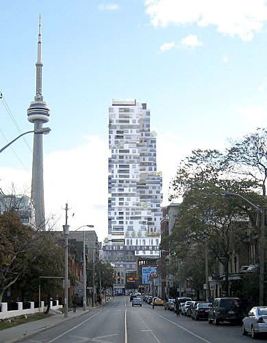
Toronto Picasso Condos | 128.62m | 39s | Mattamy Homes | Teeple Architects

ud - if this gets approved and built, it will open up possibilities for further boundary pushing in the future...

...of course, your friend could be from the Pudong school of boundary pushing in which case I'm glad they didn't push this one further

42
 
Honestly, I don't like this rendering. This building reminds me a lot of the Holiday Inn downtown. Unique design, but unique in an ugly way. It looks like the architects got the inspiration for this design from the board game, Jenga--"Take one from the bottom and put it on top." Sure don't want it's poor architecture to haunt the downtown core the same way the Holiday Inn does.

Sorry for crapping on the parade.
 
There are too many lines all over the place with no apparent pattern making it look like a Jenga tower.

Honestly, I don't like this rendering. This building reminds me a lot of the Holiday Inn downtown. Unique design, but unique in an ugly way. It looks like the architects got the inspiration for this design from the board game, Jenga--"Take one from the bottom and put it on top." Sure don't want it's poor architecture to haunt the downtown core the same way the Holiday Inn does.

Sorry for crapping on the parade.

Yes, I'm not the only one. Although I'm changing my opinion a bit in favour of the design since I've seen these new renderings from a Richmond Street perspective where you can see how it meets the street as opposed to the first renderings from a Queen St perspective looking southeast
 
Honestly, I don't like this rendering. This building reminds me a lot of the Holiday Inn downtown. Unique design, but unique in an ugly way. It looks like the architects got the inspiration for this design from the board game, Jenga--"Take one from the bottom and put it on top." Sure don't want it's poor architecture to haunt the downtown core the same way the Holiday Inn does.

Sorry for crapping on the parade.

The Holiday Inn building has looked good for the past 10 years, now that they are building these new boxes all around, it dont look good anymore?This TAS designed building is going to look good and im glad its not another boring look-a-like development.
 
I posted an article about Herzog & de Meuron's 56 Leonard Street project in New York in the World Architecture section, another "Jenga block" design. For those who missed it, here's a comparison between the two projects.

digs19re1big.jpg
1.jpg
 
I went to see a seminar on "urban agriculture" at Isabel Bader theatre the other day, and Stephen Teeple was there putting in a plug for this building (as well as his other project on Queen East ... the name escapes me) and its various LEED features.
 
from the Star:

Is Hogtown ready for an upscale `urban resort?'

Sep 25, 2008 04:30 AM

Bernadette Morra

Can a spa be sexy?

Apparently so, as G-Spa at Hotel Gansevoort in New York proves.

Glossy red walls, lounge lighting, and a unisex steam room all suggest perhaps more than a back massage is on offer at the Meatpacking District's hippest hotel. The spa menu is innocent enough, though, with holistic treatments worked into the standard beauty fare.

But get this: three nights a week the spa converts to a nightclub. Hydrotherapy pools illumine the floors. The elevated mani-pedi area becomes banquette seating. And curtained massage rooms transform into private cabanas where Veuve Clicquot champagne, Grey Goose vodka and sushi are served.

"It's wicked," comments Mazyar Mortazavi, principal of TAS DesignBuild. Mortazavi and his family firm are behind a number of local condo projects including Giraffe, M5V, DIA and Zed. Latest on the drawing board is Gansevoort Toronto, a 150-room, 35-storey hotel, spa and condo residence. The project is slated to open at 318 Richmond St. W., between John and Peter Sts., in 2011. A series of "hanging gardens," devised by award-winning Teeple Architects, is configured so that "practically every suite is a corner unit," Mortazavi describes.

Over refreshments at The Spoke Club in Toronto last week, he makes a compelling case by his appearance alone.

"The intent of bringing The Gansevoort to Toronto is not to try to be New York," says Mortazavi, immaculately outfitted in a slim grey suit and floral enamel Paul Smith cufflinks. "It's to bring in a brand that is unique and innovative."

Gansevoort hotels are positioned as "urban resorts" that tailor amenities to a city's mood. Gansevoort South, which opened in Miami this year, has a 25,000-square-foot David Barton gym and a 50-foot-long shark tank in the lobby.

Gansevoort New York, on the other hand, has a minuscule gym with no celebrity-trainer affiliation but boasts a rooftop pool with underwater lights and music, and a lounge with panoramic city views. Another New York Gansevoort is expected next year at Park Ave. S. and 29th St.

Toronto's specifics are still being devised, based on this city's "socio-nuances," Mortazavi says.

"We will offer the same quality of rooms and the same uniqueness of experience as The Gansevoort, but not the same experience."

One difference will be Gansevoort Toronto's holistic approach to design and sustainable living. Enviro-friendly mechanicals, lighting, automation controls, toiletries and linens will be chosen to attain silver certification from LEED, the Leadership in Energy and Enviromental Design rating system.

But hotels are about meeting needs and whims, and Mortazavi will have to improve upon the uneven service that is the downfall of many hip hotels. I stayed at Hotel Gansevoort for two nights during New York Fashion Week last month, one night on them, the other on me to the tune of $675 (U.S.) plus taxes. The taupe-on-taupe room with airport-lounge decor was comfortable enough, and there were nice little surprises, like a desk stocked with Post-it notes and paper clips. But there were annoyances like a promised New York Times that didn't materialize on either morning.

The location is stellar, though, right across from the fashion hangout Pastis bistro and walking distance to many designer showrooms. And the frenetic bar scene and lively elevator rides made the solo trip less lonely.

"Gansevoort Toronto won't be for everyone because it will have an attitude," Mortazavi admits, praising other downtown T.O. projects like The Ritz-Carlton and Shangri-La for those who have more conventional tastes. "Gansevoort is for early adopters, for people with foresight for change. It's for the Prada and MiuMiu crowd, as opposed to those who wear Armani and Hugo Boss."
 
The Holiday Inn building has looked good for the past 10 years, now that they are building these new boxes all around, it dont look good anymore?This TAS designed building is going to look good and im glad its not another boring look-a-like development.

The Holiday Inn has never looked good.
 
from today's Globe...

A new modernist muscles in

Toronto architect Stephen Teeple has crafted a building style that bypasses the glass boxes and historical boxes that make up most new condos forms
Article Comments JOHN BENTLEY MAYS

From Friday's Globe and Mail

October 10, 2008 at 12:00 AM EDT

Throughout Toronto's most recent residential real estate boom, the condominium towers that count creatively have come in two basic styles. Both have long histories and venerable architectural pedigrees. But, if I'm right, both tall-building styles may soon be obliged to move over and make room for a kind of design that's newer and cooler, and likely to be more controversial, than either of them.

One of the two older styles is the slender glazed box, soaring up sleekly from bottom to top in a single graceful gesture. Rooted in the thinking of Ludwig Mies van der Rohe and other masters of the modern movement in architecture, such artistically unified projects celebrate the industrial city, mass production, twentieth-century advances in glass and steel technology.

The other of these two historic approaches is typified, in Toronto, by U.S. architect Robert A. M. Stern's One St. Thomas, in the mid-town Yorkville neighbourhood. This building looks backward to the luxury apartment blocks put up, circa 1930, on New York's Park Avenue. It's toney and romantic, but unsophisticated — sculpted in imitation of the simple stepped-up facades Mr. Stern admires, but deliberately anti-modern and, in that sense, anti-Toronto. We're a big, sprawling Great Lakes town, after all, not dense Manhattan. One St. Thomas, and other pseudo-historical works of its sort, look as though they'd escaped from a museum of reactionary architecture.

But now, for tall condominium structures that are neither glass boxes nor historical boxes, nor conventional boxes of any kind, take a look at what Toronto architect Stephen Teeple is up to. This city has never seen anything like Giraffe and Gansevoort, Mr. Teeple's first tall-building projects.

The 36-floor Gansevoort boutique hotel and apartment tower on Richmond Street West, the more artistically radical (and architecturally smart) of his two current skyscrapers, will be a jaunty stack of dwellings that jut out and tuck in as the building rises. The terraces created every few floors by this strong rhythmic structural pulse will be planted with trees, generating a kind of park in the sky. In sharp contrast to the usual glazed plinth, the external surface of Gansevoort will be only 50 per cent glass; the opaque portions will be glistening European cement-based panels.

The overall effect of the project promises to be tough and agile, very urbane — and very cool indeed. But if Gansevoort is unusual as tall buildings go, its architect has drawn on sources deeply inscribed in architectural history.

Take Moshe Safdie's famous Habitat, for example.

"Our idea was to turn Habitat's modular vision vertically, to flip it," Mr. Teeple told me. "Habitat has these beautiful cantilevered rectangular volumes, and [Gansevoort] is a tower. But this image of modules cantilevered out in space, a sense of hovering, is what we definitely wanted to explore. It's imagined as a vertical landscape, which is different from a sheer glass tower."

Mr. Teeple also declares himself indebted, especially, to the work of British architect James Stirling, widely known (and criticized) for his love of paradox and surprising formal interplay.

"Even though they seem evil and ugly and awful now," the architect told me, "the post-modernist pieces done by the best architects, such as Stirling, implied that urban life could be absorbed into architecture again. The true modernist glass boxes were powerful, expressive buildings, but they projected a different world — the purity of production, the beauty of order, and also the blankness, coldness, of a pure industrial universe. We're staunch believers in always moving the art forward, evolving one's expression, so we're never interested in using a previous style to express our ideas. But the notion that a building could be complementary to urban forms, a comment on them, is something brought forward from those [post-modernist] projects into our projects."

In its opacity and bold geometry, Gansevoort draws its inspiration from the hard stuff of the big city — sidewalks, roadways, strongly composed urban space — but also from the vitality of street life, the exuberant unpredictability of urban culture. Instead of prescribing a utopian perfection, as a sheer glass tower can, Gansevoort, Mr. Teeple said, has "to grow out of the city instead … It takes the urban condition and works it up into an emotive composition that has dynamism, expression, force and beauty."

With any luck, Mr. Teeple's projects will help galvanize an urgently needed discussion about the future of building high in Toronto.

"I think tall buildings are a challenging type, but there are ample opportunities to re-invent, to think about them creatively. Sustainable design issues should be brought into the conversation. It's a matter of our overall way of imagining how we want to live, what kind of world and city we want to live in — trying to have [architectural design] driven, not strictly by hyper-practical decision-making, but by a vision of what we're building in the long run."
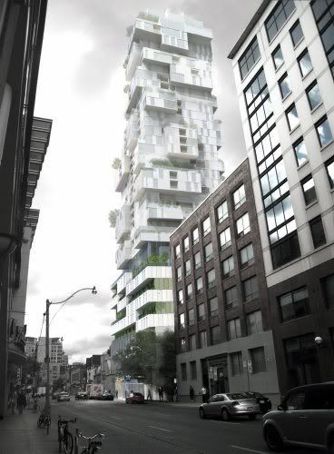
 
And here's the new render that went with that article.

I'm suddenly not too fond of this now.

mays10re2big.jpg


It looks like it's been fattened up verus the previous render below.

digs19re1big.jpg
 
It hasn't fattened up, it's just a different angle.
It's a pretty crude rendering, so I wouldn't put much faith in it anyway, aside from the massing.
 

Back
Top