Toronto Peter Gilgan Centre for Research and Learning | ?m | 21s | Sick Kids | Diamond Schmitt

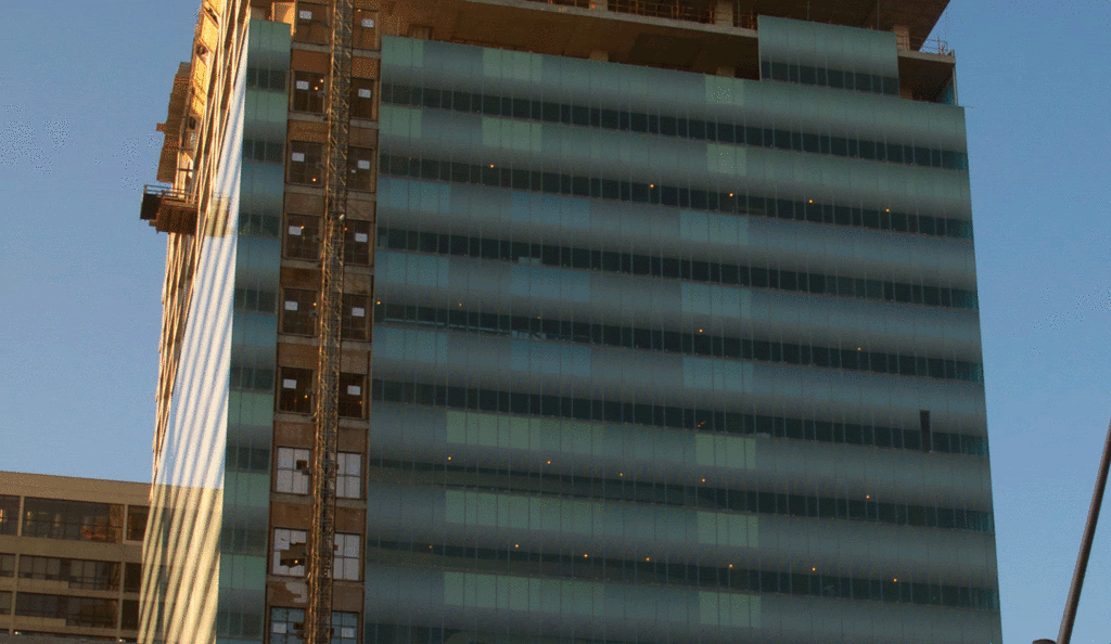
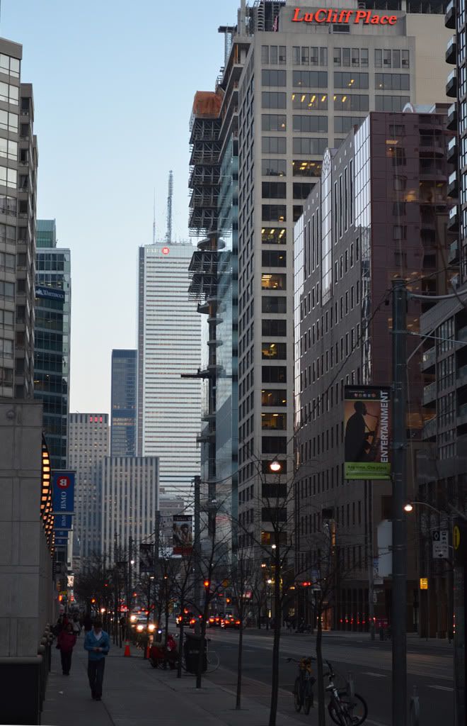
Pretty plain and simple, and nothing special here.....but then again, its just a research centre.

that's a rather odd remark. why is it "just a research centre"?

why is this a lesser category of building in your view?

i think most people believe that research centres--especially a medical research facility related to children's health--are rather important.

why not: "it's just a condo"? "it's just an office building"? "it's just a hotel"?

by many metrics, all of these are far less significant to the city than the presence of a world-class research facility.

"For the first time, there will be a public face for SickKids Research Institute. The building will showcase the incredible depth and breadth of research being conducted by the Hospital to improve child health through prevention, better cures and early detection of childhood disease."

"The Tower consolidates the research staff presently working in six different locations across the city and enhances the opportunity for interactions between clinical and research colleagues. The integration of research with patient care and learning are among the strengths of SickKids that have resulted in many significant contributions to the understanding, treatment and prevention of disease."

Of course its important, whats that got to do with the looks (once again, i think its pretty plain) amongst everything else going up in Toronto... i was born and raised in this city and know everything of what Sick Kids stands for...now lets not twist it.
 
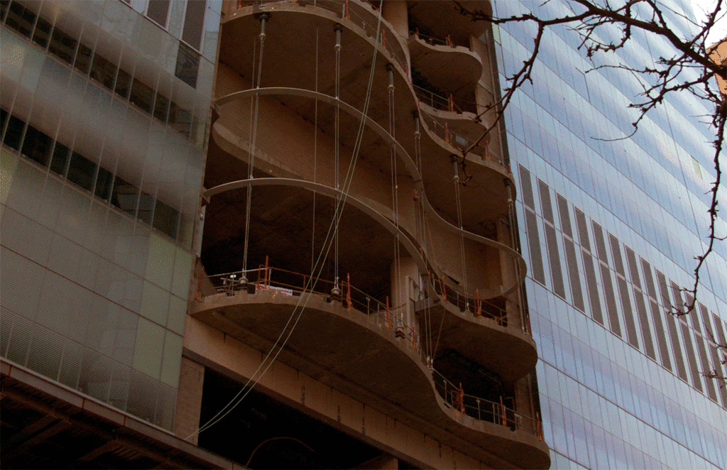
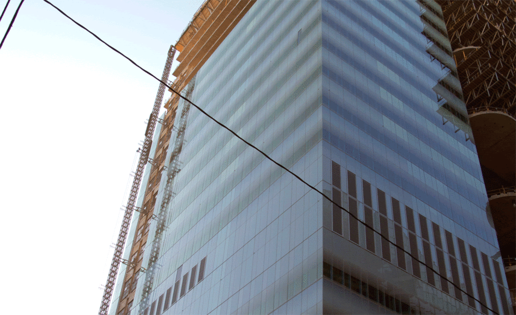
re: looks - Not that I am particularly enamored with the looks of the building, but I'd be quite happy to hear you pointing out examples of curved glass being used in such amounts in Toronto.

AoD
 
Last edited:
whatever:

The AGO uses flat glass to approximate curves for the galleria - though there are some used for the exterior portion of the spiral staircases. it's not that much relative to this project.

AoD
 
Last edited:
I think what he's trying to say is that it's an institutional building, so why would they care about aesthetics? He's right, the building is hideous and doesn't fit in at all.

I don't really care what goes on inside the building, I just wish they had made it look better... a lot better. The curved centre windows with the right angle block of a building looks like something a 5 year old would design.

That's terrific that it's a Sick Kids research building, I'm obviously all for that, but regardless, it's hideous and if it was a condo, hotel or office tower, I doubt people would be rushing to get in there...

So as an institutionalized building, I'm not surprised they didn't really care about the exterior aesthetics, but I wish they had.
 
Last edited:
It's interesting that Mr. grand refuses say what is so lacking here and instead chooses to rant without qualifiers. 'Hideous' and 'didn't care about the exterior aesthetics' are powerful phrases, especially when the member sprouting them seems unable to tell us why he feels so strongly.
 
He's right, the building is hideous and doesn't fit in at all.

I don't really care what goes on inside the building, I just wish they had made it look better... a lot better.

The curved centre windows with the right angle block of a building looks like something a 5 year old would design.

it's hideous and if it was a condo, hotel or office tower, I doubt people would be rushing to get in there...

thank you for extremely intelligent and well-considered contribution. you might want to bone up on your knowledge of architecture a bit more before weighing in next time, but hey, if you're happy--we're happy. in other words, "go for it!", troll-man.
 
thedeepend:

I don't think stating one's preference is trolling - however, it must be recognized that it is a purely personal take on the aesthetic of the structure that's not been substantiated in any other way.

Like:
1. The claim that the building does not "fit in" - to what? And why should it "fit in" in the first place?
2. There are recent hotels, condos (which is a significantly different use) and offices that are far more aesthetically questionable and yet they are fully occupied.
3. Claim of institutional buildings = bad aesthetics - sorry, some of the most visually interesting and pleasing buildings of late have been institutional structures; and certainly one wouldn't be testing out cladding or using premium materials if aesthetic concerns aren't an issue.

AoD
 
Last edited:
a4ed68a0.gif

fddaf75b.gif

e3a8d83c.gif
.
 
The building most definitely has the "heft" of an institutional structure, but personally speaking, I find nothing hideous about it. At the same time, I'd love to see some condos or a hotel add on that kind of sweep of swerving glass.
 
Last edited:

Back
Top